
Color That Signals Trust, Not Alarm
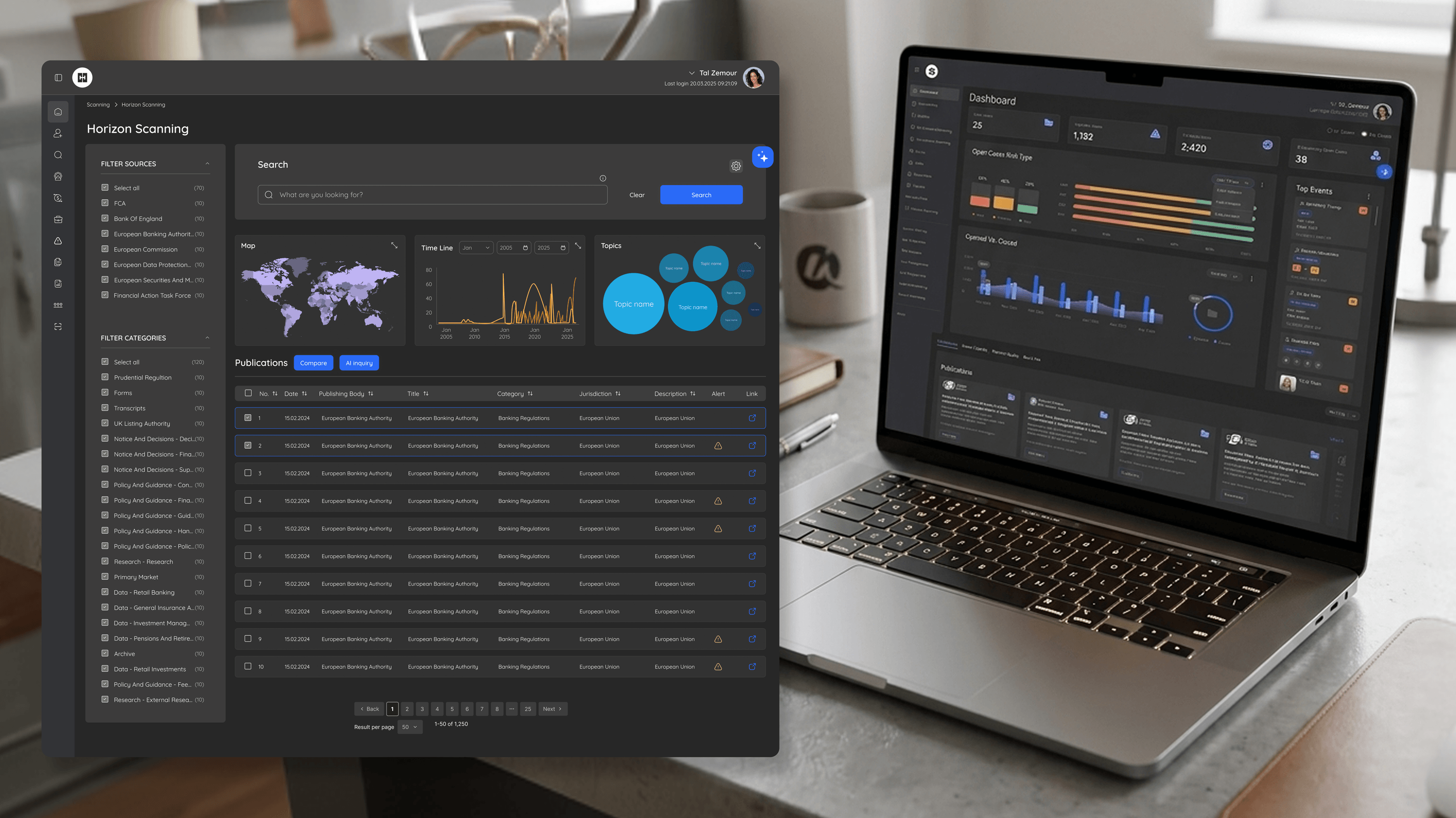
Founders selling into banks know the product has about three seconds to feel credible. On BlackSwan, color was one of the first things doing that work. This is a risk-intelligence platform — PEP screening, sanctions, geographic risk — so the temptation is to drown everything in red. I resisted it. If every flag screams danger, severity loses all meaning and the product feels frantic rather than authoritative. Instead I built a restrained palette where color carries calibrated meaning: red reserved for genuine high-severity signals, amber for caution, neutral surfaces for the everyday work where analysts spend most of their time. The psychology is deliberate. A calm, composed interface tells a buyer this tool is in control of the situation — which, in financial compliance, is the exact emotional promise. Color also had to survive WCAG contrast requirements and stay legible for the long, dense sessions analysts and investigators actually run. For a founder, this is brand and function fused: the palette signals seriousness and trust in a demo, and it keeps users oriented in production. Color isn't decoration here. It's a credibility argument made before anyone reads a word.
Related articles

About
Making complicated into easy for users.
Senior product designer with a decade of work across complex systems - financial risk platforms, legal operations, healthcare apps, manufacturing tooling and insurance portals. The common thread is depth: products where the data is rich, the users are expert, and the interface has to disappear into the work.