
Visualizing Entity Relationships Without Drowning the User
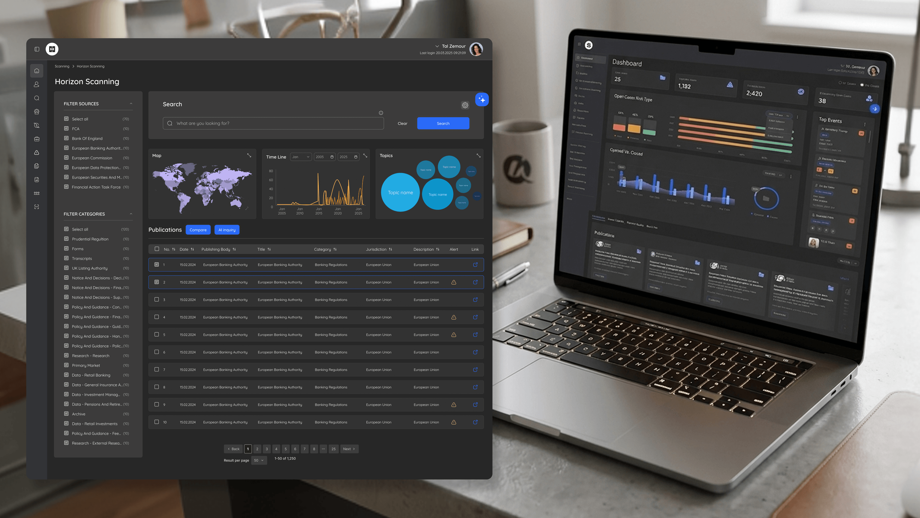
BlackSwan asks two very different things of data visualization, and an engineering leader needs to appreciate why that distinction drives architecture. Investigators on the Entity page need to see relationship and ownership structure — who connects to whom, where the risk concentrates. Analysts in Explore need condensed triage results they can scan and clear quickly. Same underlying data, opposite presentation goals. The relationship and ownership mapping was the interesting problem: real entity networks are dense, and a naive node-graph dump is unreadable. The design has to make the meaningful connections legible without forcing the investigator to untangle visual noise, which means the visualization layer must be opinionated about what to surface and what to defer to drill-down. The Risk Engine pushed visualization further: I turned configuration of four core engines into a visual decision system where weights and rules are seen, not just typed. For a CTO, the implication is that these views aren't generic charts you can bolt on; they're purpose-built to the domain's data shapes and the user's task. Investing in that specificity is what separates a tool people trust under real caseloads from one they fight. The data was always there — visualization is what makes it usable.
Related articles

About
Making complicated into easy for users.
Senior product designer with a decade of work across complex systems - financial risk platforms, legal operations, healthcare apps, manufacturing tooling and insurance portals. The common thread is depth: products where the data is rich, the users are expert, and the interface has to disappear into the work.