
Typography as Triage: Hierarchy for Analysts Under Load
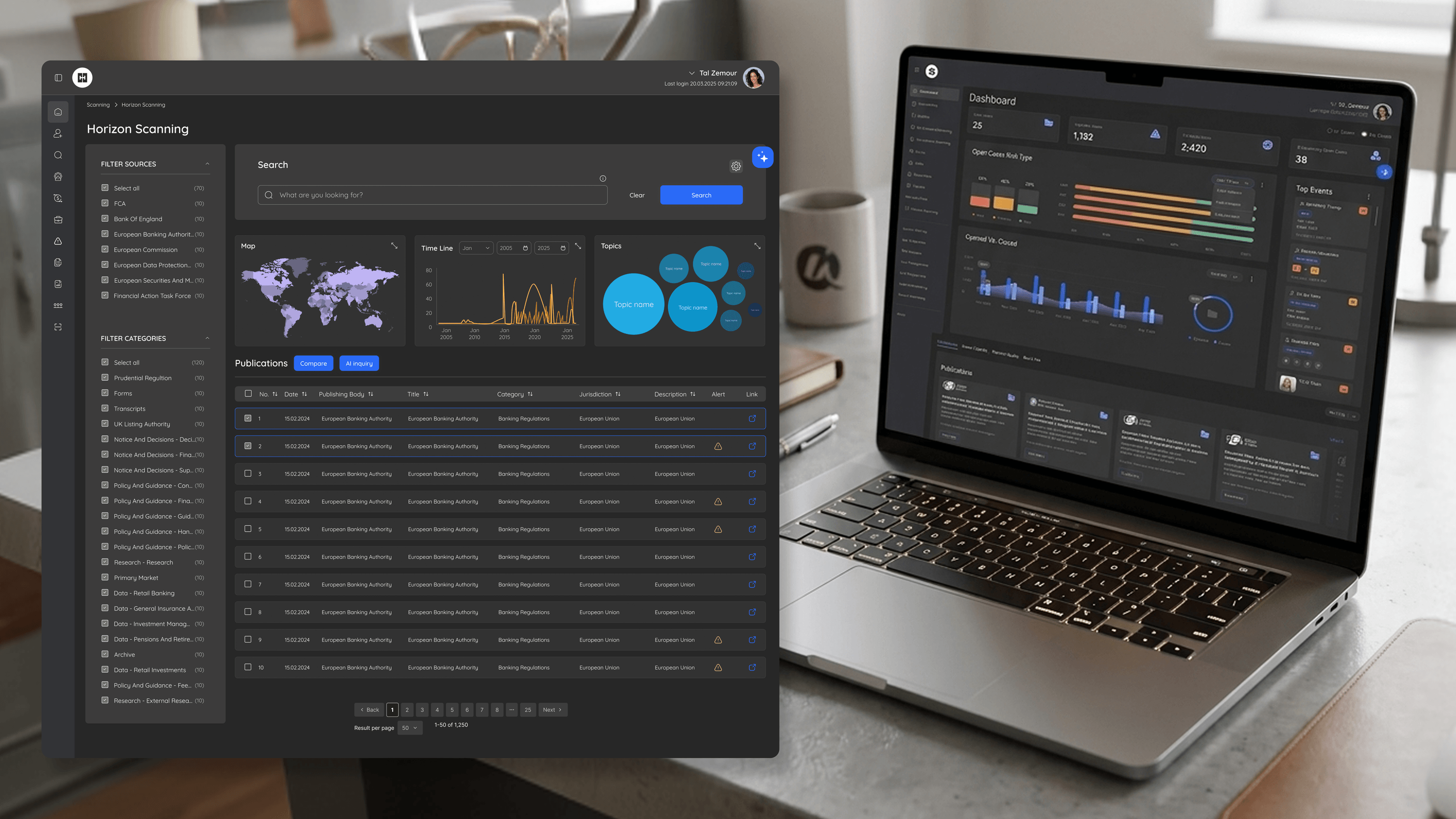
Analysts on BlackSwan don't read screens — they scan them. They're moving through condensed triage results in Explore, deciding in seconds whether a flagged entity deserves a closer look or a pass. Typography is the quiet machinery that makes that decision fast. As the PM, the lever you care about is time-to-decision, and hierarchy is where it lives. I designed the type scale so the eye lands on the risk signal first — the score, the flag, the reason — before the supporting detail. Weight, size, and spacing do the prioritizing so the analyst doesn't have to. Where everything shouts, nothing reads; so I deliberately demoted secondary metadata to let the primary signal breathe. The same discipline carries to the investigator's Entity page, where dense relationship and ownership data needs structure, not decoration. Clear hierarchy also reduces a cost PMs underrate: misreads. In risk work, mistaking a secondary attribute for a primary one isn't a cosmetic slip, it's a bad call. Good typography doesn't just look professional. It routes attention to what matters, which is exactly what a triage workflow is supposed to do.
Related articles

About
Making complicated into easy for users.
Senior product designer with a decade of work across complex systems - financial risk platforms, legal operations, healthcare apps, manufacturing tooling and insurance portals. The common thread is depth: products where the data is rich, the users are expert, and the interface has to disappear into the work.