
Accessibility in Field-Dense Insurance Flows
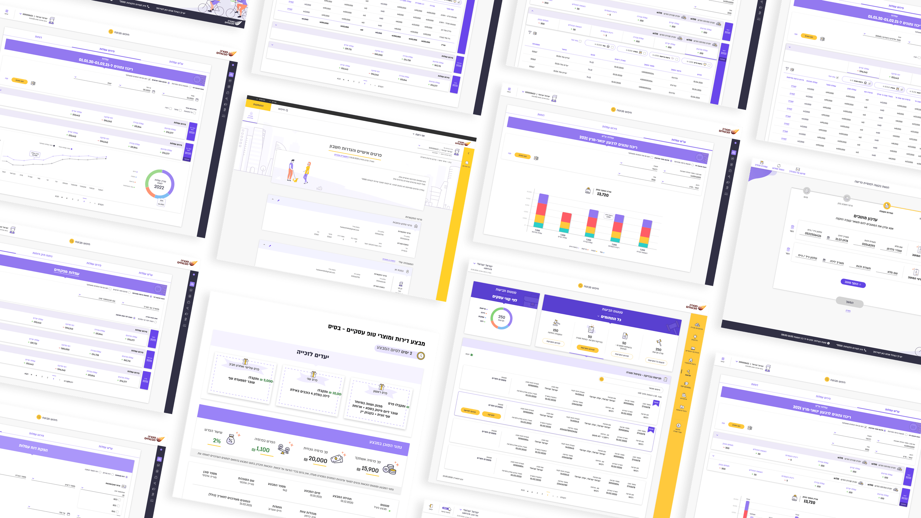
Accessibility conversations tend to default to marketing pages and color contrast. In insurance, the harder and more interesting surface is the dense operational interface. On Menora's agent zone, a single screen can carry many fields, many conditional rules, and data that changes meaning depending on which of five roles is looking at it. Meeting WCAG there isn't about ticking contrast ratios — it's about whether a keyboard user can traverse a complex multi-axis filter in a sane order, whether a screen reader announces conditional fields as they appear and disappear, whether focus survives the state changes that these flows constantly trigger. For engineering leaders, the takeaway is that accessibility is an architecture decision in this domain, not a finishing pass. Semantic structure, managed focus, and predictable announcement of dynamic content have to live in the components that render these forms, because retrofitting them across hundreds of conditional fields is brutal. The B2C side — login, profile settings, self-service forms — has its own obligations to a broad public audience. But the deepest accessibility debt hides in the internal tools, where complexity is highest and the assumption that 'it's just for power users' is exactly where teams cut the corners they later regret.
Related articles

About
Making complicated into easy for users.
Senior product designer with a decade of work across complex systems - financial risk platforms, legal operations, healthcare apps, manufacturing tooling and insurance portals. The common thread is depth: products where the data is rich, the users are expert, and the interface has to disappear into the work.