
Learning Experience (LX): How Do You Design a Course-Management System That Students Love?
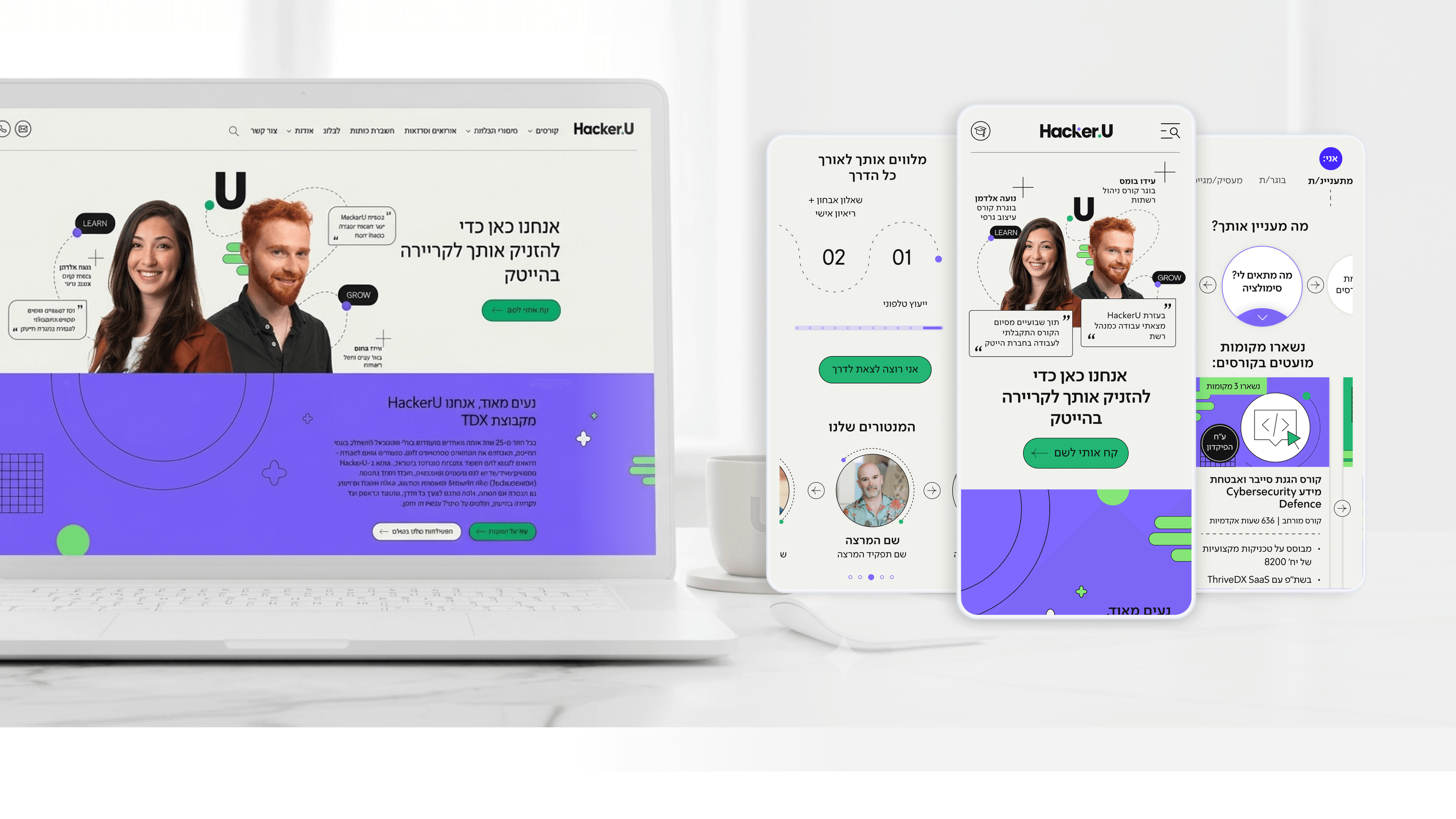
Product managers in EdTech need to understand that designing an educational system isn't just a UX exercise - it's a Learning Experience (LX) exercise. A student starting a tech course at Hacker U invests thousands of shekels and hundreds of hours. Every point of friction in the system - a clunky enrollment screen, a hard-to-search lesson, uncertainty about their own progress - translates into frustration, support tickets, and ultimately churn.
In the project for Hacker U, the central product challenge was to build a system that reflects personal progress clearly and motivationally. Students aren't tech people - more often than not, they start their studies out of a desire to change careers and bring variety to their professional lives. They need emotional support through the screen: a clear visualization of "where am I in the course," "how much have I completed," "what's the next step."
Cracking it involved building a milestone-based progress system, with friendly reminders, clear displays of submitted projects, and positive reinforcement at moments of success. We also integrated community features - interaction with instructors and with other students - that create a sense of belonging to a larger community of learners.
For product managers in EdTech, the key insight: students aren't rational users operating a system. They're human beings navigating a personal journey of learning, growth, and sometimes fear of failure. Good design is design that accompanies them throughout the journey, not just one that hands them functionality.
Related articles

About
Making complicated into easy for users.
Senior product designer with a decade of work across complex systems - financial risk platforms, legal operations, healthcare apps, manufacturing tooling and insurance portals. The common thread is depth: products where the data is rich, the users are expert, and the interface has to disappear into the work.