
Backlog Prioritization in an EdTech System: How Do You Run a Project That Serves Thousands of Users Simultaneously?
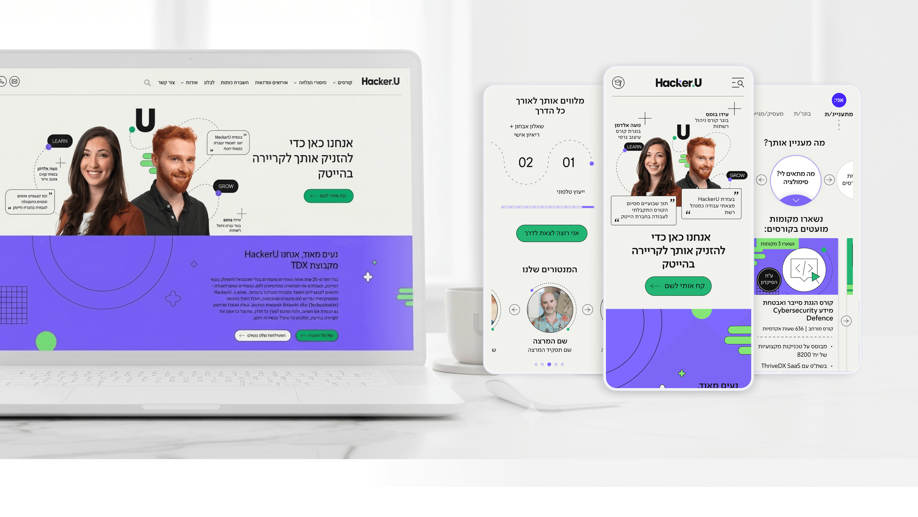
Project managers leading an enterprise EdTech platform like Hacker U face a unique kind of complexity: the system serves several user audiences at the same time - active students, alumni, instructors, course administrators, marketing teams, and sales teams. Each of them demands different features, and the backlog swells quickly to dozens of competing items.
In the Hacker U project, the prioritization strategy was built on a dual-impact matrix: impact on the bottom line (recruiting new students) versus impact on Retention (keeping active students). Features that contributed to both areas got top priority. For example, improving the enrollment screen (Conversion Optimization) directly affected recruitment, while the academic tracking system affected Retention. That dual improvement delivered the highest ROI on development hours.
In addition, the methodology involved breaking the project into 3-week Sprints, each with a clear, measurable product goal. At the end of each Sprint, you show stakeholders what shipped, how it moves the metrics, and what the priority is for the next one. That transparency kept the college's leadership highly engaged and led to fast sign-off on plans.
For project managers in the world of tech education, the message is: don't fall into the trap of "serving everyone" in a single project. A clear impact matrix that incorporates business metrics lets you stay on schedule and present measurable value at every milestone.
Related articles

About
Making complicated into easy for users.
Senior product designer with a decade of work across complex systems - financial risk platforms, legal operations, healthcare apps, manufacturing tooling and insurance portals. The common thread is depth: products where the data is rich, the users are expert, and the interface has to disappear into the work.