
A Modular Design System R&D Could Actually Build
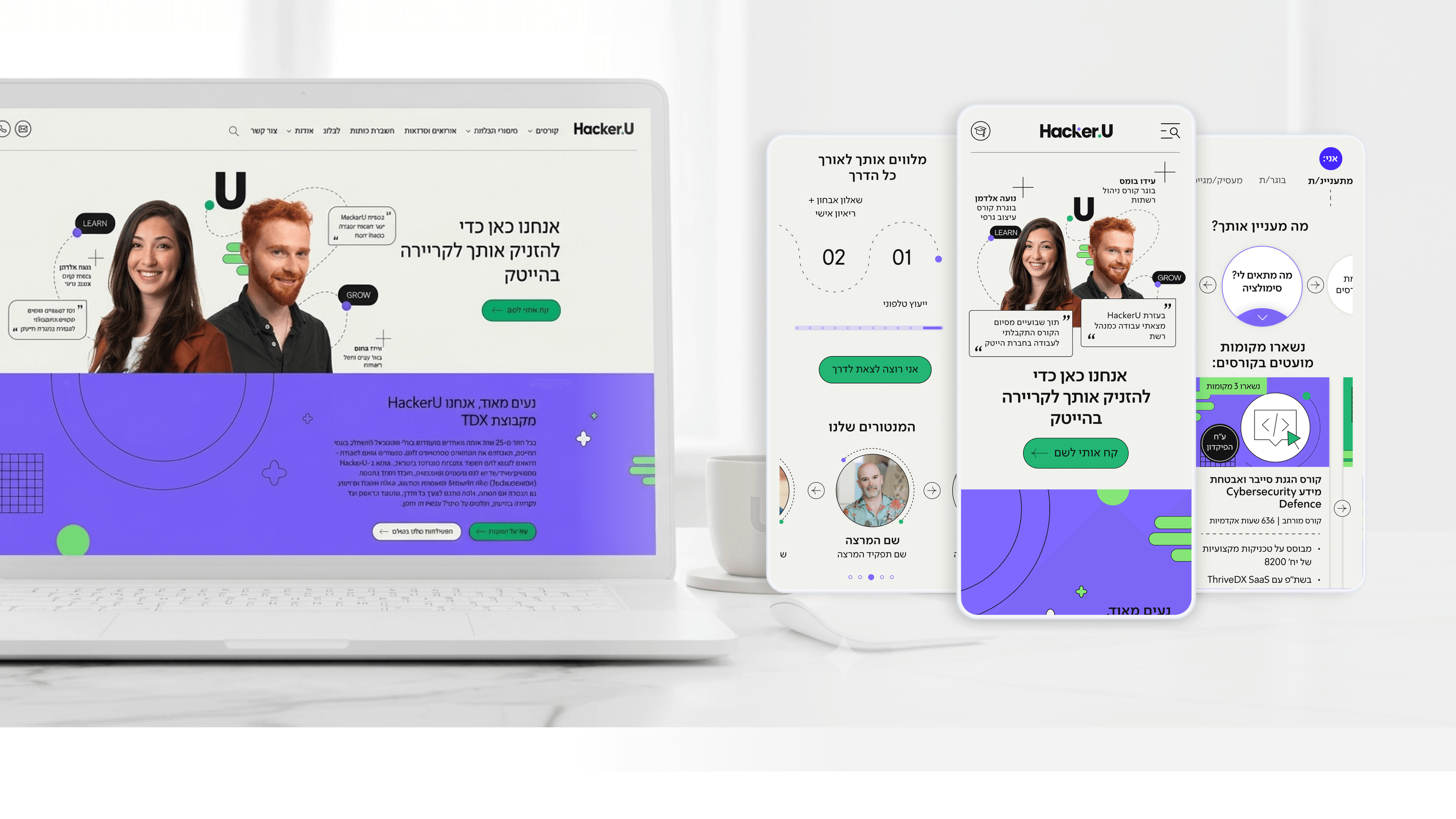
When I designed HackerU's marketing site, I treated R&D as a partner in the design, not a recipient of it. The site spans many pages — a personalized homepage, dense course pages, a 'Classroom to Career' placement page — and the only sane way to deliver that without a sprawling, unmaintainable front end was a modular design system. For a CTO, the relevant point is that this system was built to be implemented, not just admired. Components were defined as reusable, composable pieces with consistent states, so engineers weren't re-solving the same layout problem on every page. I worked with R&D early on what was genuinely reusable versus what was a one-off, because that boundary is where front-end debt accumulates. The personalized entry layer — where the primary content card adapts to who the user is — is a good example: rather than five bespoke homepages, it's one component pattern with adaptive content, which is far cheaper to maintain. Good collaboration here means the design system speaks the team's language: predictable components, clear states, no surprises at build time. The payoff is a front end that stays consistent as the marketing site grows, instead of fragmenting page by page.
Related articles

About
Making complicated into easy for users.
Senior product designer with a decade of work across complex systems - financial risk platforms, legal operations, healthcare apps, manufacturing tooling and insurance portals. The common thread is depth: products where the data is rich, the users are expert, and the interface has to disappear into the work.