Meytal Dahan
Back to insights

Designing Command and Control Systems: How Do You Balance Volume of Information Against Speed of Decision?
Ministry of DefenseProduct ManagersDefenseTech / Government
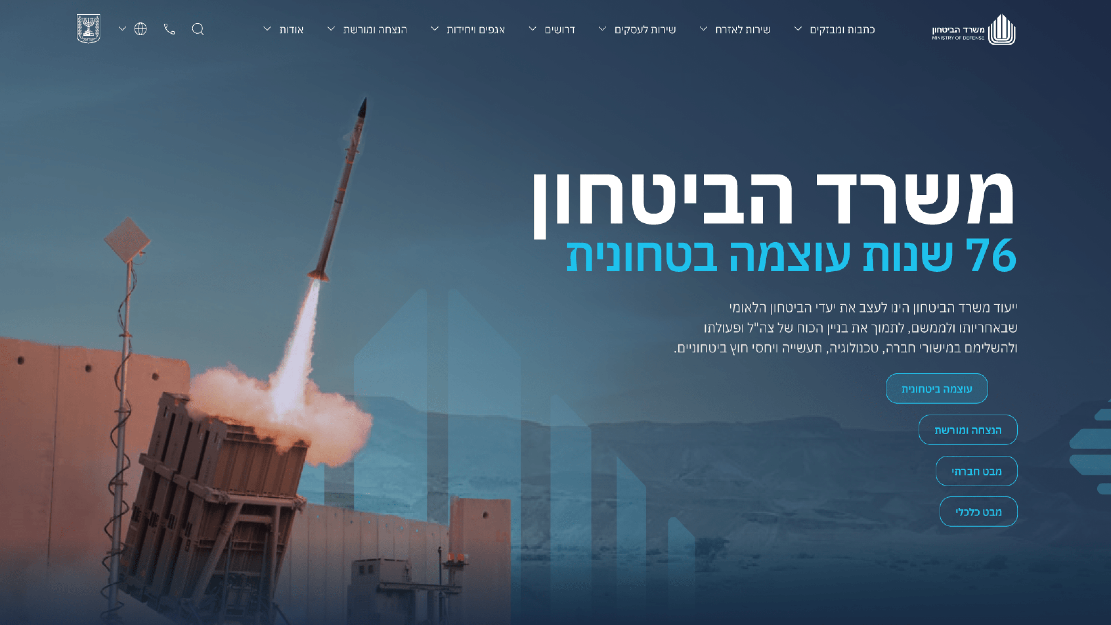
Ministry of Defense — A marketing platform
Designing command and control systems for defense organizations is one of the most complex product challenges in the industry. The users are experts working under intense pressure, who need to make critical decisions in seconds, and who carry a responsibility that can shape operational outcomes. Every design decision in a system like this demands a delicate balance between "showing enough information to enable an informed decision" and "not flooding the user with a load that disrupts their judgment." Working on systems for the Ministry of Defense, the key insight was that users don't need "All Information All The Time." They need "Right Information Right Now." Cracking this required a precise mapping of Use Cases — what is the critical information at any given moment, and how does it change according to the operational situation. The design approach was built on "Contextual UI" — an interface that shifts dynamically based on context. In a calm state, the system presents a comprehensive overview. In an alert state, it collapses into a focused view that surfaces only the information critical to the decision. The transition between states is smooth and intuitive, so the user never wastes a fraction of a second on "where did the information go?" For product managers in command and control worlds — not only defense, but also transportation, energy, or emergency medicine — this insight is critical. A static design that "fits everyone" creates a load in every situation. A dynamic design that adapts itself to context is the difference between a system that helps the user and a system that holds them back.

Get in touch

Have a project in mind?

Drop a line. Meytalyav@gmail.com

Related articles

Ministry of Defense
Engineering LeadersR&D Collaboration

Designing a public face for serious engineering

The MoD public portal tells citizens about real strategic and security advancements - so the collaboration that mattered most was with the technical side that owns the substance. My constraint as a designer: present serious work credibly, never overclaim it. R&D partners weren't a sign-off gate; they were the source of truth for what 'forward-thinking' could honestly say. The win wasn't agreed pixels - it was a shared standard for representing rigorous work publicly without distortion. Fidelity to the truth is a design requirement, not just an engineering one.

Read
Ministry of Defense
Product ManagersUser Research

Researching a portal that speaks to a whole nation

On the Israel MoD public portal, the research question wasn't 'who is the user' - it was 'who are ALL of them, and where do their needs collide.' Citizens, partners, press, one set of pages. The instinct to pick one persona and optimize would have broken trust with the others. We researched by intent, not demographics. The real deliverable wasn't insights - it was a model that let the roadmap say no with confidence. Research earns its keep when it makes prioritization defensible, not just informed.

Read
Ministry of Defense
Project ManagersDelivery & Handoff to Development

A handoff built to survive the ministry's scrutiny

Handoff on the MoD public portal had high stakes: a public-facing government record where accessibility is an expectation, not a bonus. My PMO-minded goal was simple - kill ambiguity before it becomes rework. Not a Figma dump over the wall, but a sequenced package: responsive system, reusable components, documented states, WCAG-minded specs. Foundations first, so build starts on solid ground. A good handoff doesn't just transfer files - it transfers intent. That's what keeps a high-visibility delivery on schedule.

Read
Meytal Dahan

About

Making complicated into easy for users.

Senior product designer with a decade of work across complex systems - financial risk platforms, legal operations, healthcare apps, manufacturing tooling and insurance portals. The common thread is depth: products where the data is rich, the users are expert, and the interface has to disappear into the work.