
Why Beehive Needed a Design System Before It Needed a Second Page
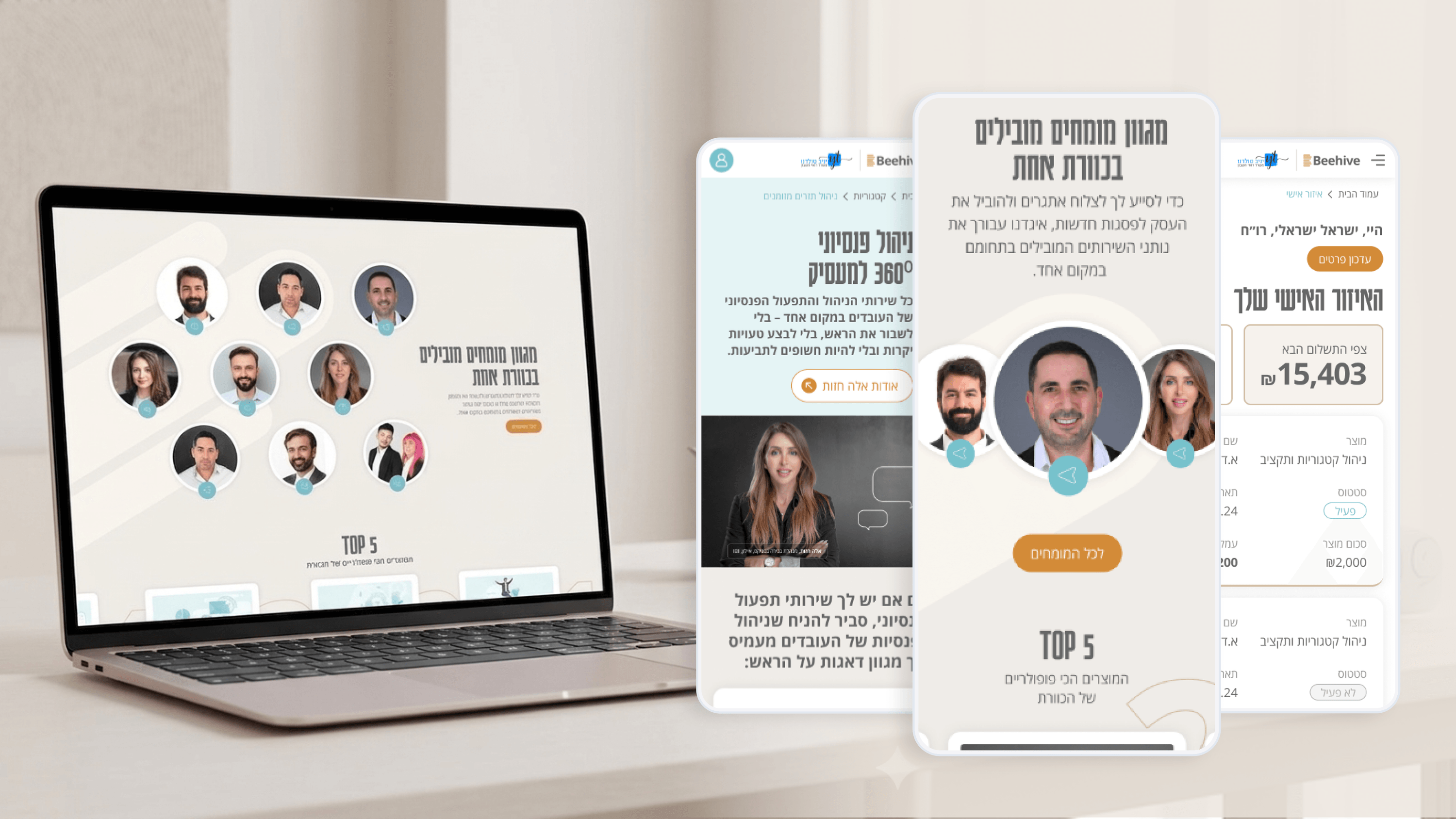
When I started Beehive, the temptation was to design screen by screen: a homepage here, a product page there, the Personal Zone later. I resisted it. A network branded as 'The Hive of 100 Accountants' has to feel like one coherent roof across a marketing site and a client dashboard, and that consistency only survives handoff if it's encoded, not just drawn. So I built a small but disciplined Design System: tokens for the charcoal-and-gold palette, a type scale, spacing, and a component set shared between the public site and the Personal Zone. For an engineering team, this is the difference between reusing a button and reinventing it. The gold accent had to mean the same thing — a deliberate signal of authority — whether it framed a hero CTA or a status chip in a client's activity view. I kept the system intentionally lean: enough structure to guarantee the premium feel scales, not so much that it becomes its own maintenance burden. The payoff is predictability. New surfaces inherit the brand for free, reviews get faster, and the codebase and the design stay in sync instead of drifting apart over time.
Related articles

About
Making complicated into easy for users.
Senior product designer with a decade of work across complex systems - financial risk platforms, legal operations, healthcare apps, manufacturing tooling and insurance portals. The common thread is depth: products where the data is rich, the users are expert, and the interface has to disappear into the work.