Meytal Dahan
Back to insights

Typography Is How Beehive Decides What You Read First
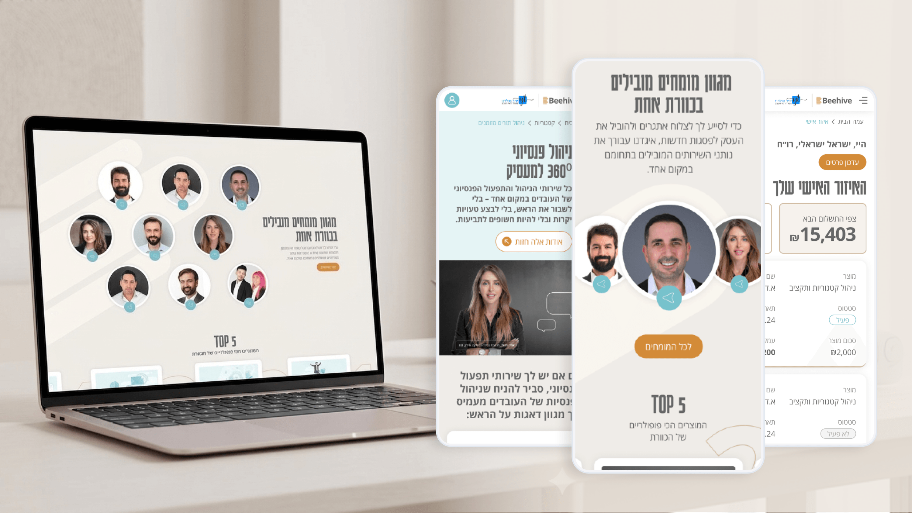
Beehive — A high-end platform for financial services
Financial services are dense by nature, and Beehive's product page had a real PM problem: it needed to make complex offerings approachable without dumbing them down. My lever for that wasn't more copy — it was typography and hierarchy. On the homepage, the narrative had to unfold deliberately: from the big idea of 'the collective power of 100 experts' down to specific, personalized services. So I built a clear type scale where each step earned its size. Headlines carry the promise, subheads orient, body text does the explaining, and the charcoal-and-gold palette reinforces the order with restraint rather than noise. For a PM, this is conversion infrastructure. When users land knowing instantly what this is, who it's for, and what to do next, you don't need to fight for attention with bigger buttons. In the Personal Zone the same discipline keeps a client's activity readable at a glance — labels recede, the numbers and actions that matter step forward. Hierarchy is a product decision disguised as a visual one: it's you deciding, on the user's behalf, what deserves their first three seconds. I'd rather make that call on purpose than leave it to chance.

Get in touch

Have a project in mind?

Drop a line. Meytalyav@gmail.com

Related articles

Beehive
Project ManagersDocumentation & Organizational Handoff

What Beehive Needed After I Left the Room

A brand is only worth what survives after the designer leaves. Beehive will keep growing — new pages, more in the client Personal Zone — mostly without me. So I documented decisions, not just files: how charcoal-and-gold is applied, when the logo is used, the tone that keeps finance approachable. For a PMO, that's how you close a project cleanly and kill key-person risk. The real deliverable is a brand the business can run without you.

Read
Beehive
Product ManagersMicro-interactions & Animation

The Quiet Motion That Makes Beehive Feel Premium

Premium is a feeling, and on Beehive it's built from small moments — a restrained section reveal, a button that acknowledges you, a soft transition when a client updates their info in the Personal Zone. The rule I hold: every micro-interaction must reduce uncertainty or reinforce the brand. Never decorate. PMs — if motion doesn't earn its place, it's just latency with extra steps.

Read
Beehive
Project ManagersUsability Testing

Testing the Personal Zone Before It Cost Us a Sprint

The riskiest part of Beehive wasn't the marketing site — it was the client 'Personal Zone', where confusion becomes support tickets. So we usability-tested it as a prototype. The findings were boring and perfect: unclear labels, a nav order that buried what people came to check. As edits, they were cheap. As post-launch change requests, they'd have eaten a sprint. Testing early isn't a quality nicety. It's timeline insurance.

Read
Meytal Dahan

About

Making complicated into easy for users.

Senior product designer with a decade of work across complex systems - financial risk platforms, legal operations, healthcare apps, manufacturing tooling and insurance portals. The common thread is depth: products where the data is rich, the users are expert, and the interface has to disappear into the work.
