
Testing the Personal Zone Before It Cost Us a Sprint
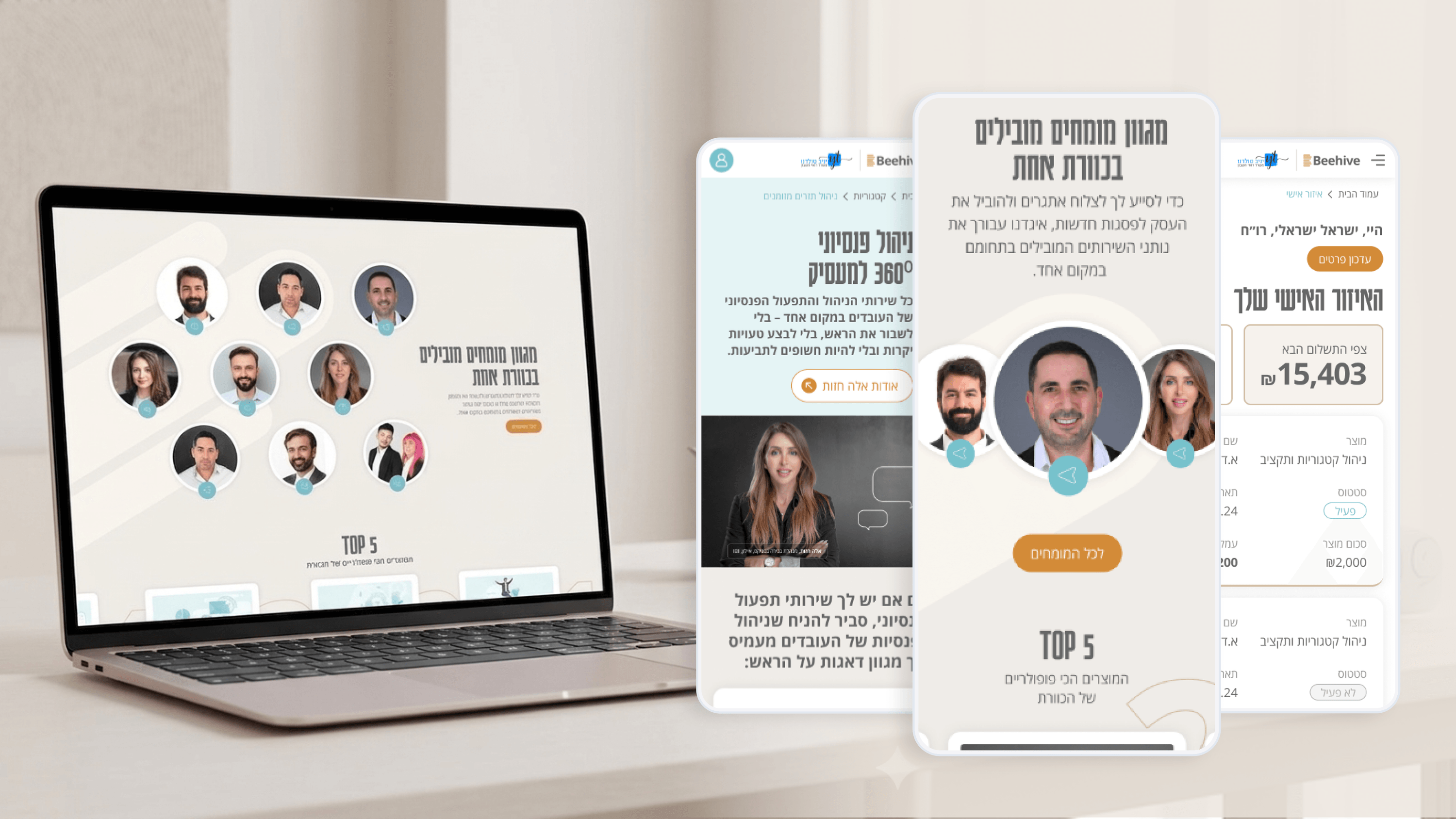
From a delivery standpoint, the riskiest part of Beehive was never the marketing pages — it was the 'Personal Zone', the dashboard where clients track activity and manage their information. That's where confusion turns into support tickets and rework. So we tested it before it hardened into code. I ran lightweight usability sessions on the flows that mattered most: finding where you stand, updating your details, understanding what each section meant without a glossary. The findings were unglamorous and exactly what a PMO wants early — labels that read clearly to a designer but not to a client, a navigation order that buried the thing people opened the page to check. Catching those at the prototype stage meant they were edits, not change requests. For project management, that's the real argument for testing: it converts late, expensive surprises into cheap, scheduled fixes. It also gave us a shared, evidence-based vocabulary, so 'I think this is confusing' became 'several people couldn't find this.' On Beehive, usability testing wasn't a quality gate at the end. It was a way to protect the timeline by spending small, early effort instead of large, late effort.
Related articles

About
Making complicated into easy for users.
Senior product designer with a decade of work across complex systems - financial risk platforms, legal operations, healthcare apps, manufacturing tooling and insurance portals. The common thread is depth: products where the data is rich, the users are expert, and the interface has to disappear into the work.