Meytal Dahan
Back to insights

What Beehive Needed After I Left the Room
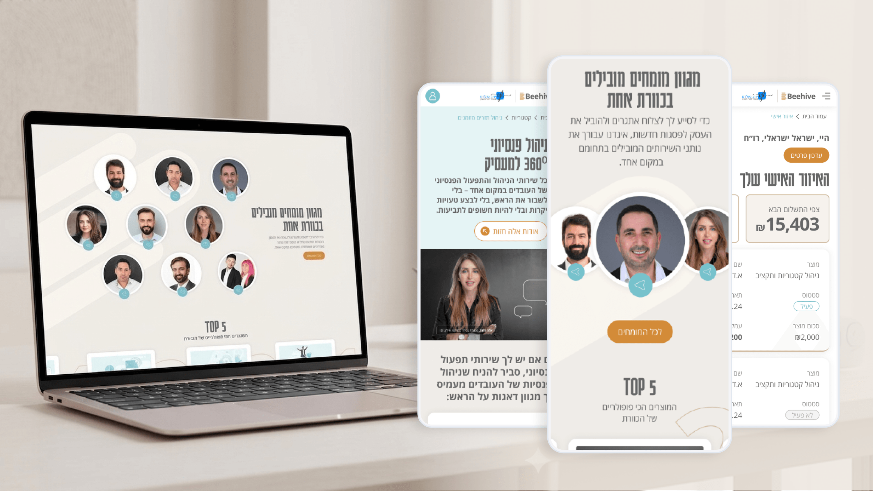
Beehive — A high-end platform for financial services
A brand identity is only valuable if it outlives the project that created it. Beehive will keep growing — new pages, new services, more activity in the client 'Personal Zone' — and most of that will happen without me in the room. So part of my delivery was documentation built for that future, not just for the launch. I captured the brand as usable rules: how the charcoal-and-gold palette is applied, when the beehive-and-coins logo is and isn't used, and the tone that keeps complex financial services approachable rather than cold. I documented the homepage as a narrative structure others can extend without breaking the story it tells. And I noted the patterns the Personal Zone relies on, so anyone adding to it stays consistent. For a PMO, this is what closes a project cleanly: the organization can maintain and grow the work without re-hiring the original context. It also reduces key-person risk — decisions live in a reference, not in someone's memory. On Beehive, documentation wasn't paperwork at the end. It was the difference between a one-time deliverable and a brand the business can actually run with.

Get in touch

Have a project in mind?

Drop a line. Meytalyav@gmail.com

Related articles

Beehive
Product ManagersTypography & Visual Hierarchy

Typography Is How Beehive Decides What You Read First

Beehive's product page had to make complex financial services approachable. My main tool wasn't copy — it was typography. A type scale where every step earns its size, so the eye travels from promise to detail in the right order. For PMs: hierarchy is conversion infrastructure. Decide what the user reads in their first three seconds, or the layout decides for you — usually badly.

Read
Beehive
Product ManagersMicro-interactions & Animation

The Quiet Motion That Makes Beehive Feel Premium

Premium is a feeling, and on Beehive it's built from small moments — a restrained section reveal, a button that acknowledges you, a soft transition when a client updates their info in the Personal Zone. The rule I hold: every micro-interaction must reduce uncertainty or reinforce the brand. Never decorate. PMs — if motion doesn't earn its place, it's just latency with extra steps.

Read
Beehive
Project ManagersUsability Testing

Testing the Personal Zone Before It Cost Us a Sprint

The riskiest part of Beehive wasn't the marketing site — it was the client 'Personal Zone', where confusion becomes support tickets. So we usability-tested it as a prototype. The findings were boring and perfect: unclear labels, a nav order that buried what people came to check. As edits, they were cheap. As post-launch change requests, they'd have eaten a sprint. Testing early isn't a quality nicety. It's timeline insurance.

Read
Meytal Dahan

About

Making complicated into easy for users.

Senior product designer with a decade of work across complex systems - financial risk platforms, legal operations, healthcare apps, manufacturing tooling and insurance portals. The common thread is depth: products where the data is rich, the users are expert, and the interface has to disappear into the work.
