Meytal Dahan
Back to insights

Beehive Didn't Launch as Everything at Once
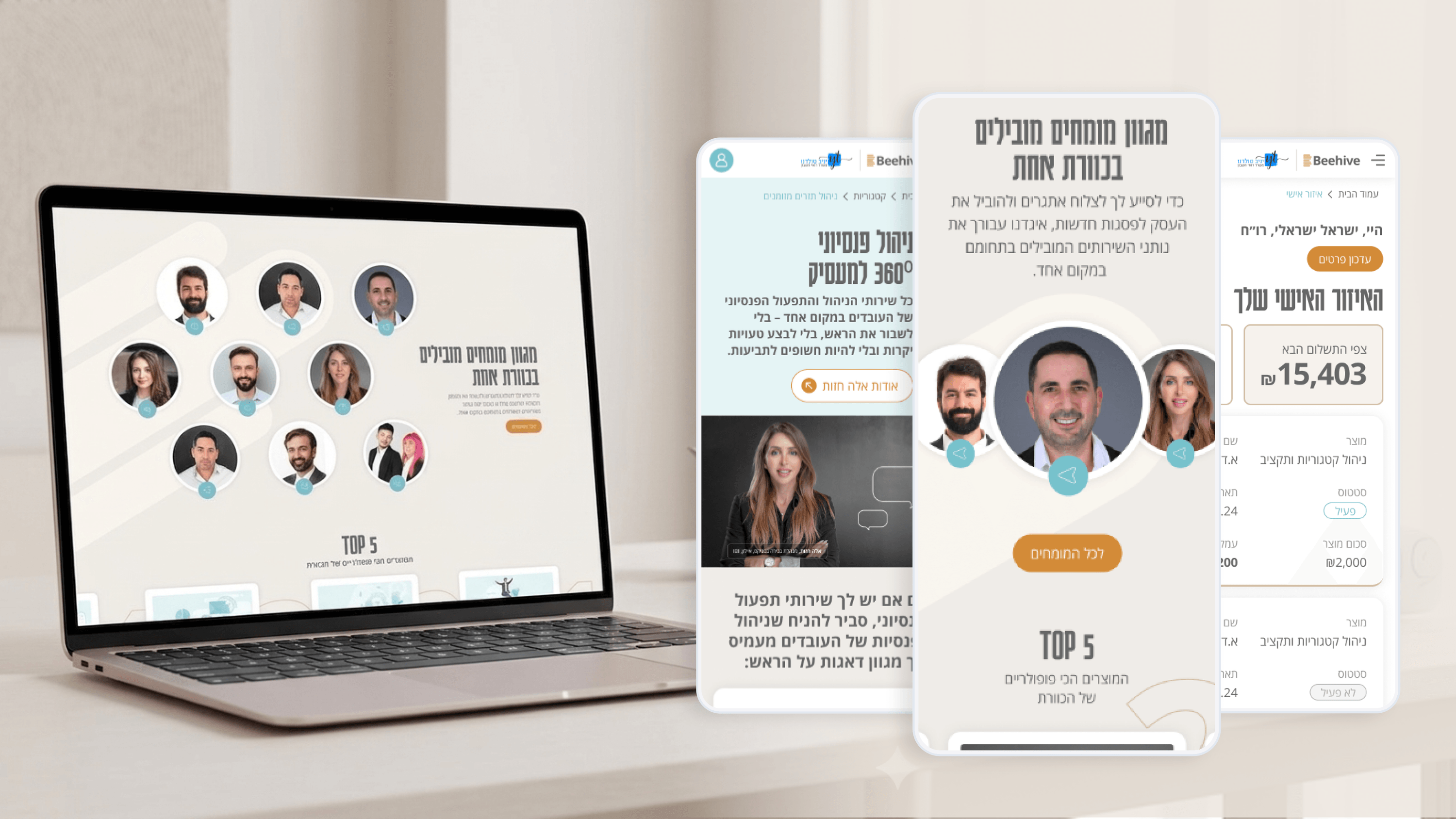
BeehiveFoundersFrom MVP to Full VersionProfessional Services / Finance
Beehive — A high-end platform for financial services
As a founder, the temptation is to ship the whole vision on day one. With Beehive — a network uniting 100 business and financial experts — I argued for the opposite. We sequenced it. The MVP was the brand and the marketing narrative. Before a single client logged in, we needed the world to believe in "the collective power of 100 experts." So the first release was the identity — the logo bridging a beehive with stacked coins, the charcoal-and-gold palette — and a homepage that unfolds that story down to personalized services. That alone could attract and convert. It earned the right to build more. The Personal Zone came next, once we understood what clients actually wanted to track and manage. Building the dashboard first would have meant guessing. Building it second meant designing against real expectations the marketing site had already set. MVP to full version isn't about shipping a smaller, sadder product. It's about sequencing so each release de-risks the next. For Beehive, trust came first, then the tools that reward it.

Get in touch

Have a project in mind?

Drop a line. Meytalyav@gmail.com

Related articles

Beehive
Product ManagersTypography & Visual Hierarchy

Typography Is How Beehive Decides What You Read First

Beehive's product page had to make complex financial services approachable. My main tool wasn't copy — it was typography. A type scale where every step earns its size, so the eye travels from promise to detail in the right order. For PMs: hierarchy is conversion infrastructure. Decide what the user reads in their first three seconds, or the layout decides for you — usually badly.

Read
Beehive
Project ManagersDocumentation & Organizational Handoff

What Beehive Needed After I Left the Room

A brand is only worth what survives after the designer leaves. Beehive will keep growing — new pages, more in the client Personal Zone — mostly without me. So I documented decisions, not just files: how charcoal-and-gold is applied, when the logo is used, the tone that keeps finance approachable. For a PMO, that's how you close a project cleanly and kill key-person risk. The real deliverable is a brand the business can run without you.

Read
Beehive
Product ManagersMicro-interactions & Animation

The Quiet Motion That Makes Beehive Feel Premium

Premium is a feeling, and on Beehive it's built from small moments — a restrained section reveal, a button that acknowledges you, a soft transition when a client updates their info in the Personal Zone. The rule I hold: every micro-interaction must reduce uncertainty or reinforce the brand. Never decorate. PMs — if motion doesn't earn its place, it's just latency with extra steps.

Read
Meytal Dahan

About

Making complicated into easy for users.

Senior product designer with a decade of work across complex systems - financial risk platforms, legal operations, healthcare apps, manufacturing tooling and insurance portals. The common thread is depth: products where the data is rich, the users are expert, and the interface has to disappear into the work.
