
Designing Beehive So i18n Wouldn't Be a Rebuild
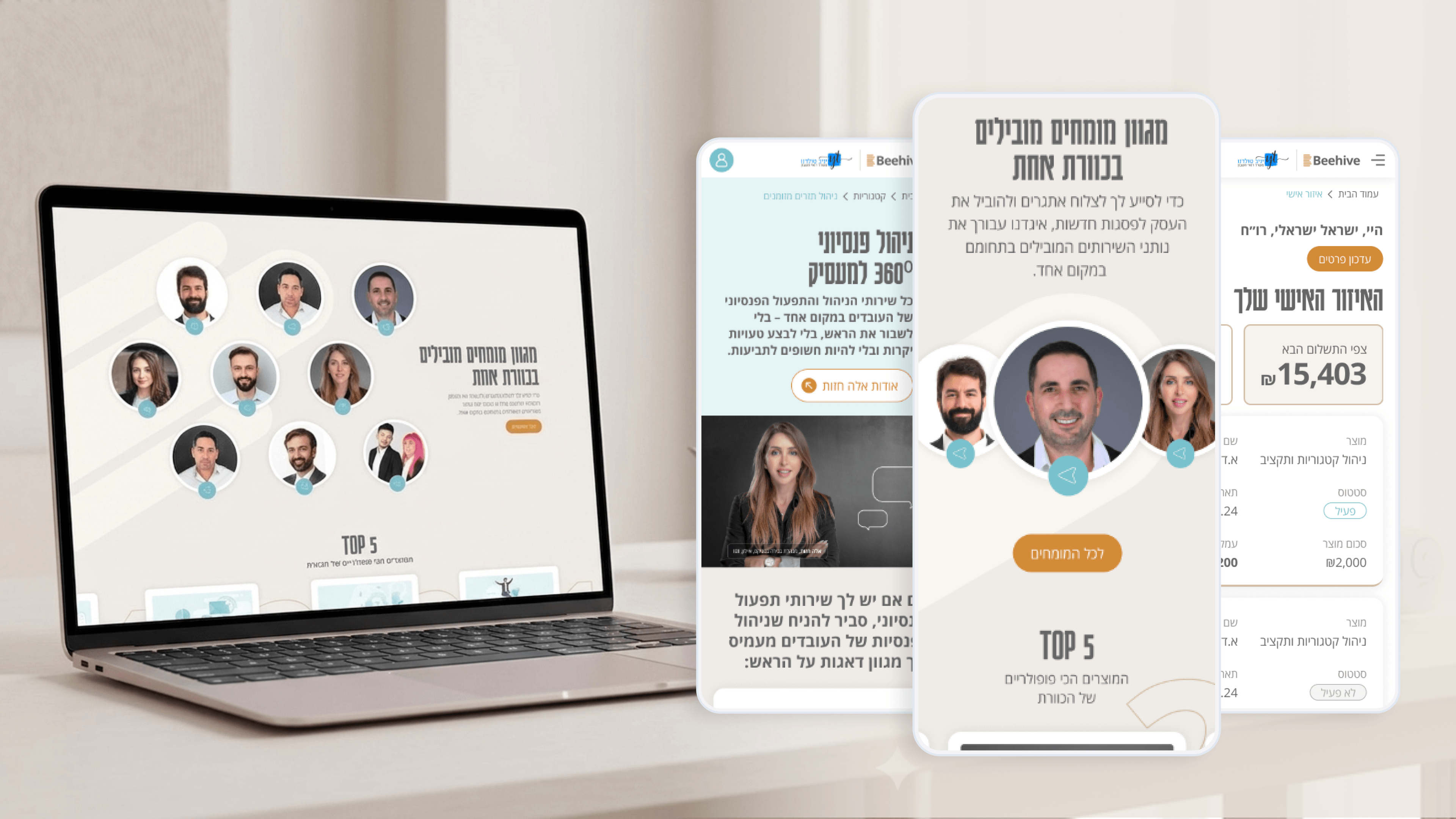
i18n is rarely a launch-day requirement — but it's almost always a future one, and engineering leaders pay dearly when it's bolted on late. With Beehive, I designed the marketing site and Personal Zone so internationalization stayed an option, not a rewrite.
That starts in the design layer, before any localization framework. The narrative homepage uses generous, flexible containers so text that expands in another language doesn't shatter the layout. I avoided baking copy into imagery — the charcoal-and-gold brand holds up without text fused into graphics. In the Design System, I separated labels from structure so strings live in one place, ready to be extracted.
For a financial network, the harder part is tone. "The hive of 100 accountants" carries cultural weight that doesn't translate literally; the experience has to feel equally authoritative in any market. So I treated copy as content, not decoration — keeping it modular and addressable rather than scattered across components.
None of this committed Beehive to launching multilingual. It simply meant the day that decision arrives, it's a content effort for your team — not a structural one.
Related articles

About
Making complicated into easy for users.
Senior product designer with a decade of work across complex systems - financial risk platforms, legal operations, healthcare apps, manufacturing tooling and insurance portals. The common thread is depth: products where the data is rich, the users are expert, and the interface has to disappear into the work.