Meytal Dahan
Back to insights

Designing Beehive's Personal Zone: Visualization That Knows Its Job
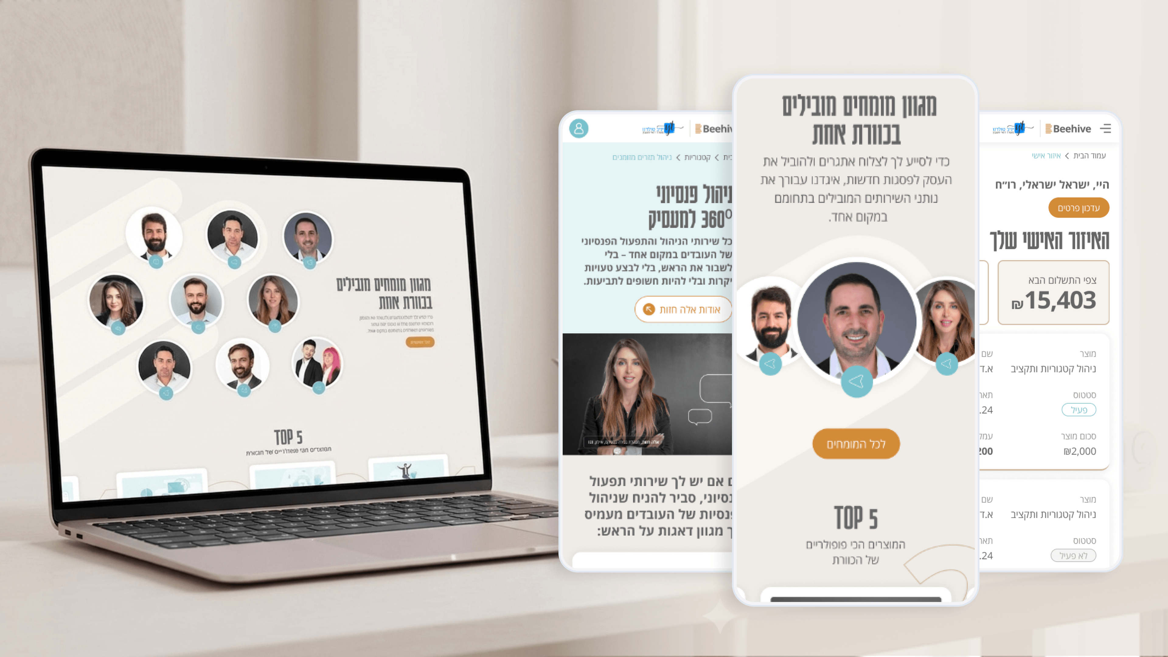
Beehive — A high-end platform for financial services
Beehive's Personal Zone is where I had to be most honest about scope. It's a place where clients track their activity and manage their information — a personal area, not a daily analytics power-tool. That framing shaped every visualization decision, and it's a framing engineering teams should hold onto, because it's easy to over-build. Clients here don't need dense dashboards full of live charts; they need to see, at a glance, what's happening with their account and feel oriented. So I designed visualization that summarizes and reassures rather than overwhelms: clear activity views, legible status, and information surfaced in the same calm charcoal-and-gold language as the rest of the brand. For a CTO, that restraint is a gift — fewer heavyweight charting dependencies, simpler data contracts, and a frontend that stays maintainable because it isn't pretending to be a BI platform. The discipline is matching the visualization to the actual user task. When the job is orientation and trust, a tidy, well-typed summary beats a wall of graphs every time. We built exactly what the Personal Zone needed to do its job well, and deliberately resisted the gravitational pull toward more.

Get in touch

Have a project in mind?

Drop a line. Meytalyav@gmail.com

Related articles

Beehive
Product ManagersTypography & Visual Hierarchy

Typography Is How Beehive Decides What You Read First

Beehive's product page had to make complex financial services approachable. My main tool wasn't copy — it was typography. A type scale where every step earns its size, so the eye travels from promise to detail in the right order. For PMs: hierarchy is conversion infrastructure. Decide what the user reads in their first three seconds, or the layout decides for you — usually badly.

Read
Beehive
Project ManagersDocumentation & Organizational Handoff

What Beehive Needed After I Left the Room

A brand is only worth what survives after the designer leaves. Beehive will keep growing — new pages, more in the client Personal Zone — mostly without me. So I documented decisions, not just files: how charcoal-and-gold is applied, when the logo is used, the tone that keeps finance approachable. For a PMO, that's how you close a project cleanly and kill key-person risk. The real deliverable is a brand the business can run without you.

Read
Beehive
Product ManagersMicro-interactions & Animation

The Quiet Motion That Makes Beehive Feel Premium

Premium is a feeling, and on Beehive it's built from small moments — a restrained section reveal, a button that acknowledges you, a soft transition when a client updates their info in the Personal Zone. The rule I hold: every micro-interaction must reduce uncertainty or reinforce the brand. Never decorate. PMs — if motion doesn't earn its place, it's just latency with extra steps.

Read
Meytal Dahan

About

Making complicated into easy for users.

Senior product designer with a decade of work across complex systems - financial risk platforms, legal operations, healthcare apps, manufacturing tooling and insurance portals. The common thread is depth: products where the data is rich, the users are expert, and the interface has to disappear into the work.