Meytal Dahan
Back to insights

Color as Trust Infrastructure on a Big-Five Insurer's Site
Menora Insurance — Multi-Surface Design Work for Menora Insurance
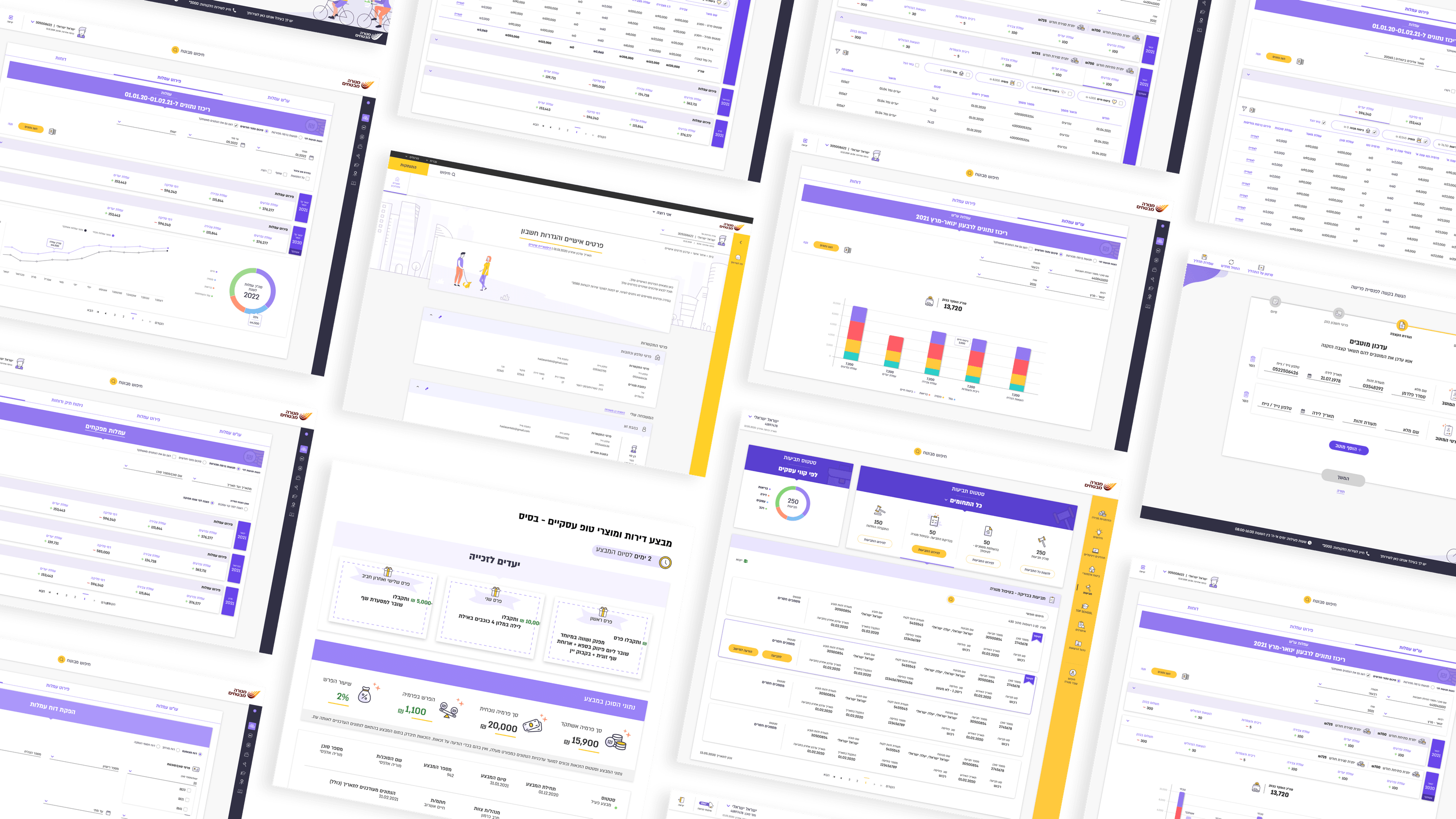
Founders ask me about color expecting a brand conversation. On Menora — one of Israel's big-five insurers — color is closer to trust infrastructure. On the B2C side, where customers manage their own profile settings, log in, and fill forms, color isn't decoration; it's how people know what's safe to touch and what just went wrong. I used color sparingly and with intent: a restrained palette so the meaningful signals actually carry weight. A required action, a validation error, a confirmed save — each needs an unambiguous color meaning, applied consistently, so a customer never has to guess whether their change took. In an insurance context, the psychology that matters most isn't excitement — it's reassurance. Overuse color and everything shouts; nothing reads as important. Reserve it, and a single accent does real cognitive work. There's a founder lesson under this: your palette is a budget, not a paint set. Every additional "brand" color you spend dilutes the signals that protect the user and your credibility. On the agent side, the same restraint keeps dense, role-heavy screens legible. Trust is built in the boring, consistent moments — and color, used quietly, is one of them.

Get in touch

Have a project in mind?

Drop a line. Meytalyav@gmail.com

Related articles

Menora Insurance
Engineering LeadersIndustry-Specific Accessibility

Accessibility in Field-Dense Insurance Flows

Most accessibility talk stops at contrast on landing pages. In insurance, the hard surface is the field-dense internal tool. On Menora's agent zone — many fields, conditional rules, five role lenses — WCAG means keyboard order through multi-axis filters, screen-reader announcements as conditional fields appear, focus that survives constant state changes. That's architecture, not a finishing pass. The deepest a11y debt hides in the internal tools everyone assumes are 'just for power users.'

Read
Menora Insurance
Project ManagersDocumentation & Organizational Handoff

Documentation That Outlives the Engagement

As an outsource designer on Menora, I knew I'd eventually leave. So I documented for the people who'd stay. Not pretty specs — the reasoning. Why a field appears for an underwriter but not a team lead. Why the fee flow's rules are shaped the way they are. For a PMO: with outside contributors, documentation isn't admin. It's how the work becomes something the organization actually owns.

Read
Menora Insurance
Project Managers

Managing UX in Enterprise Giants: Owning Milestones and Integrating Multi-Stakeholder Requirements

Project managers (PMOs), how many times has your enterprise project stalled because legal or marketing suddenly remembered to weigh in at the 90th minute? The work with Menora Insurance demanded a structured approval method. You lock down a smooth architecture in Figma, get sign-off from every department, and only then run forward. That's how you protect the Gantt.

Read
Meytal Dahan

About

Making complicated into easy for users.

Senior product designer with a decade of work across complex systems - financial risk platforms, legal operations, healthcare apps, manufacturing tooling and insurance portals. The common thread is depth: products where the data is rich, the users are expert, and the interface has to disappear into the work.
