
Same Data, Five Lenses: Visualization Under Multi-Axis Filtering
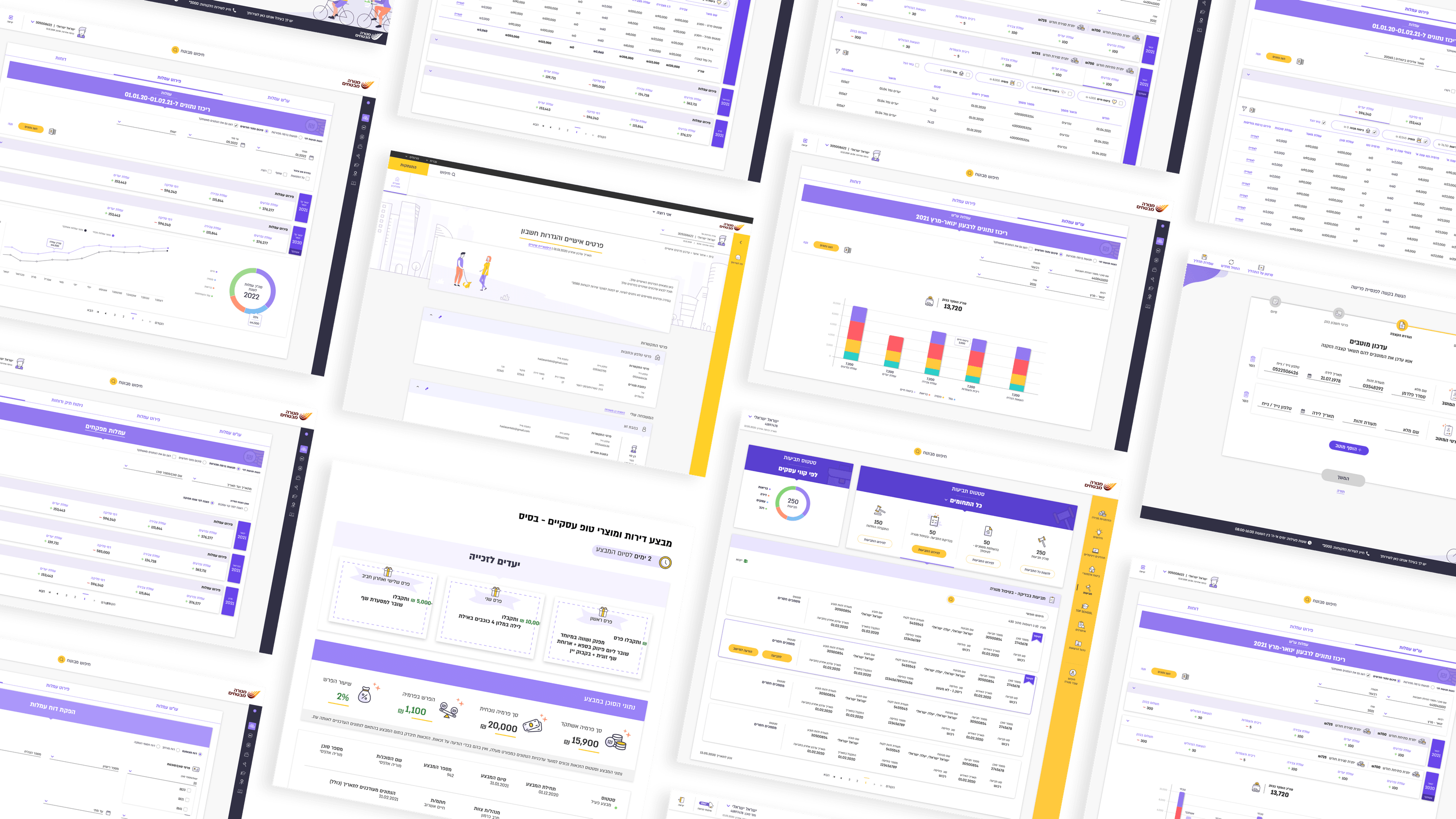
The most interesting visualization problem on Menora wasn't a chart — it was the agent-fee flow, where the real complexity is multi-axis filtering across many fields and conditional rules. "Visualizing data" there means making it legible which axes are active, how they combine, and what the resulting set actually represents, all without the user losing the thread. That's a representation problem CTOs will recognize: the data model is genuinely multidimensional, and the UI has to project it down to something a human can hold in working memory. I worked on surfacing filter state explicitly — what's applied, in what combination, and how to peel it back — so the visualization of the query is as honest as the results. The second axis is the five roles. Agent, marketing, district manager, team lead, and underwriter look at the same data through different lenses, which means the same dataset needs role-appropriate views rather than one crowded canvas serving everyone badly. For R&D, the takeaway is to treat "the view" as a function of data plus role plus active filters, not a fixed layout. I avoid inventing visualizations the project never asked for. The win here is faithful representation of real, conditional, multi-axis data — not decoration.
Related articles

About
Making complicated into easy for users.
Senior product designer with a decade of work across complex systems - financial risk platforms, legal operations, healthcare apps, manufacturing tooling and insurance portals. The common thread is depth: products where the data is rich, the users are expert, and the interface has to disappear into the work.