
When the Screen Has 40 Fields: Hierarchy as a Product Decision
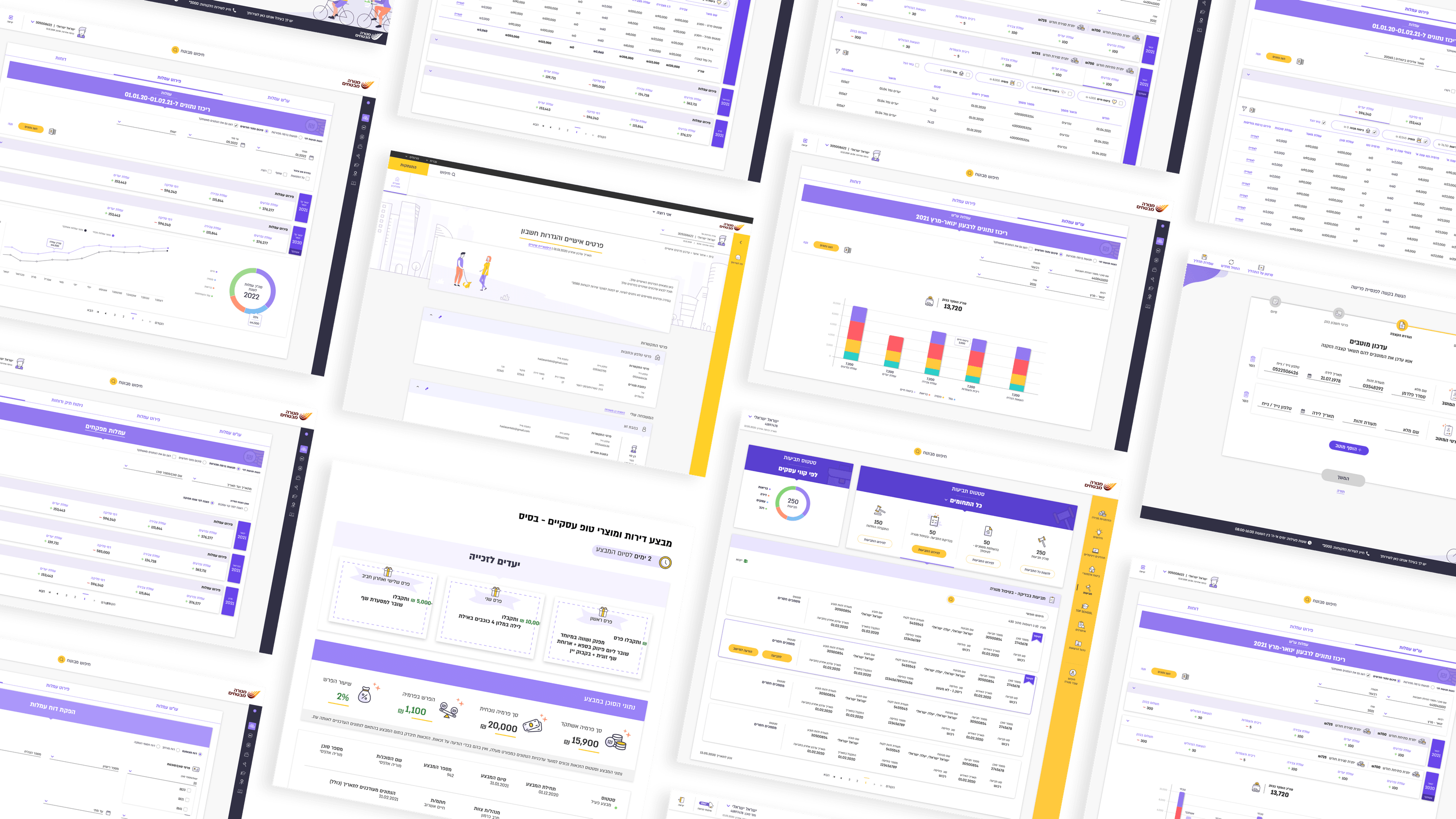
Every PM I've worked with on Menora's flows hits the same wall: the screen genuinely needs all those fields. The agent-fee flow, the role-based sales views, the underwriter's perspective — these aren't bloated, they're load-bearing. You can't cut your way to clarity. So the question stops being "how do we remove fields" and becomes "how do we rank them." That's typography and visual hierarchy doing product work. On these screens I leaned on a disciplined type scale, weight, and spacing to separate what a user acts on from what they merely reference. A label is not a value; a section header is not a field; a required input should not visually compete with an optional note. When hierarchy is right, a dense screen reads as calm rather than crowded — the interface disappears into clarity, which is exactly what an insurance audience needs under time pressure. For PMs, this reframes a backlog argument. "Reduce cognitive load" rarely means deleting requirements stakeholders fought for. It usually means investing in hierarchy so the same information lands in priority order. Typography is one of the cheapest, highest-leverage levers you have before you ever touch scope.
Related articles

About
Making complicated into easy for users.
Senior product designer with a decade of work across complex systems - financial risk platforms, legal operations, healthcare apps, manufacturing tooling and insurance portals. The common thread is depth: products where the data is rich, the users are expert, and the interface has to disappear into the work.