
The First Thirty Seconds of a Government Portal
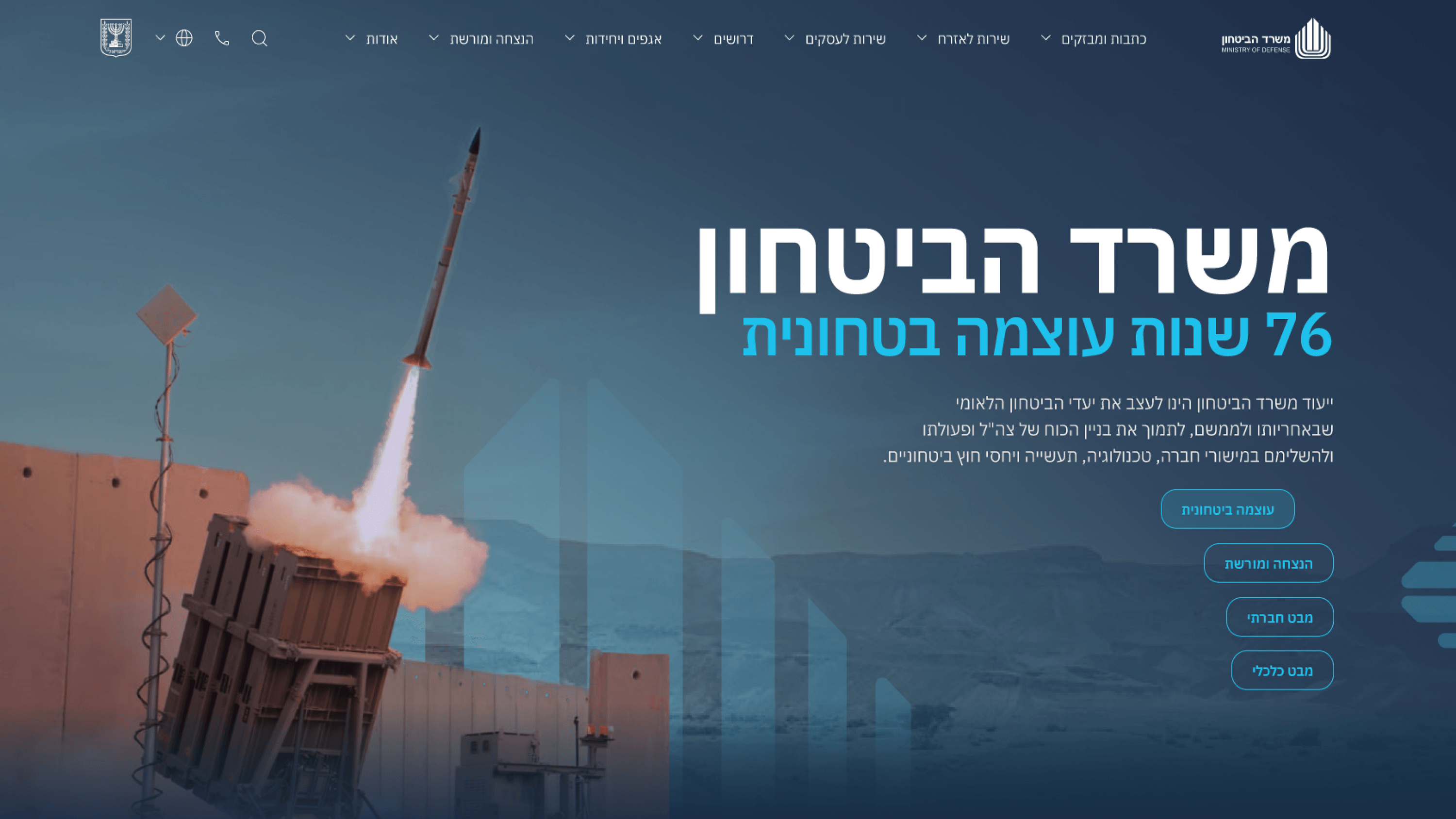
Onboarding on a public communications portal isn't a tour or a sign-up flow — most visitors arrive once, with a question, and leave. So for the Ministry of Defense site I treated the first run as a single landing impression: in the first few seconds, a citizen, partner or journalist has to feel that this is authoritative, serious and current, and immediately understand where to go. For a PM, that reframes the whole problem. There's no second screen to recover a weak first one, so the homepage has to do the orienting work itself — clear hierarchy surfacing the latest strategic milestones, an obvious path into the ministry's communications, and zero friction or cognitive overhead. I leaned on the visual system and typography to set tone instantly, because trust is decided before anyone reads carefully. I also made sure that first impression survived on mobile and in Hebrew, since a meaningful share of first visits happen on a phone. The takeaway for any product where users land cold: your onboarding is whatever they see in the first thirty seconds. Earn the trust and the orientation there, because for many people there is no later.
Related articles

About
Making complicated into easy for users.
Senior product designer with a decade of work across complex systems - financial risk platforms, legal operations, healthcare apps, manufacturing tooling and insurance portals. The common thread is depth: products where the data is rich, the users are expert, and the interface has to disappear into the work.