
An MVP That Couldn't Look Like an MVP
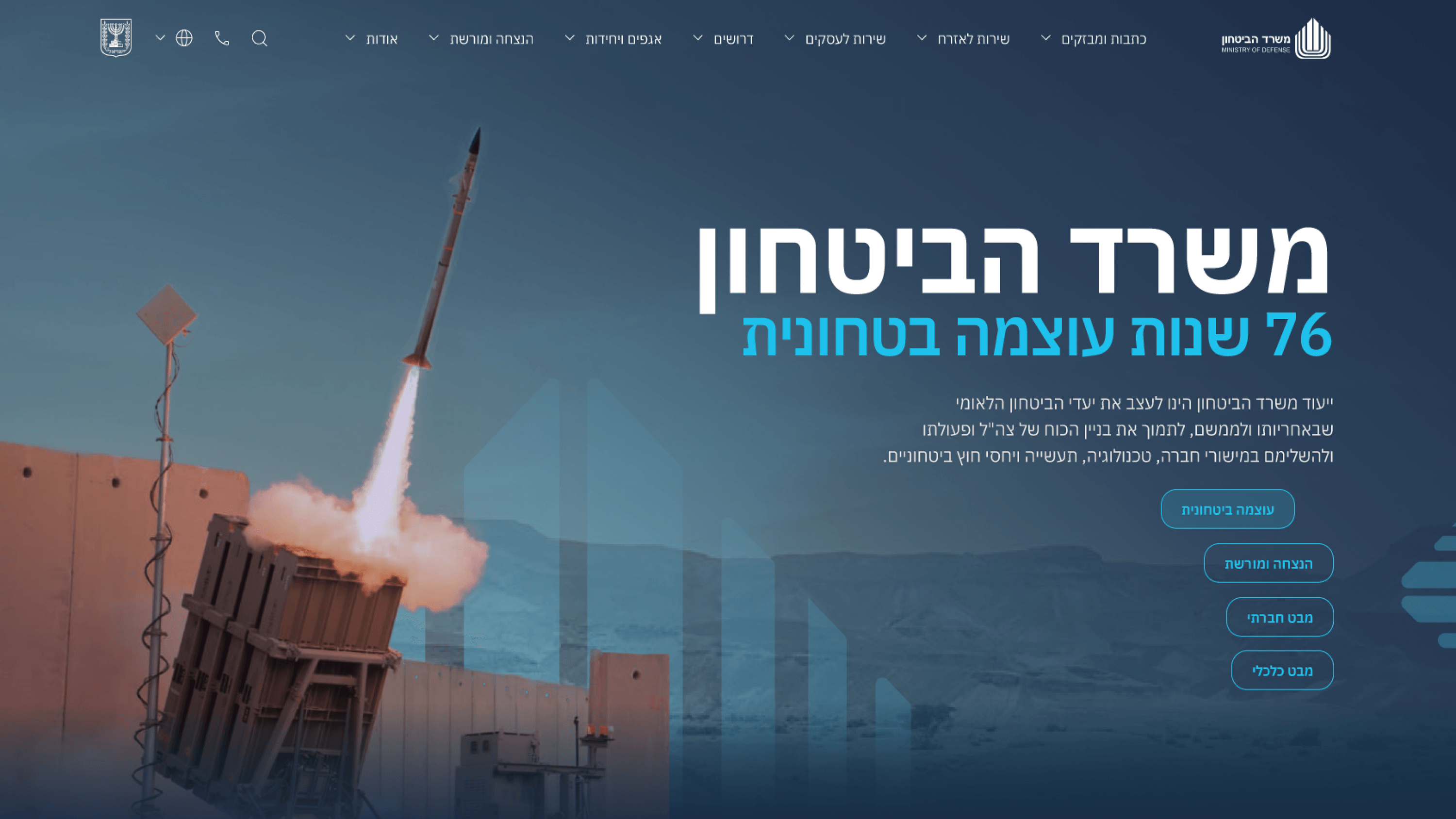
Most MVPs are allowed to look unfinished - that's the deal you make with early users. The Ministry of Defense communications portal didn't get that grace. It's the public record of an institution, so even the first version had to project authority and seriousness on day one. That reframed how I thought about scoping. I couldn't ship rough and iterate in the open; a half-formed government portal reads as untrustworthy, and trust was the entire brief. So the MVP wasn't a smaller-quality version - it was a smaller-surface version. We narrowed the scope of content and pages, but held the visual system and the responsive behavior to full fidelity from the start. The design system gave us that: define the tone, the type, the spacing and the components once, and every later page inherits the same institutional weight without redesign. For founders, that's the transferable lesson. The MVP-to-full-version path isn't always 'ship ugly, polish later.' Sometimes the credibility bar is fixed at launch, and the only honest way to move fast is to narrow scope while keeping quality non-negotiable. Decide which axis you're allowed to compromise on before you build.
Related articles

About
Making complicated into easy for users.
Senior product designer with a decade of work across complex systems - financial risk platforms, legal operations, healthcare apps, manufacturing tooling and insurance portals. The common thread is depth: products where the data is rich, the users are expert, and the interface has to disappear into the work.