
Accessibility Is the Baseline for a Public Institution
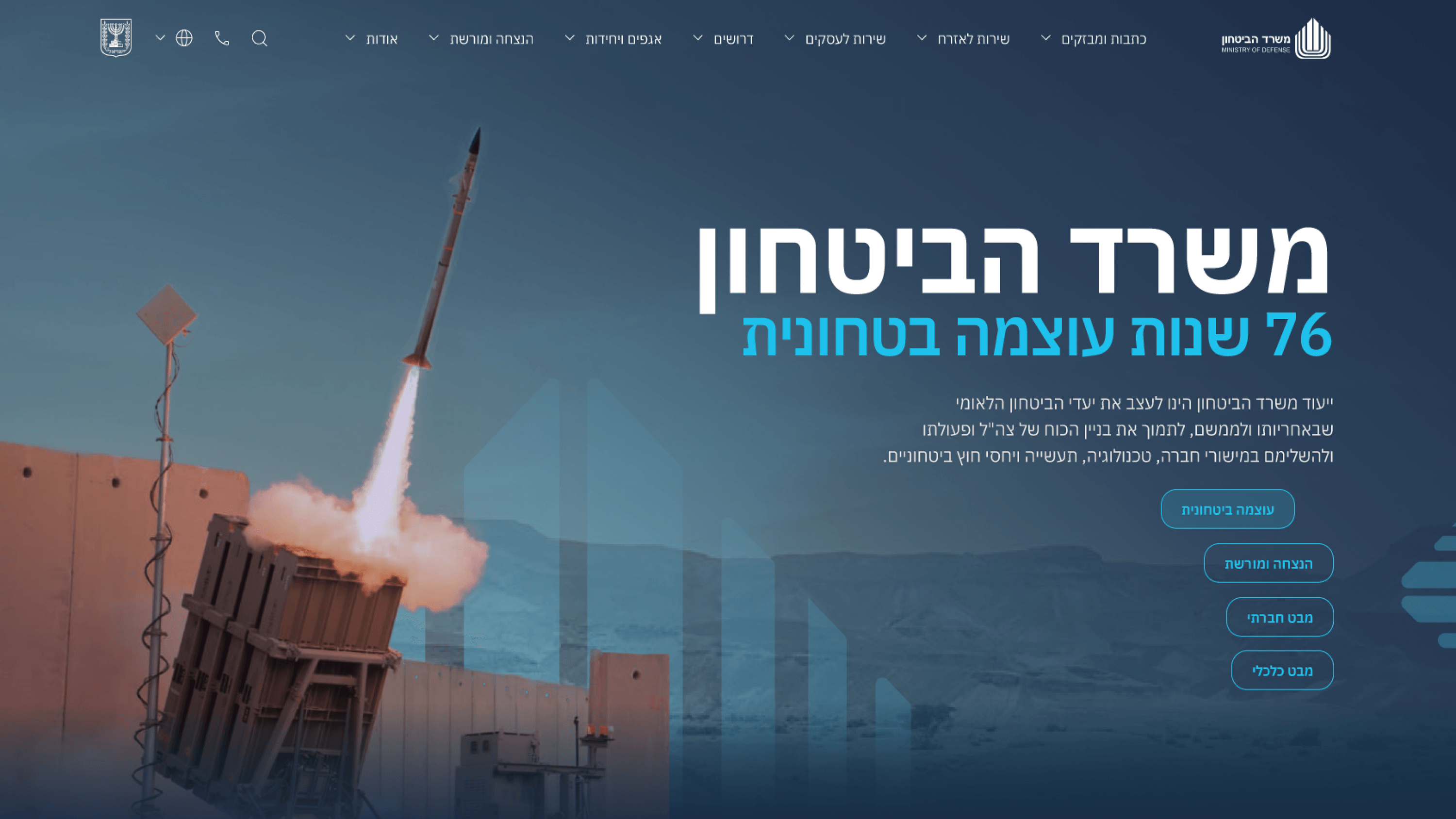
For a commercial site, accessibility is good practice. For a government portal, it's the floor you're not allowed to fall through. The Ministry of Defense communications site is public by definition - it speaks to every citizen, which means it has to be usable by every citizen, including those relying on screen readers, keyboard navigation, or high-contrast needs. That isn't an enhancement on a public-sector product; it's the obligation that comes with the audience. What made it industry-specific was the collision with the tone brief. The portal had to project authority and forward-thinking leadership, and the easy version of 'looks authoritative' - low-contrast greys, decorative type, motion-heavy reveals - is exactly what fails WCAG and fails real users. So accessibility became a design constraint that shaped the visual system, not a compliance pass bolted on at the end. I worked contrast, focus states, semantic structure and reduced-motion behavior into the component library itself, so the institutional look and the accessible behavior were the same decision. For engineering leaders, that's the point worth internalizing: on a public-sector product, accessibility isn't a ticket near launch. It's a property of the design system, and the most credible-looking interface has to also be the most usable one.
Related articles

About
Making complicated into easy for users.
Senior product designer with a decade of work across complex systems - financial risk platforms, legal operations, healthcare apps, manufacturing tooling and insurance portals. The common thread is depth: products where the data is rich, the users are expert, and the interface has to disappear into the work.