
Designing a Portal That Doesn't Assume One Direction
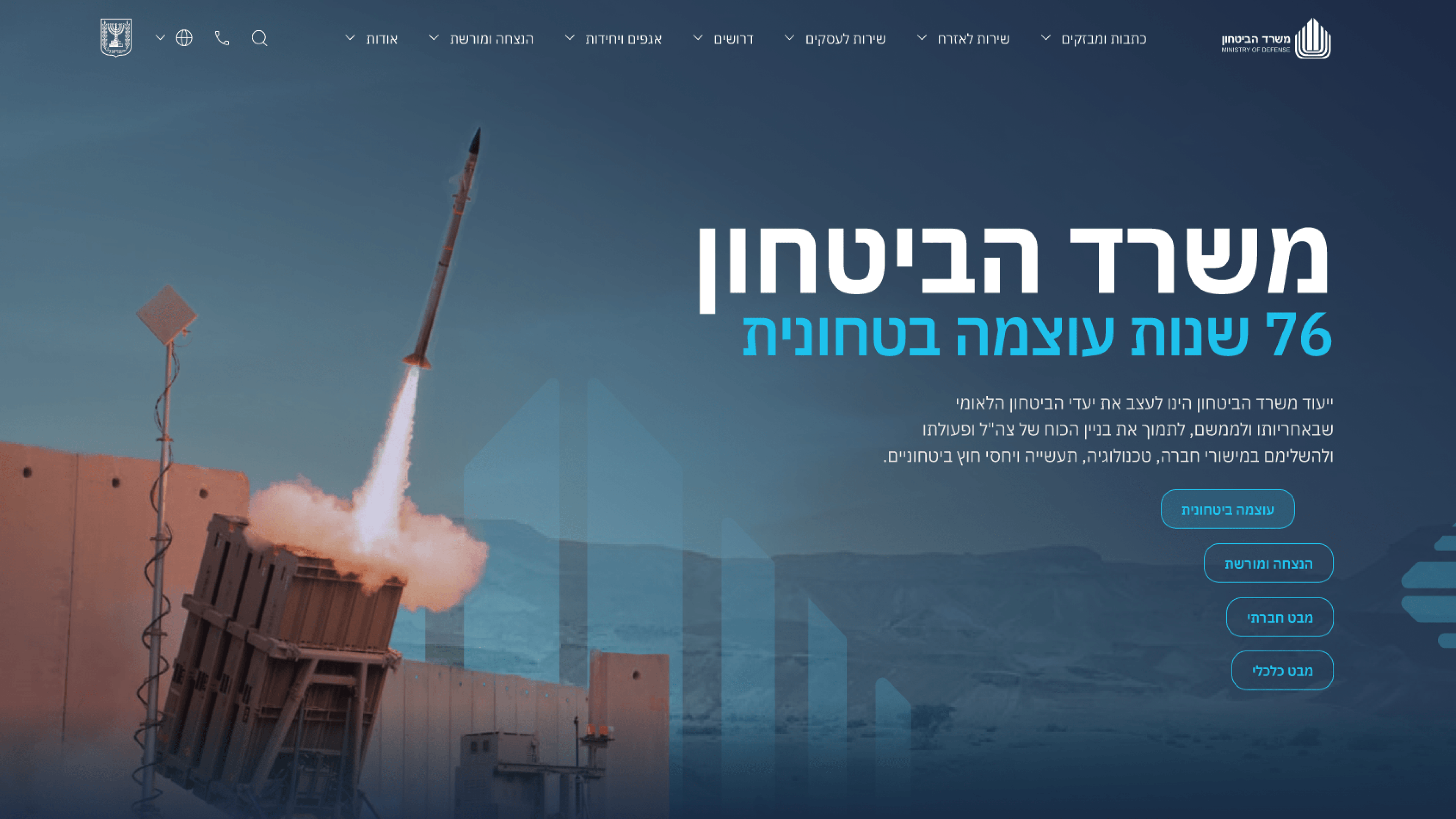
An Israeli government portal works in Hebrew, a right-to-left language, while plenty of the conventions designers reach for assume a left-to-right world. The Ministry of Defense site speaks to citizens, partners and press, and that audience makes direction-awareness a real design concern, not a cosmetic one. For engineering leaders, that's where i18n stops being a translation table and becomes a question of how the visual system is built. The instinct I designed against was hard-coding direction into the layout. Where it was within my scope - the marketing site UX, the visual system and the responsive behavior - I leaned on logical thinking: spacing and alignment described in terms of start and end rather than fixed left and right, so the system carries its institutional tone without quietly breaking when direction flips. The point that carries the brief is that authority is fragile to small layout faults; a heading that drifts or an element that sits on the wrong side erodes the seriousness the portal exists to project. The pragmatic takeaway I'd give any R&D lead: treat direction-awareness as a property of the design system from the first screen. Retrofitting it later is expensive and visible. Designing for it up front protects the tone everywhere.
Related articles

About
Making complicated into easy for users.
Senior product designer with a decade of work across complex systems - financial risk platforms, legal operations, healthcare apps, manufacturing tooling and insurance portals. The common thread is depth: products where the data is rich, the users are expert, and the interface has to disappear into the work.