
Motion That Signals Composure
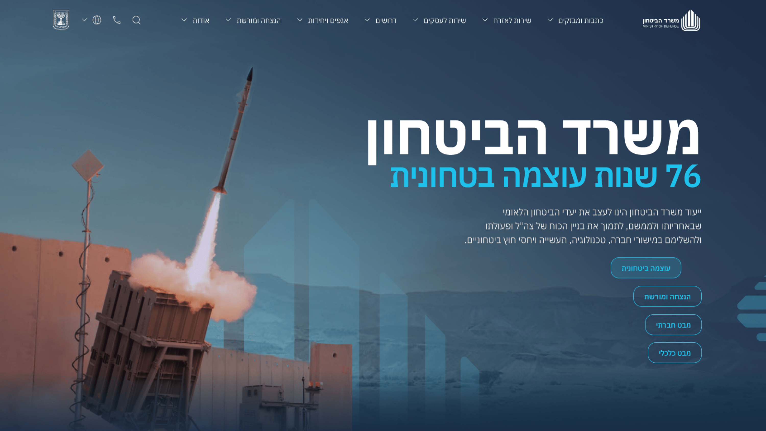
It's tempting to think a government communications portal should be static and stern. But the Ministry of Defense brief asked for forward-thinking leadership, and motion is one of the most direct ways a site signals that it's modern and considered — if you use it correctly. As a PM, the framing I'd offer is this: every animation is a tiny promise about how the institution behaves. So I kept micro-interactions calm and purposeful. Hover and focus states that confirm an element is interactive, smooth transitions that guide the eye between sections, media that reveals with intent rather than bouncing for attention. The restraint is the point. Playful, springy motion would have undercut the seriousness the whole portal exists to project; sluggish or janky motion would have read as dated. Composed, responsive transitions say competent and current at the same time. I also respected reduced-motion preferences and kept everything cheap on lower-end and mobile devices, because perceived performance is part of the trust story. For your roadmap, treat motion as a tone instrument — small, deliberate cues that make a serious product feel alive without ever feeling frivolous.
Related articles

About
Making complicated into easy for users.
Senior product designer with a decade of work across complex systems - financial risk platforms, legal operations, healthcare apps, manufacturing tooling and insurance portals. The common thread is depth: products where the data is rich, the users are expert, and the interface has to disappear into the work.