
Visualizing Milestones the Public Can Trust
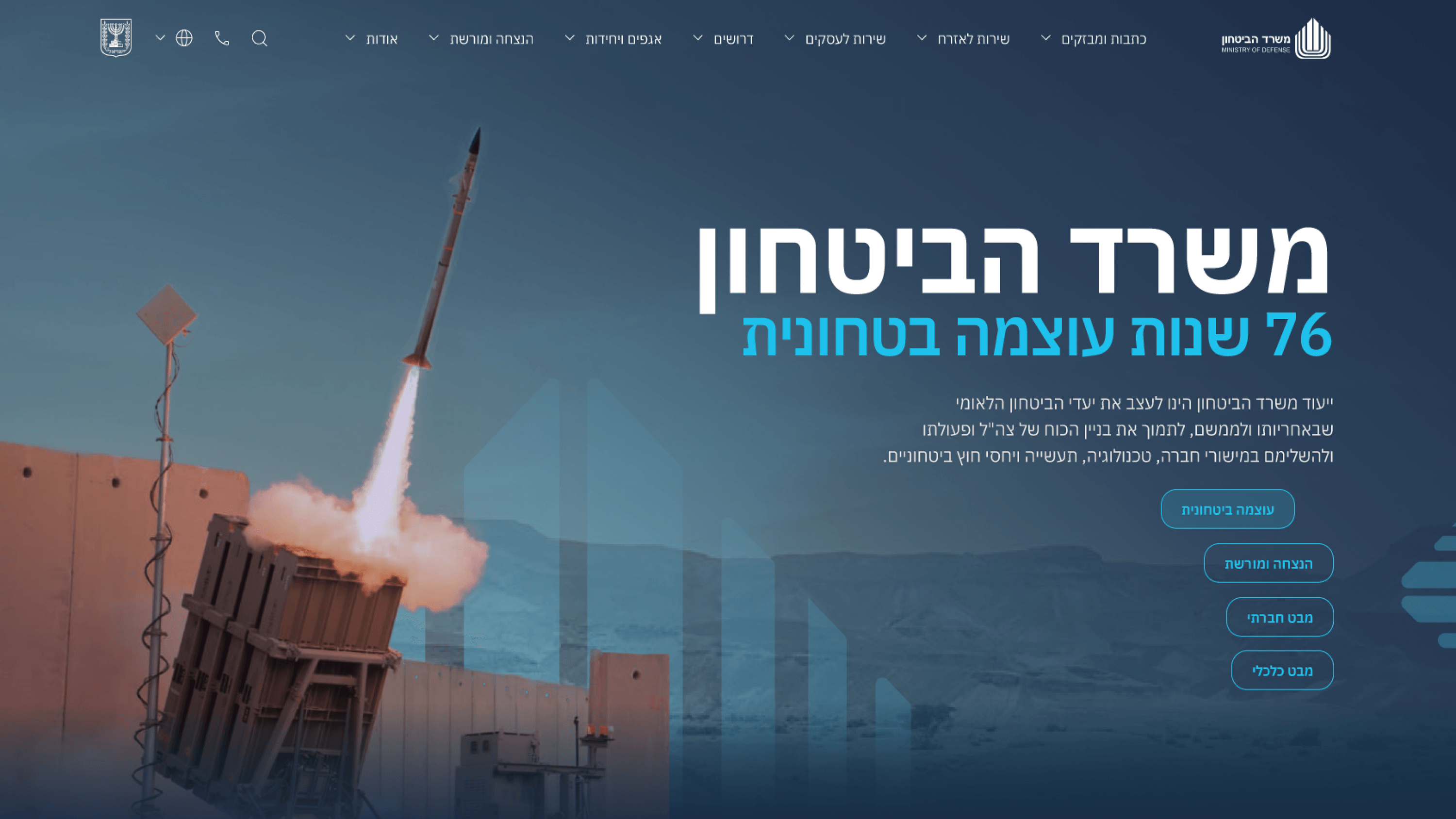
The Ministry of Defense portal is a public record of strategic milestones and security advancements — which means the moments where numbers and timelines appear are exactly the moments credibility is most at stake. This isn't a real-time operational dashboard; it's communication. So the visualization work was about presenting the ministry's published figures and timelines clearly and honestly to citizens and press, not building analytics. For an engineering leader, the constraints are what matter. These visuals are public-facing, so they had to be accessible: readable without relying on color alone, labeled for screen readers, and legible at mobile widths. They had to degrade gracefully — a chart that fails should still leave the underlying facts visible, never a broken blank box on a government site. And they had to fit the design system's restrained, authoritative tone, so I avoided ornamental 3D and gimmicks that would read as marketing spin and undercut trust. My principle was simple: clarity over flourish. On a public-record portal, a visualization's job is to make a milestone unmistakable and verifiable — accuracy and accessibility are the features, not the decoration.
Related articles

About
Making complicated into easy for users.
Senior product designer with a decade of work across complex systems - financial risk platforms, legal operations, healthcare apps, manufacturing tooling and insurance portals. The common thread is depth: products where the data is rich, the users are expert, and the interface has to disappear into the work.