
Typography as the Tone of Voice
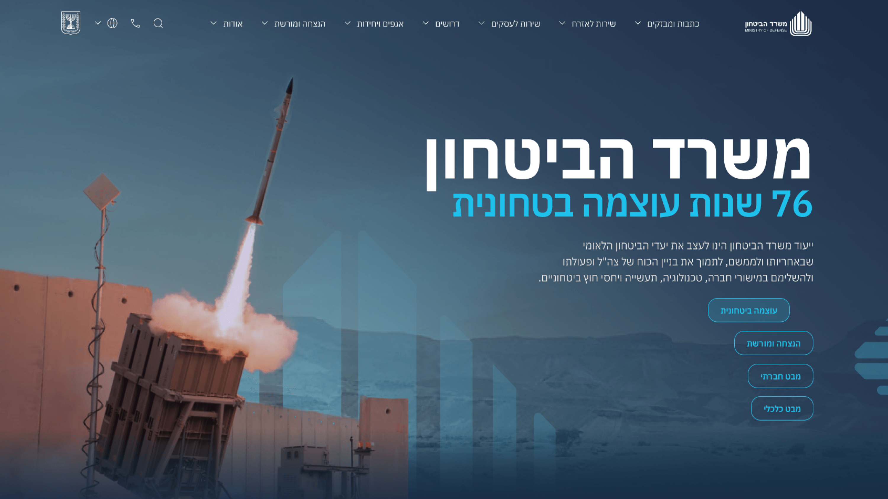
The brief for the Ministry of Defense portal was a tone problem before it was anything else: project authority and seriousness without sliding into bureaucratic dryness, and signal forward-thinking leadership without the cheap brightness of marketing. Typography did more of that work than any other single decision. As a PM, here's why it should matter to you: the type system is what turns a wall of official content into something a citizen, partner or journalist can actually scan and trust. I built a clear hierarchy — confident headline weights, a measured body that reads as composed rather than chatty, and disciplined spacing that lets serious statements breathe. Hierarchy is also a prioritization tool. Where the ministry wanted a strategic milestone to lead, type size and contrast made that the unmistakable first read, so the page communicated intent without a stakeholder having to explain it. Crucially, this held across Hebrew and the responsive breakpoints, so the same authority survived on a phone. Good hierarchy isn't decoration; it's how the product tells people what's important before they read a word.
Related articles

About
Making complicated into easy for users.
Senior product designer with a decade of work across complex systems - financial risk platforms, legal operations, healthcare apps, manufacturing tooling and insurance portals. The common thread is depth: products where the data is rich, the users are expert, and the interface has to disappear into the work.