
Testing trust, not just task completion
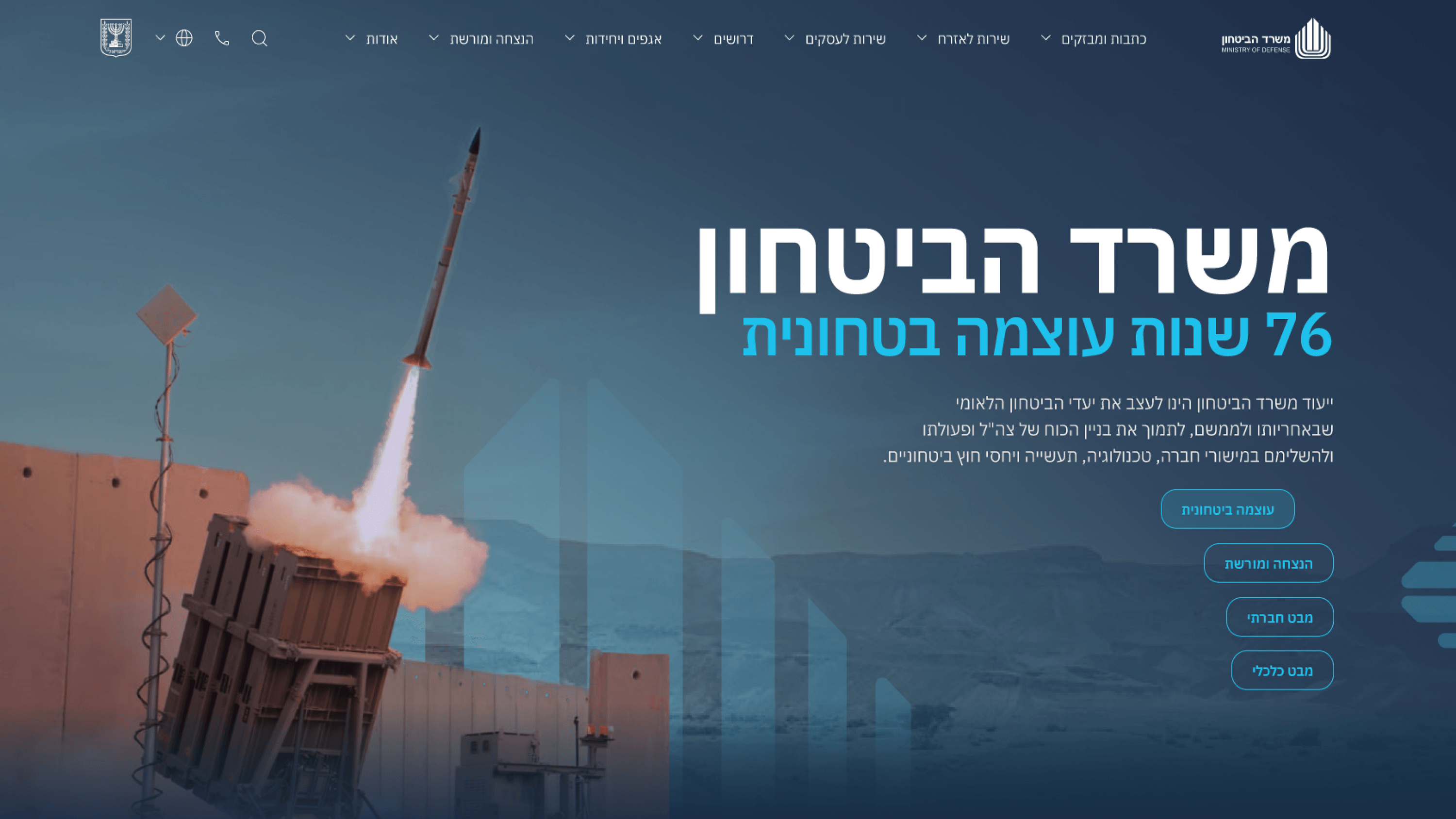
When we put the Ministry of Defense portal in front of real people, the usual usability metrics only told half the story. Yes, I cared whether someone could find a strategic update or navigate to the right section. But on a public government communications site, the harder thing to test was perception: does this feel authoritative? Does it feel trustworthy, or does it tip into the over-bright tone that makes institutions look like they're selling something? From a PMO standpoint, that ambiguity is a schedule risk, so I made testing concrete and rounds-based. We ran moderated sessions on representative flows, captured where people hesitated or doubted the source, and logged findings against severity - blocking, serious, cosmetic - so the team triaged rather than debated. Each round fed a fixed cycle: test, prioritize, resolve, retest. That cadence is what kept testing from becoming an open-ended sink. The value to delivery was predictability: instead of a vague 'is it good enough' conversation before launch, we had evidence that the tone and the navigation held up under real eyes - and a clear, closed list of what still needed work.
Related articles

About
Making complicated into easy for users.
Senior product designer with a decade of work across complex systems - financial risk platforms, legal operations, healthcare apps, manufacturing tooling and insurance portals. The common thread is depth: products where the data is rich, the users are expert, and the interface has to disappear into the work.