
Visualizing Body Measurements and Results Without Pretending to Diagnose
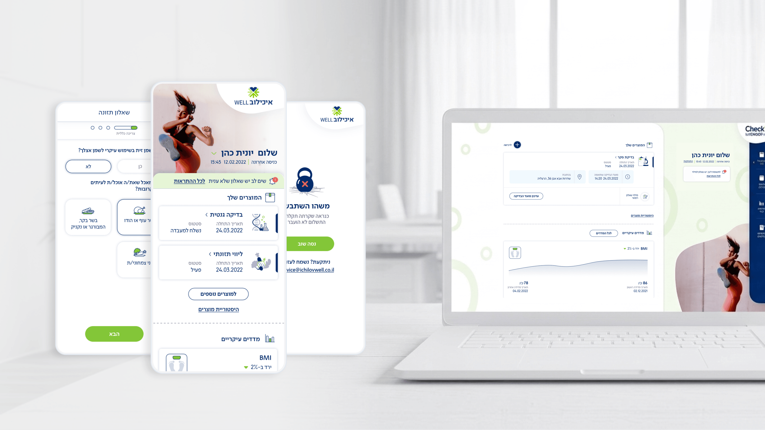
Movement surfaces real clinical data, latest body measurements and recent checkup results, to people who are checking in, not being treated. That framing shaped every data-visualization decision, and it has direct engineering consequences a CTO should weigh. The goal was glance-able comprehension on a phone, not a clinician's analytics console. So I kept visualizations restrained: a measurement and where it sits relative to a reference, a result the user can read without interpretation, surfaced on the dashboard and in post-visit summaries. From an R&D angle, the hard part isn't drawing a chart, it's the data contract. Reference ranges, units, and result states have to be modeled cleanly so the UI renders trustworthy values across organizations and over time, and degrades gracefully when a value is missing or pending rather than rendering a misleading empty state. I deliberately avoided visualizations that imply diagnosis or trend conclusions we aren't positioned to make, that's a scope and liability boundary, not just a design taste. For engineering, that's a feature: a tighter, well-typed data model is easier to test and harder to misuse. The principle I'd defend in any architecture review: visualize for orientation, model for truth, and never let the chart claim more than the data honestly supports.
Related articles

About
Making complicated into easy for users.
Senior product designer with a decade of work across complex systems - financial risk platforms, legal operations, healthcare apps, manufacturing tooling and insurance portals. The common thread is depth: products where the data is rich, the users are expert, and the interface has to disappear into the work.