
What One Glance-able Dashboard Actually Returns
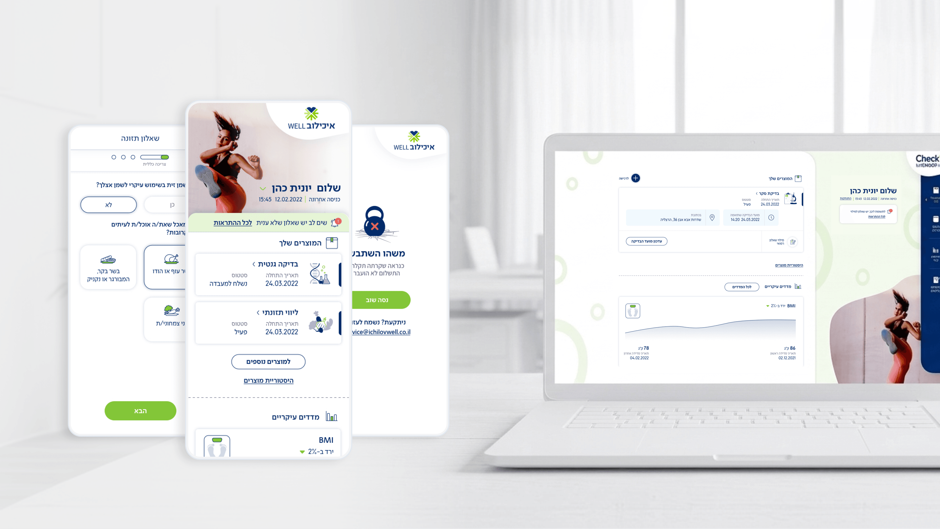
When I designed Movement, the patient app for Ichilov's corporate checkup service, the dashboard wasn't a feature I had to justify — it was the business case. This is a B2B2C product: organizations buy it as an employee benefit, and a benefit nobody opens isn't a benefit, it's a line item that gets cut at renewal. So I treated the dashboard as the ROI engine. The goal was a single glance answering 'where am I in my care right now' — purchased checkups, next appointment, latest body measurements, recent results. That clarity is what turns a one-time download into a returning habit, and habit is what an HR buyer feels when deciding to renew. For a CEO, the math is simple: the most expensive feature is the one that drives downloads but not return visits, because acquisition cost gets spent twice. A dashboard that surfaces personal, current value on open is cheap to maintain and compounds in retention. I didn't optimize the dashboard for screen time. I optimized it for the moment of reassurance — because that moment is what the buying organization is actually paying for, and what makes the contract worth renewing.
Related articles

About
Making complicated into easy for users.
Senior product designer with a decade of work across complex systems - financial risk platforms, legal operations, healthcare apps, manufacturing tooling and insurance portals. The common thread is depth: products where the data is rich, the users are expert, and the interface has to disappear into the work.