
Converting Prospects into Students: How Does Enrollment-Screen Design Affect the Bottom Line?
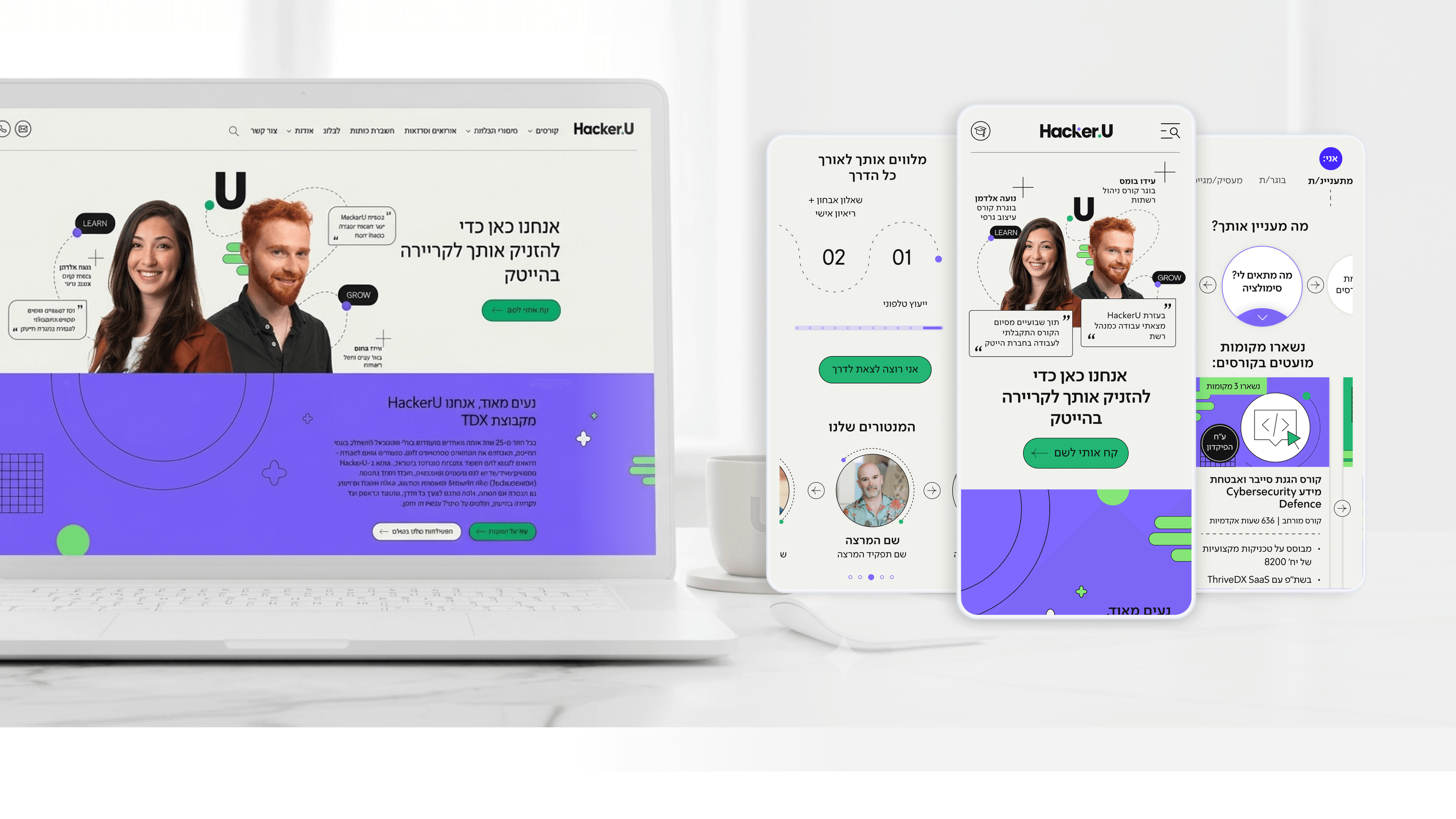
CEOs of tech education institutions know that the straight line between marketing investment and profit runs through a single screen: the enrollment screen. You can invest millions in campaigns and bring hundreds of thousands of prospects to your site, but if the enrollment screen is clunky, conversion rates plummet and the cost of acquiring each prospect skyrockets to unprofitable levels.
In the project for Hacker U, the central business challenge was clear: every improvement in the conversion rate from prospect to enrolled student translates directly into the college's profits. The design approach rested on the principle of a "human enrollment screen." Instead of a standard form with 15 fields to fill in, we broke the process down into a structured conversation - one step at a time, with context and clarity about why we're asking each question.
On top of that, we designed the enrollment screen to convey credibility, professionalism, and vision. Students about to invest thousands of shekels in further education need to feel they're signing up with a serious institution, not a spam site. The color palette, the typography, and the Social Proof are woven in to create immediate confidence.
The results show up directly in the financial reports. A 5%-10% improvement in the enrollment-screen conversion rate can translate into hundreds of thousands of additional shekels a year. For CEOs of educational institutions, investing in the user experience of the enrollment screen is the highest-ROI investment you'll make all year. Don't leave it to the IT team - bring in a senior product designer who knows how to tailor the design message to your student audience.
Related articles

About
Making complicated into easy for users.
Senior product designer with a decade of work across complex systems - financial risk platforms, legal operations, healthcare apps, manufacturing tooling and insurance portals. The common thread is depth: products where the data is rich, the users are expert, and the interface has to disappear into the work.