
Responsive and Mobile-First Specification in an EdTech System: Realistic Development Requirements
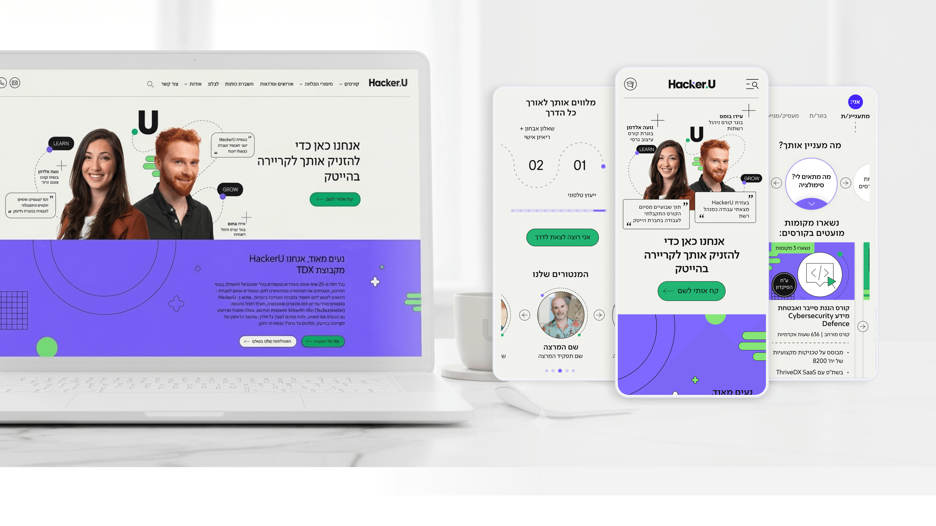
Engineering leaders on EdTech platforms know that students today don't consume content only on a computer. They check lessons on the way to work, watch recordings on their phones, and take quizzes on a tablet. Designs that are planned for desktop only and then "squeezed" into mobile after development create enormous engineering nightmares: hundreds of Front-End hours fixing responsiveness issues, bugs that keep recurring, and a fragmented experience on mobile.
In the Hacker U project, the specification strategy was built on a true Mobile-First approach. Every screen was designed for mobile first, and only then adapted to tablet and desktop. This approach forces the designer to prioritize the most critical content, and prevents design "bloat" on large screens. In addition, we used a Component System in Figma that maps to technical Breakpoints defined in advance in coordination with the Front-End team.
Every component in the design reaches the developers with clear definitions of how it behaves across 3 screen sizes: mobile (320-768px), tablet (768-1024px), and desktop (1024px+). No guesswork, no questions. The developers get a deliverable that's Ready for Implementation from day one.
For engineering leaders in EdTech, the key insight: demand a Mobile-First deliverable from your designers that includes explicit definitions of responsive behavior at every Breakpoint. This isn't a "Nice to Have" - it's the saving of hundreds of development hours. Design that "adapts itself" after development costs 3x more than Mobile-First design from day one.
Related articles

About
Making complicated into easy for users.
Senior product designer with a decade of work across complex systems - financial risk platforms, legal operations, healthcare apps, manufacturing tooling and insurance portals. The common thread is depth: products where the data is rich, the users are expert, and the interface has to disappear into the work.