
Designing an EdTech Platform That Feels Like a Startup Success: Visual Principles of Growth
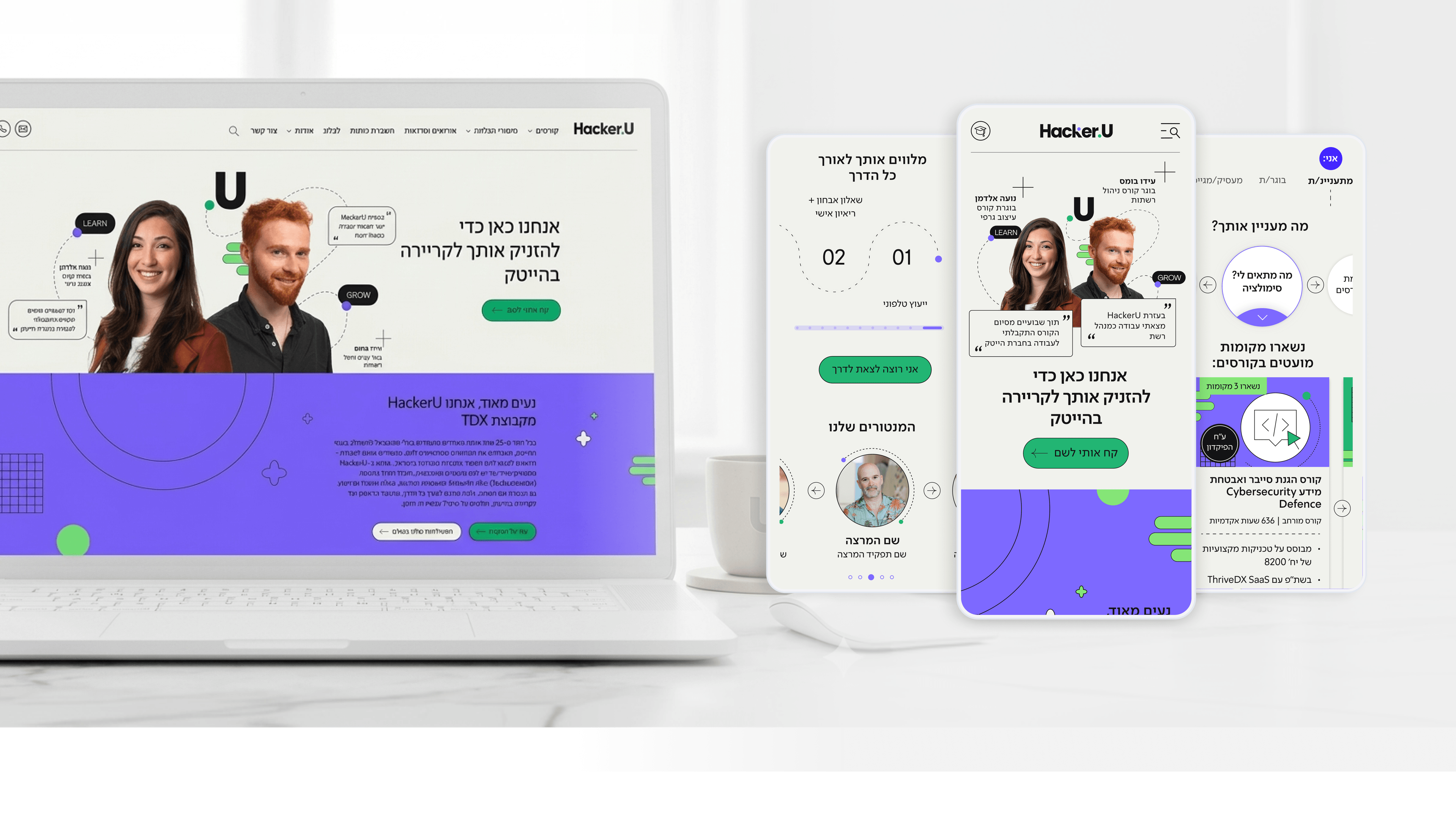
Founders in EdTech have to compete in the same mental space as the most marketable tech companies in the world. Prospective students comparing learning platforms - whether in Israel or globally - measure the experience against what they know from Netflix, from Notion, and from leading consumer products. A learning platform that looks like an old-generation management system loses credibility within half a second.
In the Hacker U project, the ambition was to build a user experience that wasn't merely "good" - but competitive with the highest standards in the market. We incorporated design principles associated with leading SaaS platforms: sharp visual hierarchy, polished micro-interactions, aesthetically pleasing data visualizations of progress, and smart use of color that creates a sense of energy and growth.
Cracking it also required an understanding of "Brand Tone" - Hacker U didn't want to be perceived as a traditional college, but as a platform for people starting their next career in tech. The color palette, the shapes, and the way successful instructors and alumni are presented - it's all aligned to that story.
For founders in EdTech, the key insight: your competitive market isn't just other educational institutions, but every digital platform your users interact with daily. If you want students to choose you, design a platform that's competitive at the level of the world's biggest brands - nothing less.
Related articles

About
Making complicated into easy for users.
Senior product designer with a decade of work across complex systems - financial risk platforms, legal operations, healthcare apps, manufacturing tooling and insurance portals. The common thread is depth: products where the data is rich, the users are expert, and the interface has to disappear into the work.