
Cracking the HealthTech Market: How Do You Successfully Run User Testing on a Medical Product?
Founders in the HealthTech world run into a unique barrier that doesn't exist in other tech products: User Testing on a medical product is nearly impossible without access to real patients in a real environment. You can't push a half-baked, partially-functional medical version and run "A/B Testing" the way you would with financial or consumer products. Any error in a medical product can lead to health harm and a lawsuit.
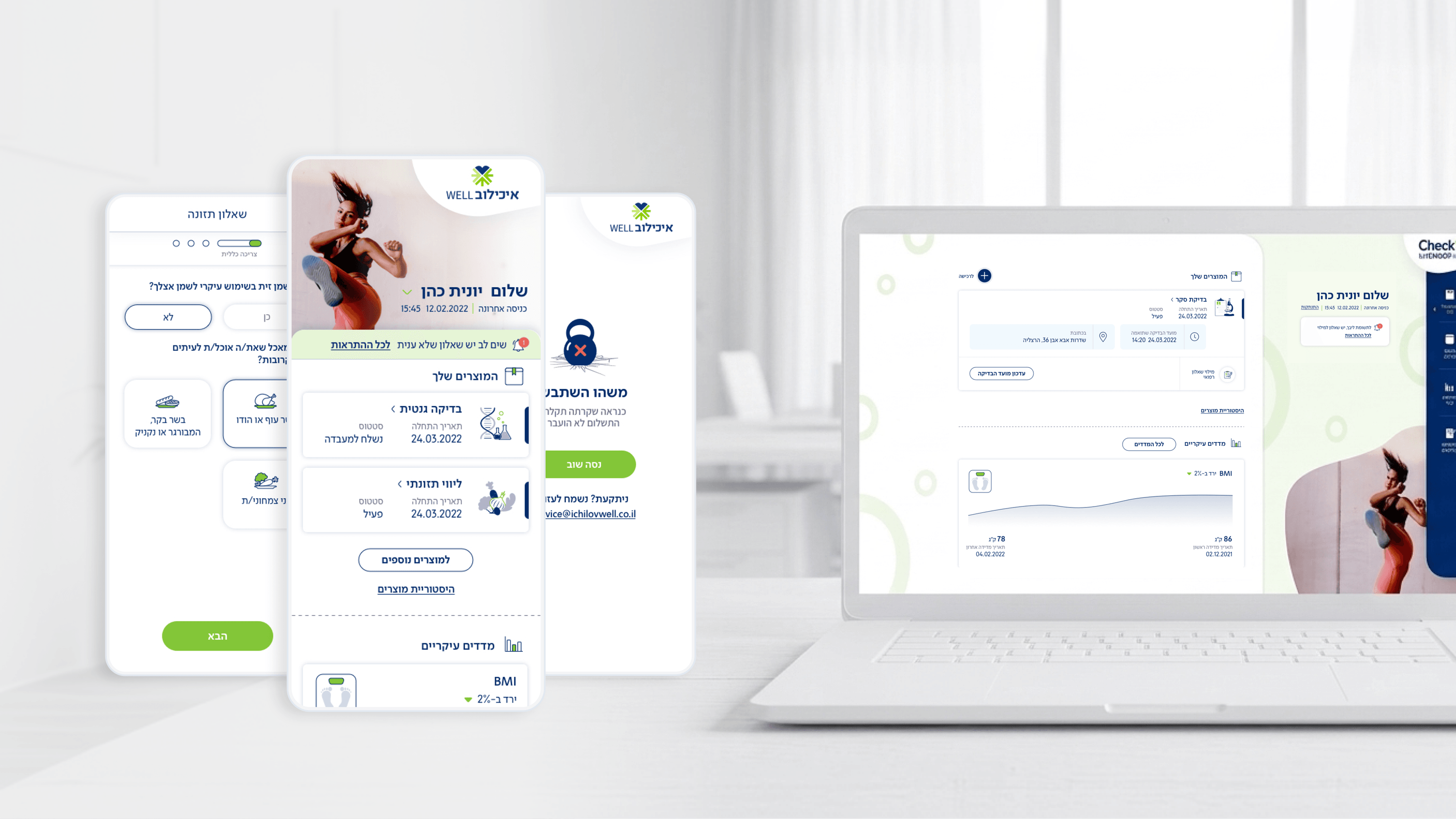
Cracking the Movement project relied on a tiered testing strategy. Instead of waiting for a full product build, we created interactive High-Fidelity prototypes in Figma that simulated the entire medical testing experience, including waiting screens, alerts, and results. These prototypes underwent testing with real users in a controlled environment – nurses, doctors, and prospective employees of organizations – long before a single line of code was written.
This process identified critical experience problems while still in the specification stages: for example, we discovered that users were confused by a certain order of questions, or that a particular alert button looked "too scary" to them. Every fix in Figma costs pennies, whereas fixing the same problem after development costs thousands of shekels in delays and R&D.
HealthTech founders who want to accelerate their path to market need to understand: investing in a comprehensive interactive prototype early on is not a waste of time – it's a significant shortening of your Time to Market. It's the most cost-efficient investment you can make before raising funds.
Related articles

About
Making complicated into easy for users.
Senior product designer with a decade of work across complex systems - financial risk platforms, legal operations, healthcare apps, manufacturing tooling and insurance portals. The common thread is depth: products where the data is rich, the users are expert, and the interface has to disappear into the work.