
Designing a Health Product Under Time Pressure: How Do You Build a Diagnostics App That Doesn't Stress the User?
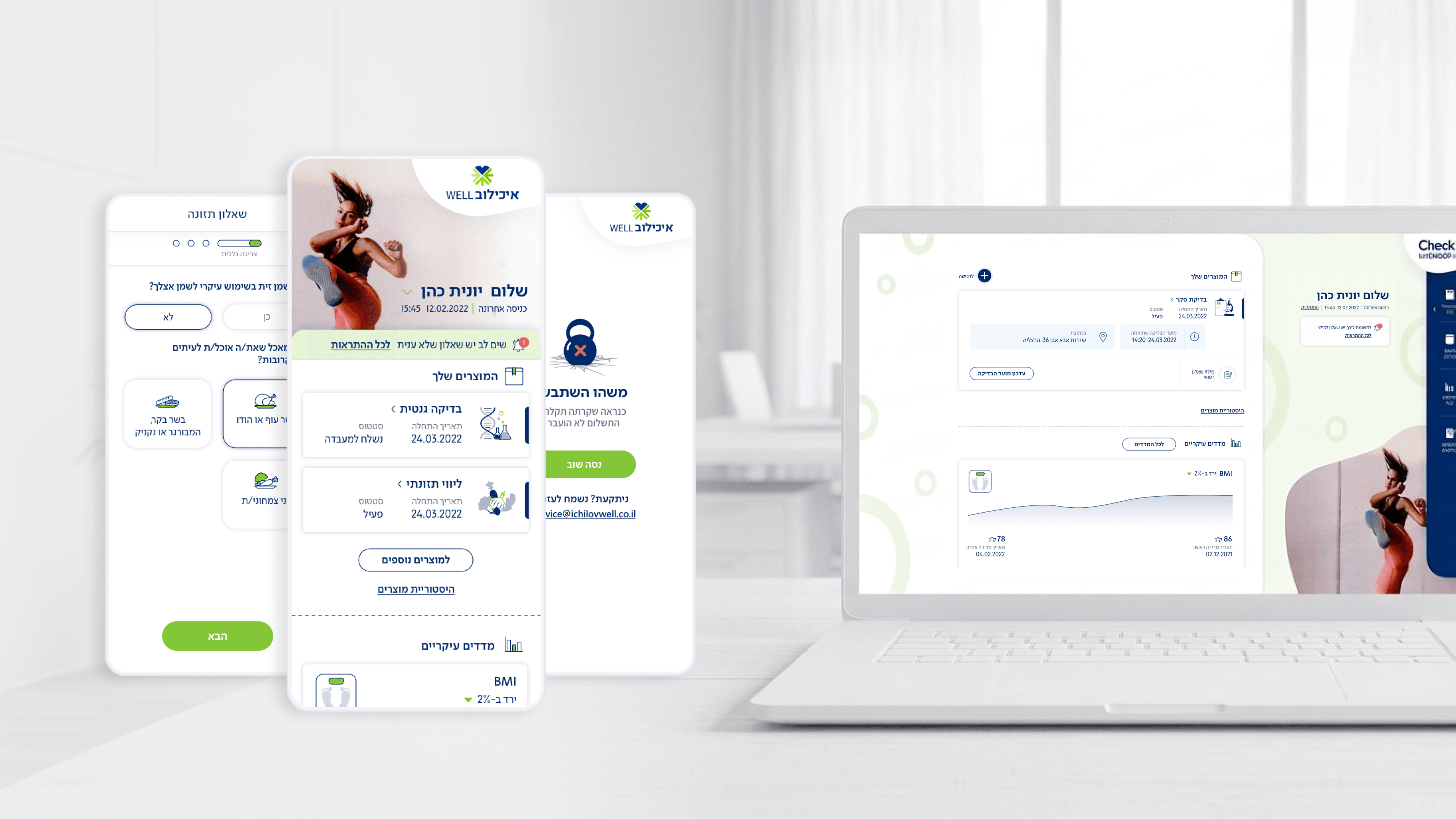
Designing digital health products poses a product challenge that exists in almost no other industry: your user opens the app in a charged emotional state. They're worried about results, anxious about the tests, or pressed for time. For product managers working on health apps, understanding this emotional state is critical – any design decision that fails to account for it translates directly into churn.
In the Movement app, designed for Ichilov Hospital, the challenge was unique: employees of organizations that subscribe to the diagnostics service as a benefit need to complete routine tests during a busy workday. The User Flow was built around the principle of "minimum cognitive load at critical points." Instead of presenting the user with 10 fields to fill in all at once before the test, they get one simple step at a time, with a clear indication of "how much is left."
We also introduced a mechanism of human micro-communication – supportive messages in friendly Hebrew that accompany the user throughout the process ("Just one more step and you're done," "Your information is secured and encrypted"). These small details, which don't look like a "feature" in a product spec, are exactly what makes the difference between a medical app users try to avoid and one that employees open without stress.
Product managers in Digital Health need to stop thinking of their end users as "Users" – they are patients. The language, the pacing, the color palette, and the micro-copy must serve the emotion first, and the function only second.
Related articles
About
Making complicated into easy for users.
Senior product designer with a decade of work across complex systems - financial risk platforms, legal operations, healthcare apps, manufacturing tooling and insurance portals. The common thread is depth: products where the data is rich, the users are expert, and the interface has to disappear into the work.