Meytal Dahan
Back to insights

Color as a Trust Signal in a High-Stakes Decision
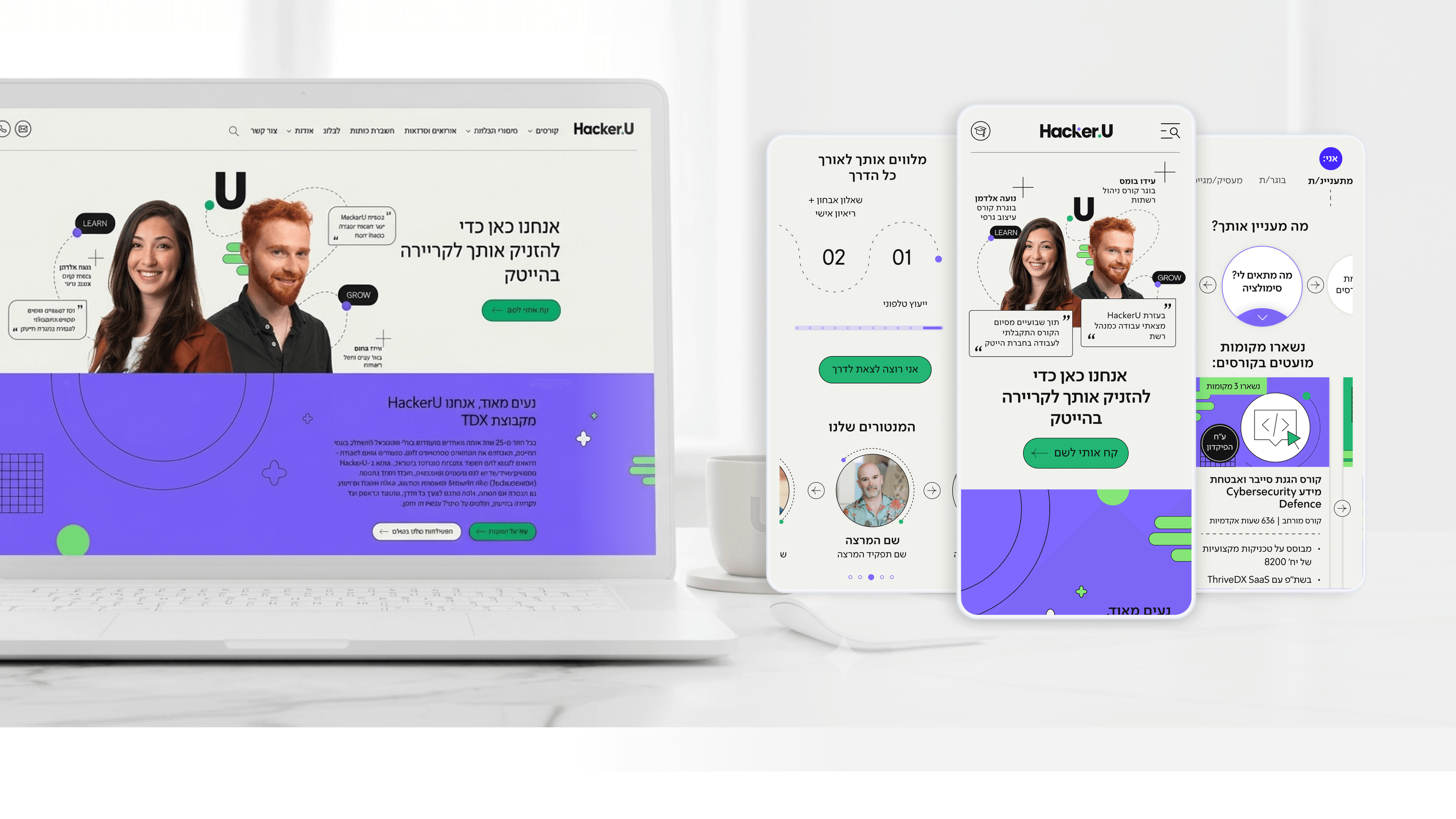
Hacker UFoundersColor & PsychologyEdTech / Conversion Web
Hacker U — High tech training institute website
Enrolling in a high-tech training program is an expensive, emotional decision — people are betting on a career change. On HackerU's site, color had to do more than look modern; it had to manage how that decision feels. For a founder, that's a brand question with conversion consequences. I used color deliberately to build credibility and guide action: a consistent palette that reads as serious and established rather than gimmicky, with a reserved accent color carrying the calls to action so the path forward is always visually obvious. Where the page touches sensitive material — the potential-salary table, the placement story on the 'Classroom to Career' page — color keeps the tone confident and reassuring instead of pushy. Restraint matters as much as choice; using the accent everywhere would dilute its pull, so I kept it tied to moments of decision. The personalized entry layer also leans on consistent color cues so each audience feels addressed by the same trustworthy brand. The founder takeaway: color isn't decoration on top of the funnel, it's part of how a visitor decides whether to trust you with one of the bigger bets of their life.

Get in touch

Have a project in mind?

Drop a line. Meytalyav@gmail.com

Related articles

Hacker U
Engineering LeadersR&D Collaboration

A Modular Design System R&D Could Actually Build

Designers can hand R&D a beautiful comp that's a nightmare to build. On HackerU I tried to do the opposite. The marketing site — personalized homepage, dense course pages, a placement page — runs on one modular design system designed to be implemented, not just admired. Reusable, composable components with consistent states mean engineers stop re-solving the same layout on every page. The adaptive homepage card is one pattern, not five bespoke pages. A design system earns its keep when it makes the front end cheaper to maintain, not just nicer to look at.

Read
Hacker U
Project Managers

Backlog Prioritization in an EdTech System: How Do You Run a Project That Serves Thousands of Users Simultaneously?

Project managers in EdTech: is your backlog exploding because you're trying to serve students, instructors, and marketing all at once? In the Hacker U project we built a dual-impact matrix: recruitment versus Retention. Only features that contributed to both earned priority. 3-week Sprints with clear metrics - that's your number one guardian of the Gantt chart.

Read
Hacker U
Product Managers

Learning Experience (LX): How Do You Design a Course-Management System That Students Love?

Product managers in EdTech: students aren't rational users - they're human beings on a personal journey of learning and fear of failure. In the Hacker U project we built a Learning Experience with clear progress visualization, milestones, and positive reinforcement at moments of success. UX = LX. Design the journey, not just the screens.

Read
Meytal Dahan

About

Making complicated into easy for users.

Senior product designer with a decade of work across complex systems - financial risk platforms, legal operations, healthcare apps, manufacturing tooling and insurance portals. The common thread is depth: products where the data is rich, the users are expert, and the interface has to disappear into the work.
