
One Modular System Behind Five Audiences
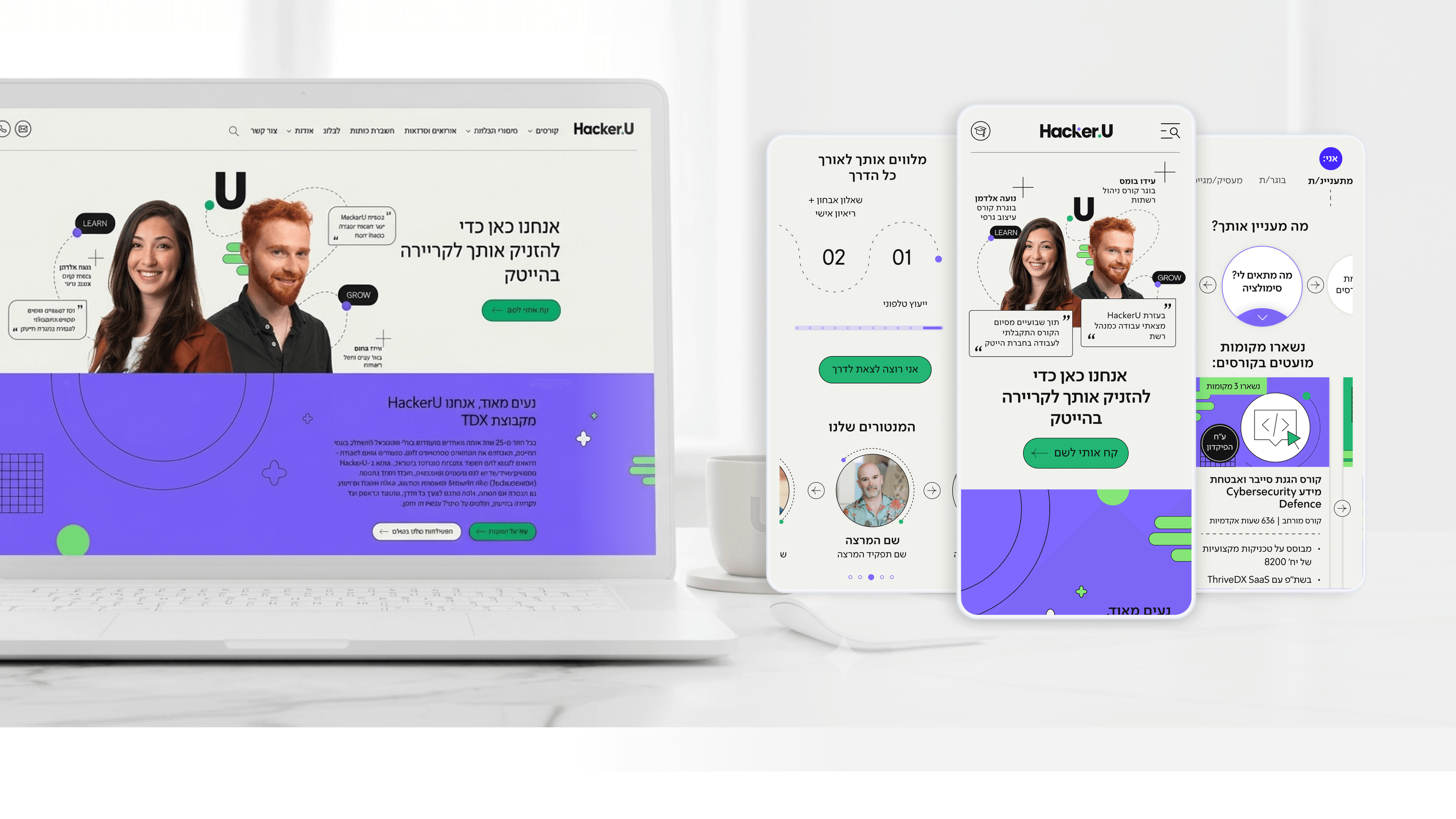
When I designed HackerU's marketing site, the hardest constraint wasn't visual — it was structural. One surface had to serve prospective students, current students, graduates, recruiters, and discharged soldiers, each with different intent. A pile of one-off page designs would have been impossible to maintain and slow to ship. So I built a modular design system: a defined library of cards, course-info blocks, tables, and entry components with consistent spacing, states, and behavior. For an engineering team, the payoff is reuse. The personalized homepage entry layer, the dense course pages, and the placement page all draw from the same components, so a fix in one place propagates everywhere instead of fracturing into per-page exceptions. It also makes the front-end contract predictable — components have known props and states, which shortens build time and reduces regression risk. I treated the system as a shared language between design and R&D, not a static sticker sheet. The result is a site that can absorb new audiences or course offerings without a redesign — you compose existing modules rather than reinvent layouts. That maintainability is the real ROI, long after launch.
Related articles

About
Making complicated into easy for users.
Senior product designer with a decade of work across complex systems - financial risk platforms, legal operations, healthcare apps, manufacturing tooling and insurance portals. The common thread is depth: products where the data is rich, the users are expert, and the interface has to disappear into the work.