
Shipping the HackerU Site as an MVP First
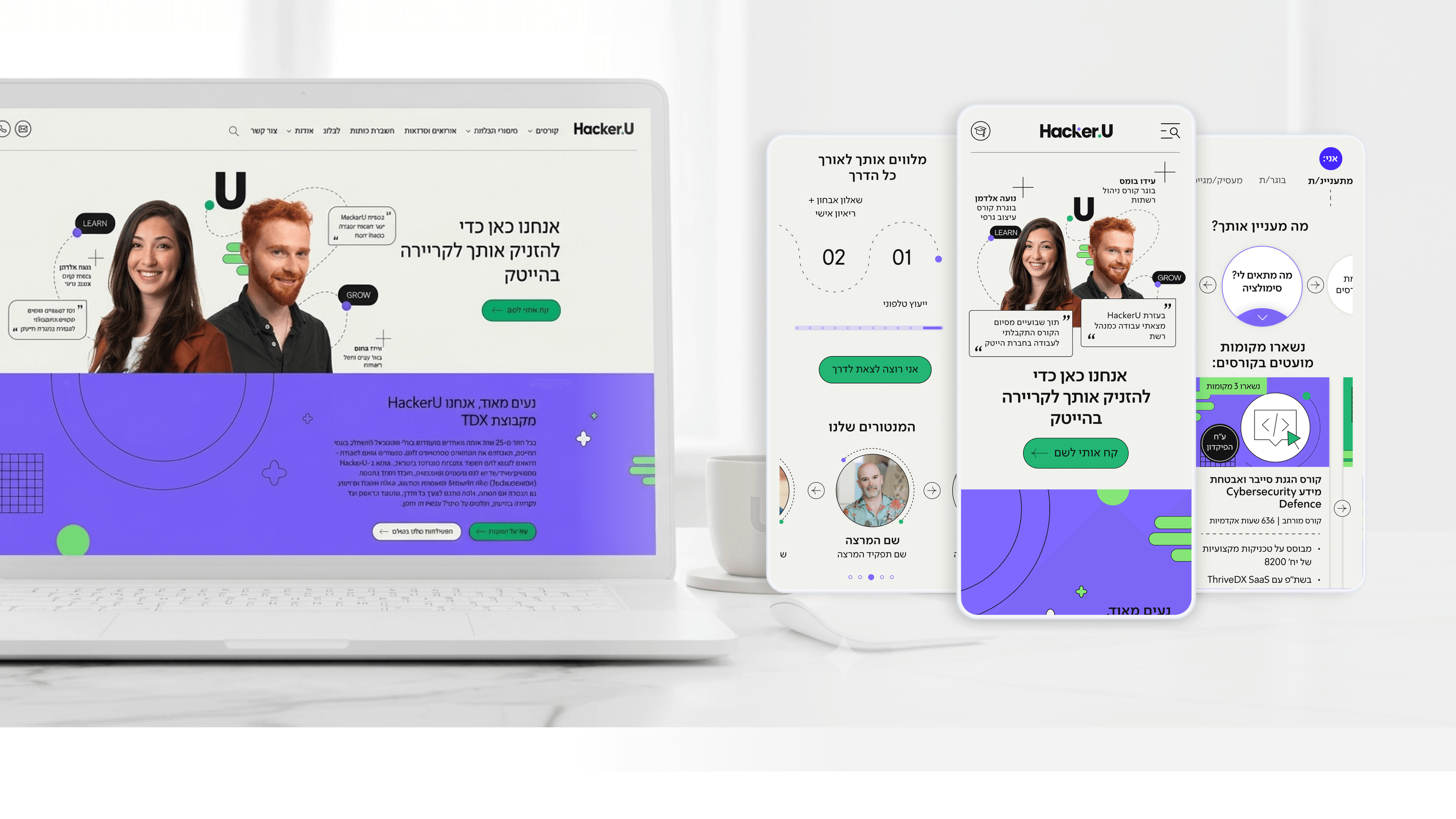
Founders I work with usually want the whole vision live on day one. I push back, gently. On the HackerU marketing site, the temptation was to launch every audience experience, every personalized path, and the full course catalog at once. The smarter move was to define an MVP that proved the riskiest assumption first: that a single homepage could serve very different people — prospective students, current students, graduates, recruiters, discharged soldiers — through a self-identification entry layer where the primary content card adapts. If that personalized entry didn't earn its complexity, no amount of polish elsewhere would matter. So I designed the core flow to stand on its own, then layered in the denser surfaces — the course page with its syllabus and salary anchor, the 'Classroom to Career' placement page — as the system proved itself. The modular design system was what made this staged rollout honest rather than messy: every later addition snapped into patterns that already existed. The mindset I bring is that 'full version' isn't a launch event. It's a sequence of validated bets, each one earning the right to build the next.
Related articles

About
Making complicated into easy for users.
Senior product designer with a decade of work across complex systems - financial risk platforms, legal operations, healthcare apps, manufacturing tooling and insurance portals. The common thread is depth: products where the data is rich, the users are expert, and the interface has to disappear into the work.