Meytal Dahan
Back to insights

Designing the HackerU Site So i18n Wasn't a Rewrite
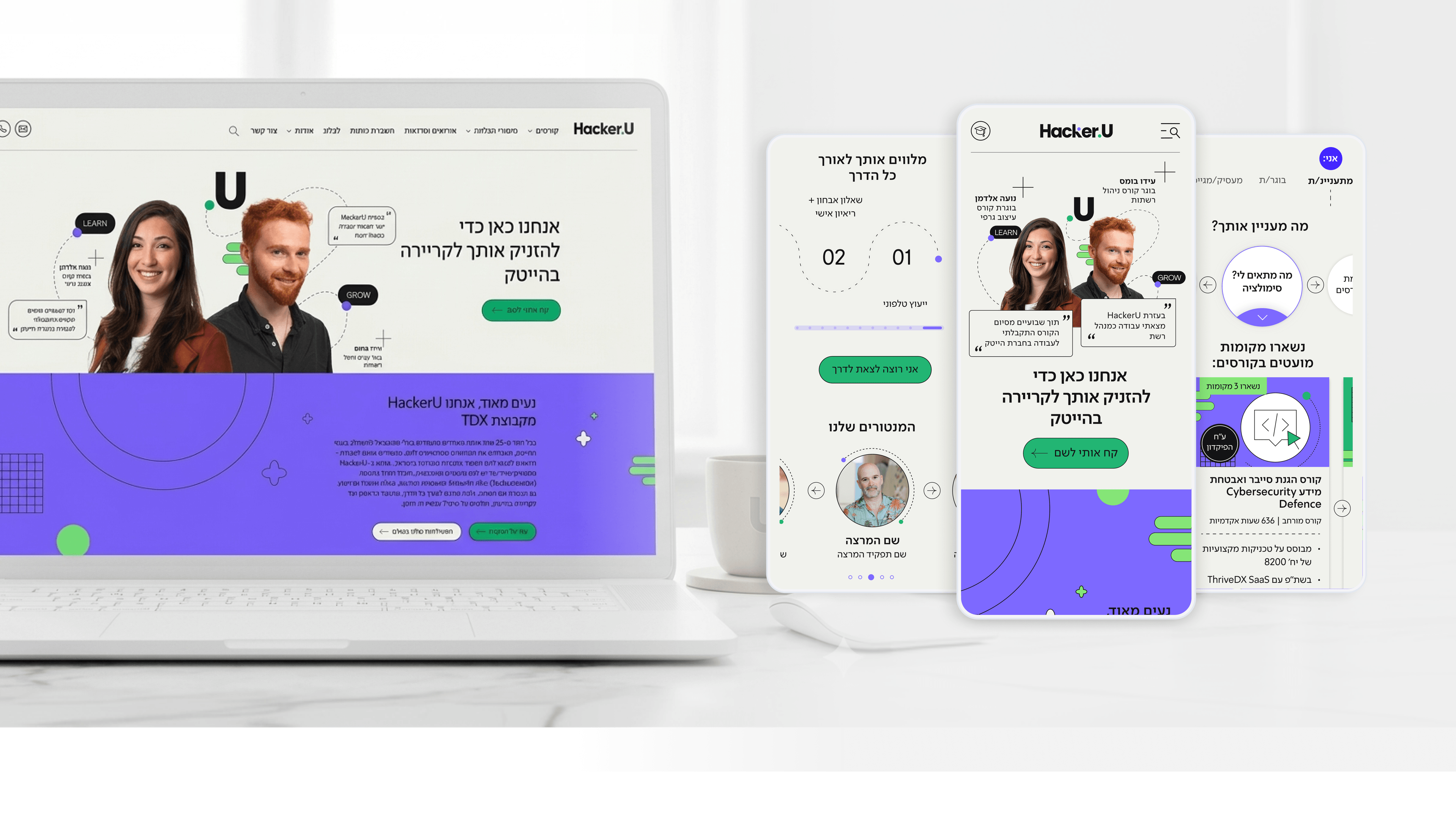
Hacker U — High tech training institute website
Most internationalization pain isn't linguistic — it's structural, and it lands on engineering. I design with that in mind even when the brief is single-market. HackerU's site is Hebrew-first, which means right-to-left is the native reading direction, not an afterthought bolted on later. For a CTO, the relevant point is what that forces upstream in the design system: directional layouts, mirrored navigation, and components that flip cleanly rather than breaking when content direction changes. When I build the modular system, I treat spacing, alignment, and iconography as direction-aware tokens instead of hard-coded left/right values. That discipline matters because the course page carries dense, structured content — syllabus blocks, the salary table, study-hours and format details — and dense layouts are exactly where RTL or future localization quietly fractures. Designing those modules to handle variable text length and mirrored flow means the cost of adding a locale later is configuration, not reconstruction. The principle I'd hand to any R&D leader: i18n readiness is mostly a design-system decision made early. If your components assume direction and string length, internationalization stops being a migration and becomes a setting.

Get in touch

Have a project in mind?

Drop a line. Meytalyav@gmail.com

Related articles

Hacker U
Engineering LeadersR&D Collaboration

A Modular Design System R&D Could Actually Build

Designers can hand R&D a beautiful comp that's a nightmare to build. On HackerU I tried to do the opposite. The marketing site — personalized homepage, dense course pages, a placement page — runs on one modular design system designed to be implemented, not just admired. Reusable, composable components with consistent states mean engineers stop re-solving the same layout on every page. The adaptive homepage card is one pattern, not five bespoke pages. A design system earns its keep when it makes the front end cheaper to maintain, not just nicer to look at.

Read
Hacker U
Project Managers

Backlog Prioritization in an EdTech System: How Do You Run a Project That Serves Thousands of Users Simultaneously?

Project managers in EdTech: is your backlog exploding because you're trying to serve students, instructors, and marketing all at once? In the Hacker U project we built a dual-impact matrix: recruitment versus Retention. Only features that contributed to both earned priority. 3-week Sprints with clear metrics - that's your number one guardian of the Gantt chart.

Read
Hacker U
Product Managers

Learning Experience (LX): How Do You Design a Course-Management System That Students Love?

Product managers in EdTech: students aren't rational users - they're human beings on a personal journey of learning and fear of failure. In the Hacker U project we built a Learning Experience with clear progress visualization, milestones, and positive reinforcement at moments of success. UX = LX. Design the journey, not just the screens.

Read
Meytal Dahan

About

Making complicated into easy for users.

Senior product designer with a decade of work across complex systems - financial risk platforms, legal operations, healthcare apps, manufacturing tooling and insurance portals. The common thread is depth: products where the data is rich, the users are expert, and the interface has to disappear into the work.