Meytal Dahan
Back to insights

One Homepage, Many People: Personalization as Strategy
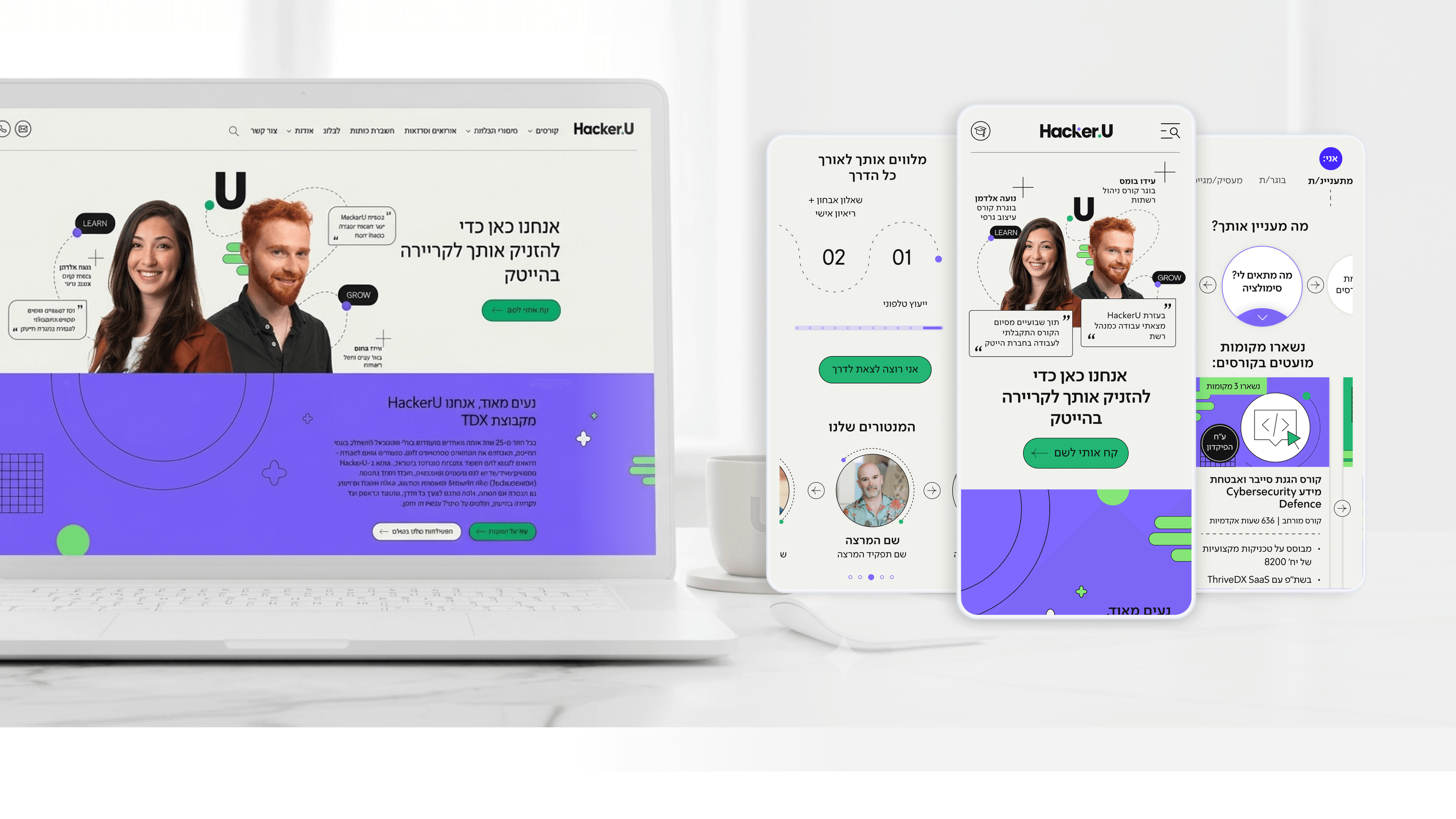
Hacker U — High tech training institute website
The hardest constraint on the HackerU site was also the most strategic: one homepage, radically different visitors. A prospective student, a current student, a graduate, a recruiter, and a discharged soldier all arrive at the same URL with completely different questions. The instinct is to build separate landing pages for each, but that fragments the brand and multiplies maintenance. I argued for the opposite — a single, coherent surface with a personalized entry layer where users self-identify and the primary content card adapts to who they are. For a CEO, the value here is leverage. Personalization done this way means one site does the work of five, the brand stays unified, and each audience still feels directly addressed rather than generically marketed to. It turns a positioning problem into a design pattern. The tailoring isn't cosmetic; it changes what content leads, which next step is offered, and how quickly someone reaches the page that resolves their specific doubt. The takeaway I'd give any leader weighing personalization: the goal isn't to show everyone something different for its own sake. It's to make every distinct audience feel the site was built for them — without building a different site for each.

Get in touch

Have a project in mind?

Drop a line. Meytalyav@gmail.com

Related articles

Hacker U
Engineering LeadersR&D Collaboration

A Modular Design System R&D Could Actually Build

Designers can hand R&D a beautiful comp that's a nightmare to build. On HackerU I tried to do the opposite. The marketing site — personalized homepage, dense course pages, a placement page — runs on one modular design system designed to be implemented, not just admired. Reusable, composable components with consistent states mean engineers stop re-solving the same layout on every page. The adaptive homepage card is one pattern, not five bespoke pages. A design system earns its keep when it makes the front end cheaper to maintain, not just nicer to look at.

Read
Hacker U
Project Managers

Backlog Prioritization in an EdTech System: How Do You Run a Project That Serves Thousands of Users Simultaneously?

Project managers in EdTech: is your backlog exploding because you're trying to serve students, instructors, and marketing all at once? In the Hacker U project we built a dual-impact matrix: recruitment versus Retention. Only features that contributed to both earned priority. 3-week Sprints with clear metrics - that's your number one guardian of the Gantt chart.

Read
Hacker U
Product Managers

Learning Experience (LX): How Do You Design a Course-Management System That Students Love?

Product managers in EdTech: students aren't rational users - they're human beings on a personal journey of learning and fear of failure. In the Hacker U project we built a Learning Experience with clear progress visualization, milestones, and positive reinforcement at moments of success. UX = LX. Design the journey, not just the screens.

Read
Meytal Dahan

About

Making complicated into easy for users.

Senior product designer with a decade of work across complex systems - financial risk platforms, legal operations, healthcare apps, manufacturing tooling and insurance portals. The common thread is depth: products where the data is rich, the users are expert, and the interface has to disappear into the work.
