
Designing for Five Audiences on One Homepage
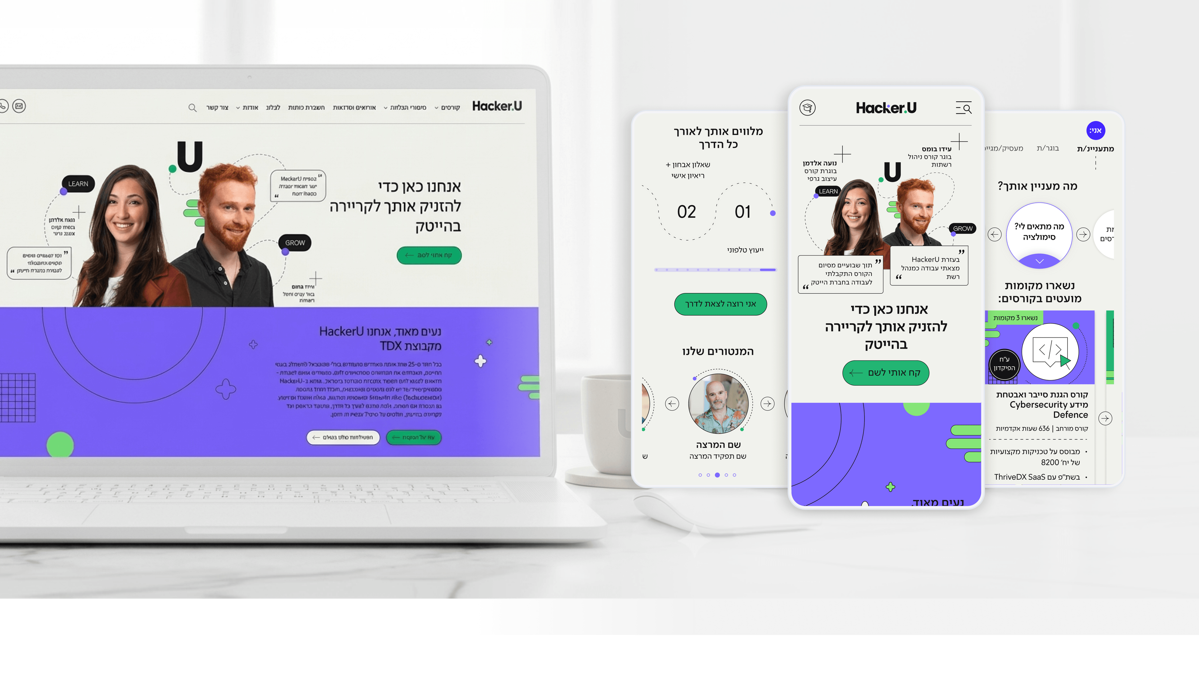
The hardest constraint on the HackerU marketing site wasn't a feature — it was the audience. Prospective students, current students, graduates, recruiters, and discharged soldiers all land on the same surface, each arriving with a completely different question. As a PM, you know what happens when you try to serve everyone with one generic message: you serve no one. So my research started not with screens but with intent. I mapped what each audience was actually trying to accomplish, where their fears lived, and what a 'next step' meant to each of them. That work is what justified the personalized entry layer — letting users self-identify so the primary content card adapts to who they are. Research kept us honest about scope, too. A discharged soldier and a recruiter don't want the same proof points, and pretending otherwise would have bloated every page. For a PM, the value of this research is that it turns 'who is this for?' from a debate into a documented decision. Every prioritization call downstream — which content leads, what the homepage promises — traces back to a real audience need, not an internal preference.
Related articles

About
Making complicated into easy for users.
Senior product designer with a decade of work across complex systems - financial risk platforms, legal operations, healthcare apps, manufacturing tooling and insurance portals. The common thread is depth: products where the data is rich, the users are expert, and the interface has to disappear into the work.