
Color Was the Difference Between a Benefit and a Clinical Portal
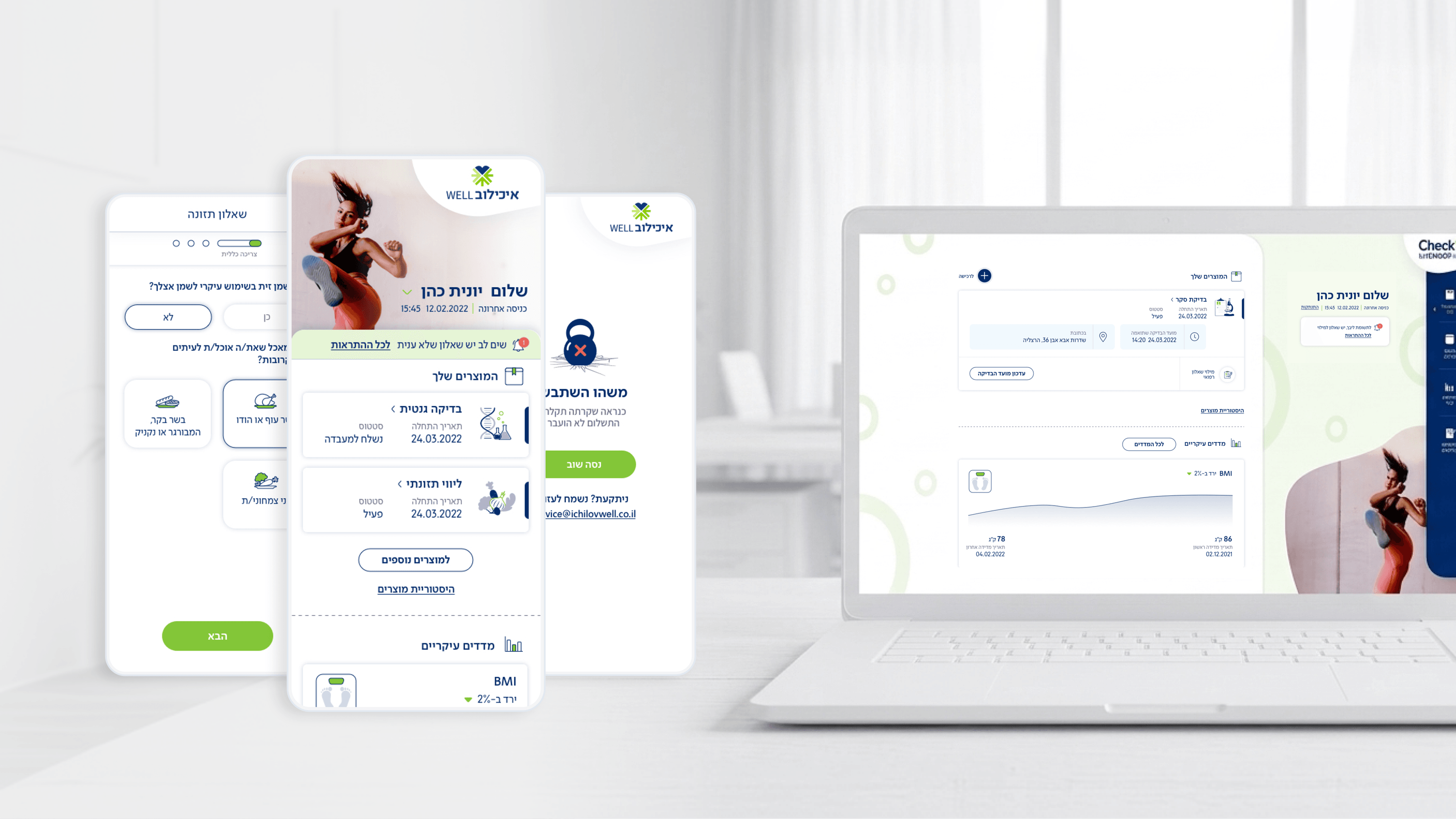
Here's the strategic bet I'd put to any founder behind Movement: these users aren't sick. They subscribed to Ichilov's checkup service through their employer, it's a perk, not a diagnosis. So the product cannot feel like a clinical portal, or the whole B2B2C model weakens, because organizations are paying for an experience employees actually open. Color is where that positioning becomes tangible. I deliberately moved away from sterile hospital palettes toward warmer, confident tones that read as 'a benefit worth opening' rather than 'log in to view your medical record.' This matters most in the self-assessment questionnaires, where completion rate is the metric the business runs on. Color carries emotional permission: a colorful, encouraging palette lowers the dread of answering health questions and keeps people moving through the flow. I was careful, though, color psychology can't override clarity or accessibility, so results and status states still use unambiguous, WCAG-respecting signals rather than mood alone. For a founder, the takeaway is that palette is a retention and adoption lever, not decoration. The right color story is what makes an employer's health benefit feel like something employees are glad to have, which is the entire reason the contract renews.
Related articles

About
Making complicated into easy for users.
Senior product designer with a decade of work across complex systems - financial risk platforms, legal operations, healthcare apps, manufacturing tooling and insurance portals. The common thread is depth: products where the data is rich, the users are expert, and the interface has to disappear into the work.