
Why a Design System Was Infrastructure, Not Decoration, for Movement
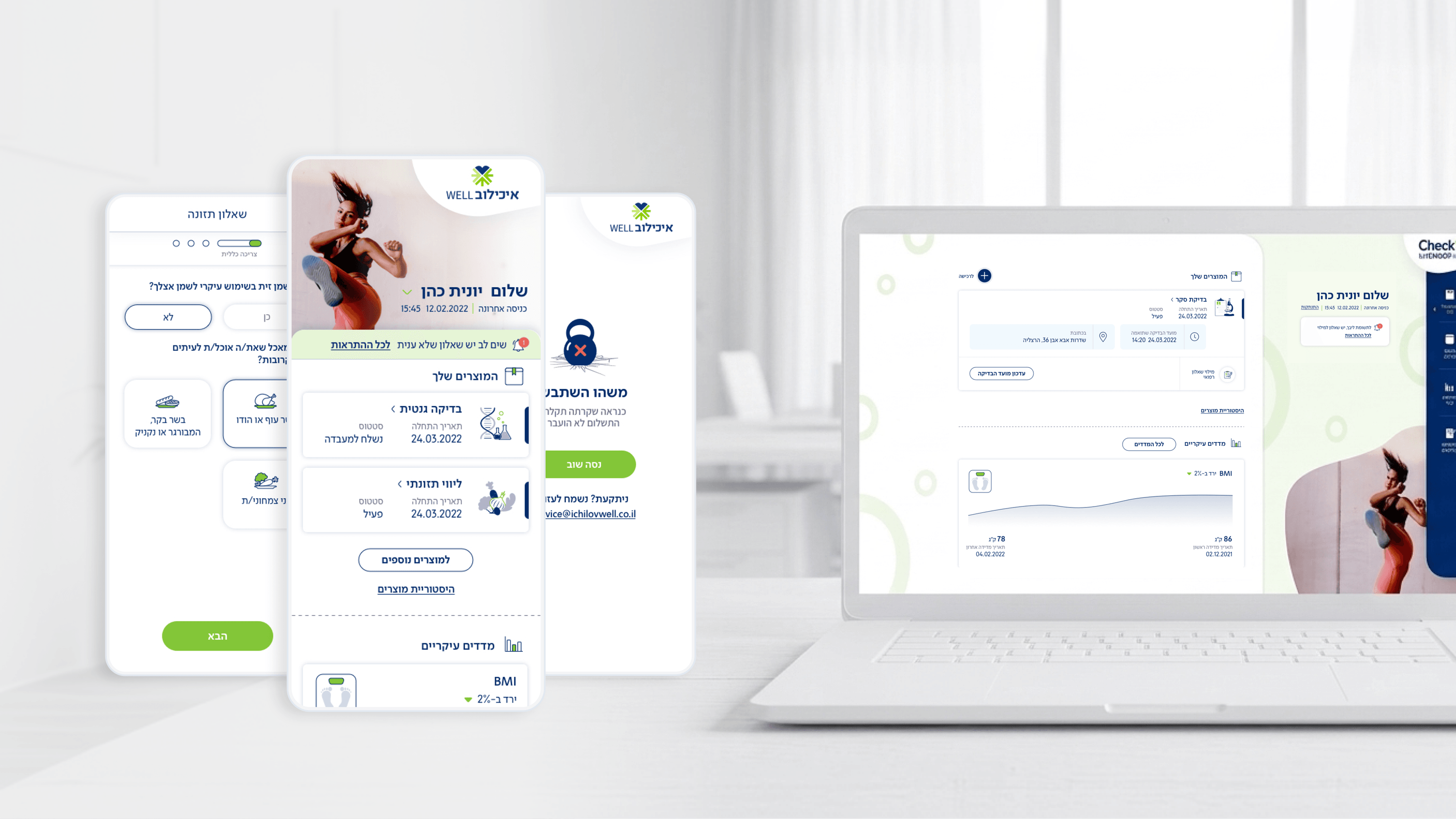
When I joined Movement, Ichilov's patient-facing checkup app, the surface area was already large: a glance-able dashboard, experiential self-assessment questionnaires, booking, results, and post-visit summaries. From an engineering standpoint, that breadth is exactly where a Design System earns its keep. I treated it as infrastructure, not styling. Shared components for cards, tap targets, form fields, and status states meant the dashboard's 'where am I in my care right now' tile and a questionnaire step could reuse the same primitives instead of diverging into one-off implementations your team has to maintain forever. For an R&D lead, that translates into predictable build estimates and far fewer regression surprises when a single token changes. Because this is a B2B2C product served to many organizations, consistency isn't cosmetic, it's reliability: every employee benefit interaction has to feel like the same trustworthy app. I scoped the system to what the product actually needed, no speculative components, so it stayed light enough to ship without slowing velocity. The payoff I'd pitch to any CTO: lower coupling between screens, accessibility baked into shared components once rather than audited per-screen, and a vocabulary designers and engineers can argue in precisely.
Related articles

About
Making complicated into easy for users.
Senior product designer with a decade of work across complex systems - financial risk platforms, legal operations, healthcare apps, manufacturing tooling and insurance portals. The common thread is depth: products where the data is rich, the users are expert, and the interface has to disappear into the work.