
First-Run Onboarding When Your Users Came for a Benefit, Not a Hospital
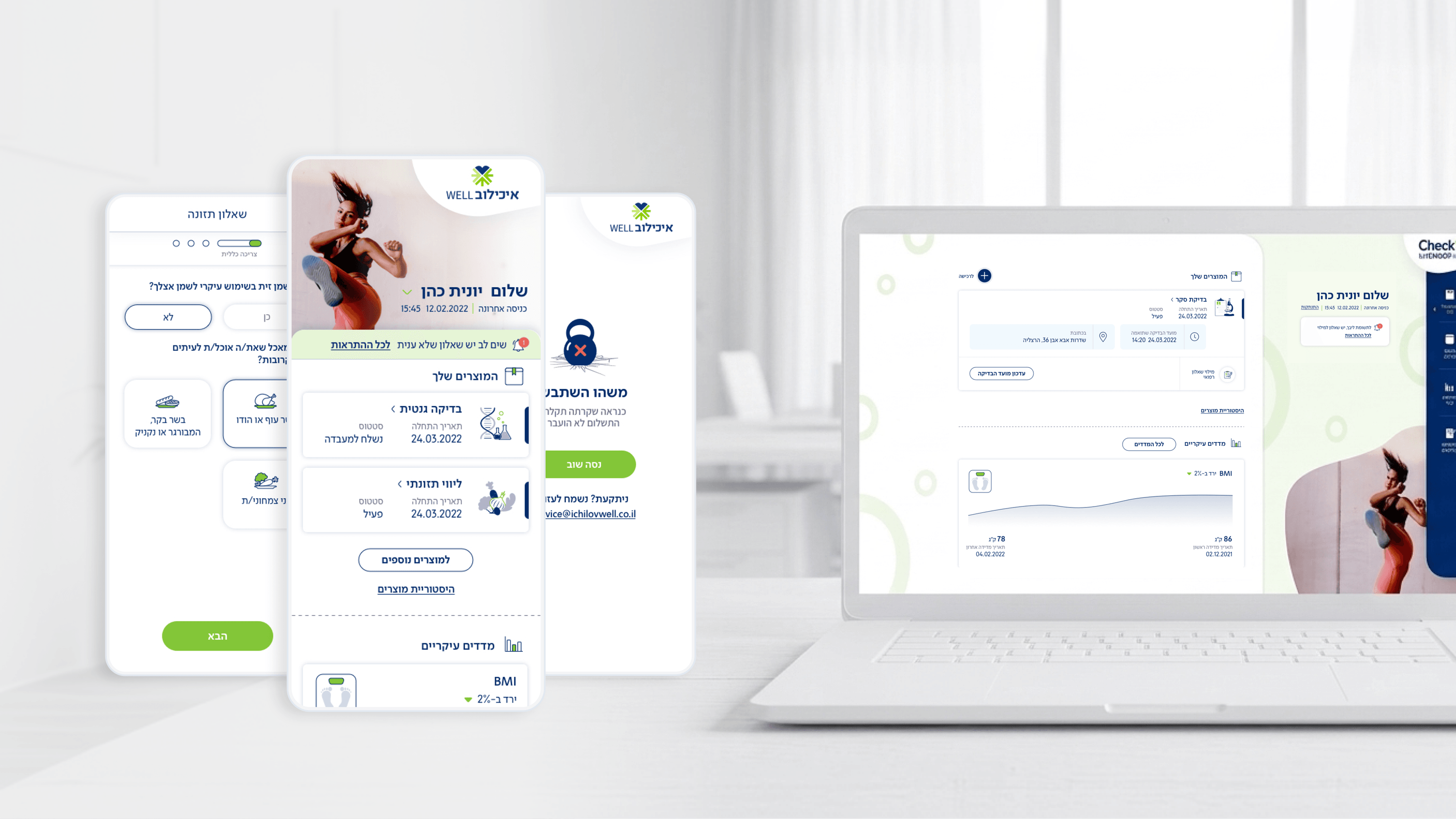
First-run onboarding in Movement carries an unusual burden: the user arrives because their employer subscribed to Ichilov's checkup service, so the very first screens have to reframe expectations fast. They're not opening a hospital portal, they're opening a benefit. As a PM, I'd frame the first run as the moment that decides whether the dashboard ever gets a second visit. So I designed it to deliver orientation, not a tutorial wall: get the user to a populated, glance-able dashboard quickly, where they can see purchased checkups and their next step, because seeing your own care state is more convincing than any explainer slide. The strategic choice was to lead with value, not setup. Where input was unavoidable, I leaned on the same conversational, large-tap-target, icon-rich pattern as the questionnaires so the first interaction already teaches the app's vocabulary, and the experiential self-assessment doubles as a low-friction, even welcoming, first real action. For a PM, that's the activation play: don't measure first-run by 'finished the tour', measure it by 'reached a meaningful state and came back'. Onboarding that proves the benefit beats onboarding that explains the product, especially when the user never asked to be in a health app in the first place.
Related articles

About
Making complicated into easy for users.
Senior product designer with a decade of work across complex systems - financial risk platforms, legal operations, healthcare apps, manufacturing tooling and insurance portals. The common thread is depth: products where the data is rich, the users are expert, and the interface has to disappear into the work.