
Accessibility in Health Isn't WCAG Theater
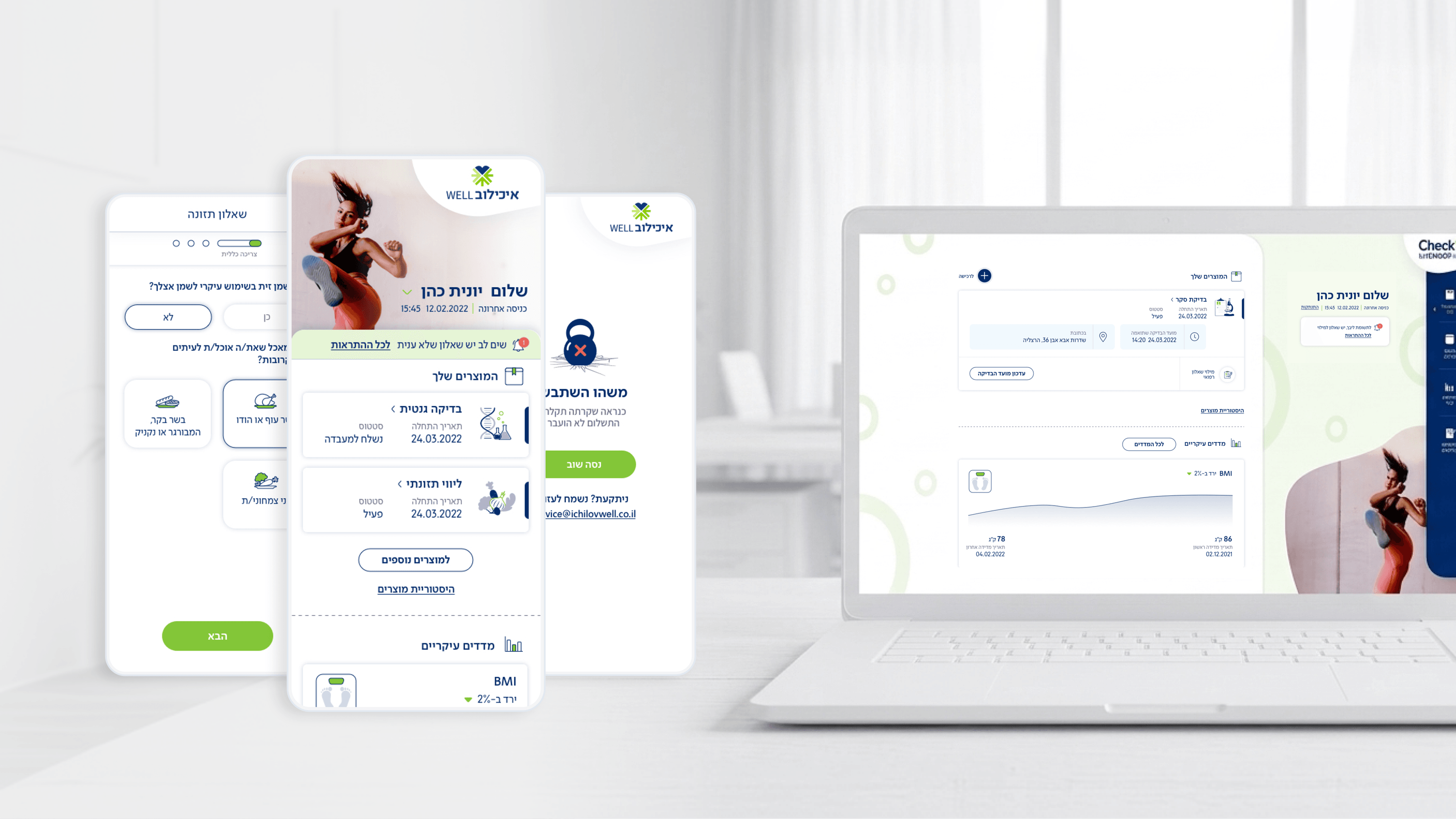
Accessibility in a health product carries weight that a generic app doesn't, and I want engineering leaders to feel that distinction. Movement is Ichilov's patient checkup app, used by a broad working population — not digital natives only, and not people in a calm frame of mind when results land. So WCAG compliance was the floor, not the goal. The experiential self-assessment questionnaires were the sharpest case: completion rate is the key metric, and every accessibility gap is a drop-off. I leaned on large tap targets, high-contrast color that still reads as friendly rather than clinical, and icons that support text instead of replacing it — so the meaning survives for screen-reader users and for anyone glancing quickly. The dashboard and results surfaces needed careful semantic structure so assistive tech announces 'next appointment' or 'latest result' as the meaningful units they are, not as a wall of undifferentiated text. For a CTO, the takeaway is that health-domain accessibility is a correctness requirement, not a compliance checkbox — an inaccessible questionnaire isn't just exclusionary, it directly suppresses the completion metric the whole clinical workflow depends on. Build it into the component contracts and it scales; bolt it on later and you re-audit every screen.
Related articles

About
Making complicated into easy for users.
Senior product designer with a decade of work across complex systems - financial risk platforms, legal operations, healthcare apps, manufacturing tooling and insurance portals. The common thread is depth: products where the data is rich, the users are expert, and the interface has to disappear into the work.