
Designing So i18n Stays a Constraint, Not a Retrofit
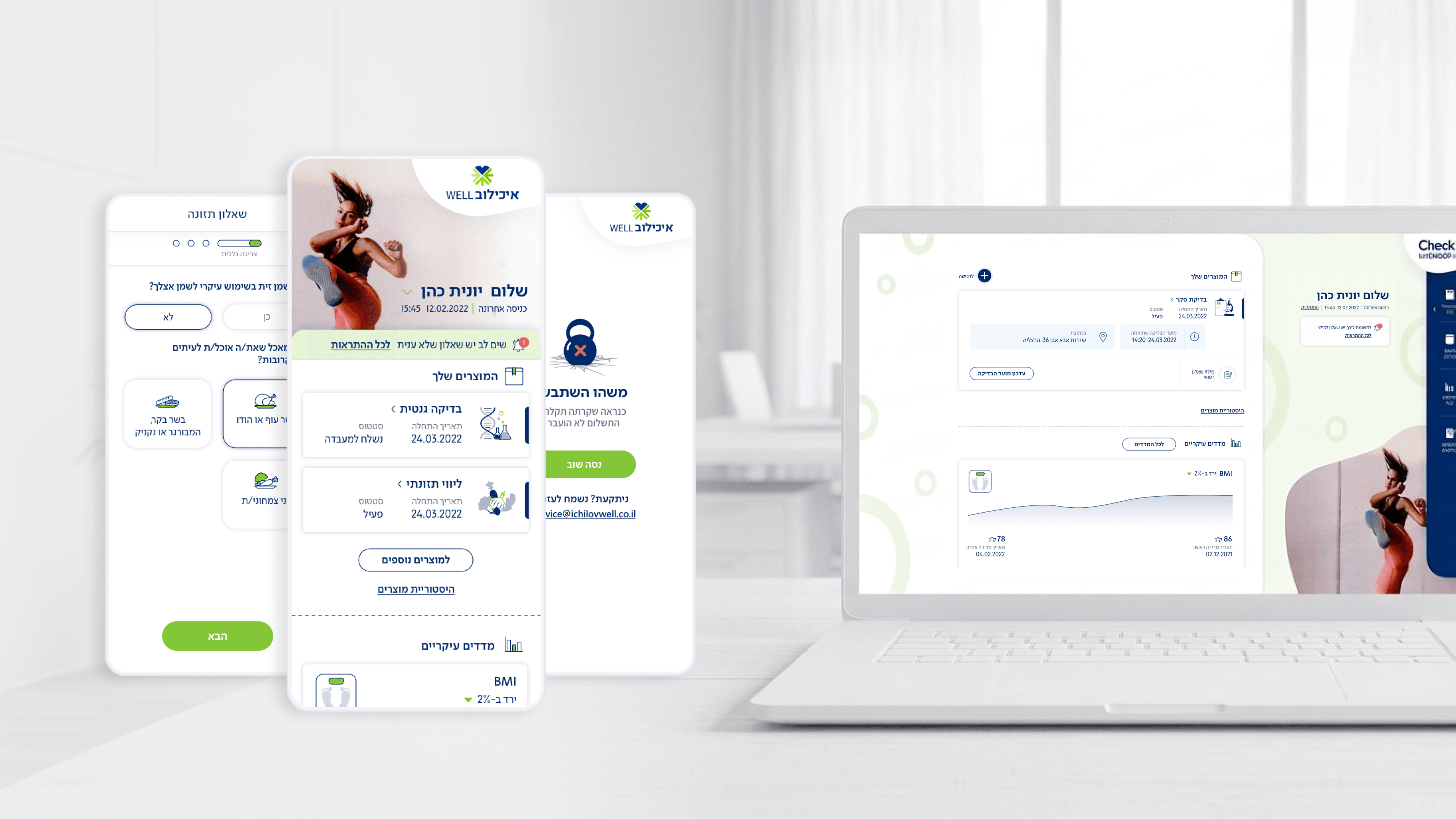
For a Tel Aviv hospital app like Movement — Ichilov's patient-facing checkup product — internationalization is never far off. Hebrew already means RTL, and a working-population patient base rarely stays single-language for long. I'm not going to claim i18n was a headline deliverable here; what I will share is the design discipline I bring to exactly this kind of surface, because that discipline is what keeps a CTO's team out of a painful retrofit later. The principle I work from is to treat direction and text-length as constraints to honor up front rather than fix after the fact: keep meaning out of icons so nothing breaks when copy changes, think in logical start/end rather than hard-coded left/right, and assume translated strings won't match the source length. The glance-able dashboard is the riskiest surface for this — dense, status-driven layouts are exactly where mirrored direction breaks alignment and truncates labels first, so cards want breathing room and tap targets want to survive longer localized text. The takeaway I'd offer engineering leaders: i18n debt is cheapest to prevent at the design-system level. If components are direction-aware and text-length-tolerant by default, adding a language becomes a content task, not a re-architecture. Paying that small tax early in design is what keeps a health product expandable instead of locked to one locale.
Related articles

About
Making complicated into easy for users.
Senior product designer with a decade of work across complex systems - financial risk platforms, legal operations, healthcare apps, manufacturing tooling and insurance portals. The common thread is depth: products where the data is rich, the users are expert, and the interface has to disappear into the work.