
Micro-interactions Were My Completion-Rate Lever in Movement's Questionnaires
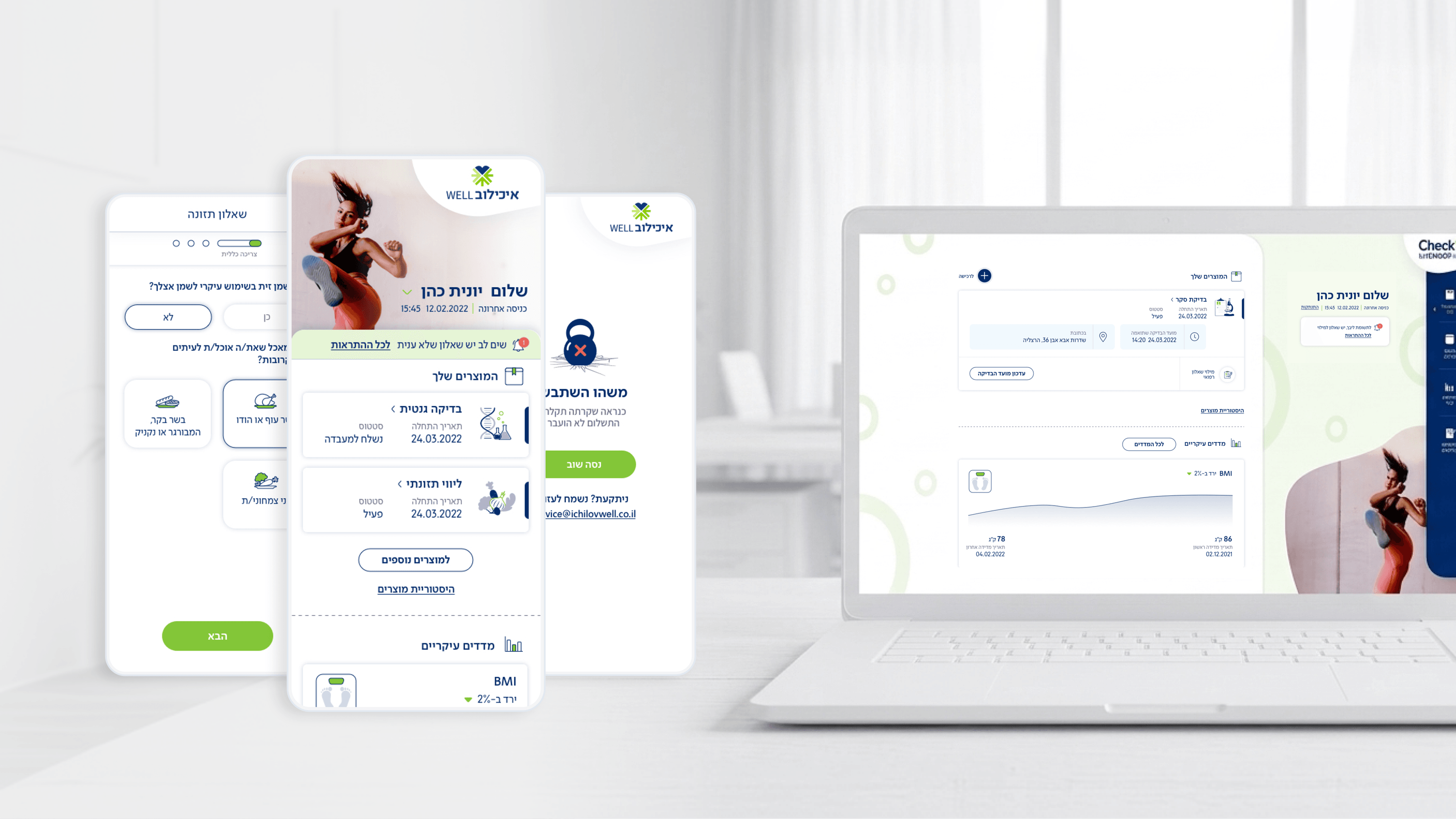
Completion rate is the number Movement's self-assessment questionnaires are judged on, so I treated micro-interactions as a tool for that metric, not as polish. The questionnaires are designed to feel experiential: colorful, icon-rich, conversational, with large tap targets. Animation is what turns that intent into momentum. A tap that responds instantly, a selection that confirms with a small satisfying motion, a smooth transition between questions, each one tells the user 'you're progressing' and removes the friction that makes people abandon health forms halfway. For a PM, the value is that these are low-cost interventions aimed squarely at the KPI you report on, without expanding scope. I kept them purposeful: motion that communicates state or progress earns its place; motion that just decorates gets cut, because on mobile it costs performance and can feel sluggish on mid-range devices our users actually carry. I also respected reduced-motion preferences, accessibility isn't optional in a health context. The principle I'd hand any PM here: micro-interactions are how you make a long questionnaire feel short. They reduce perceived effort, and perceived effort is what kills completion long before real length does.
Related articles

About
Making complicated into easy for users.
Senior product designer with a decade of work across complex systems - financial risk platforms, legal operations, healthcare apps, manufacturing tooling and insurance portals. The common thread is depth: products where the data is rich, the users are expert, and the interface has to disappear into the work.