Meytal Dahan
Back to insights

Researching People Who Don't Feel Sick
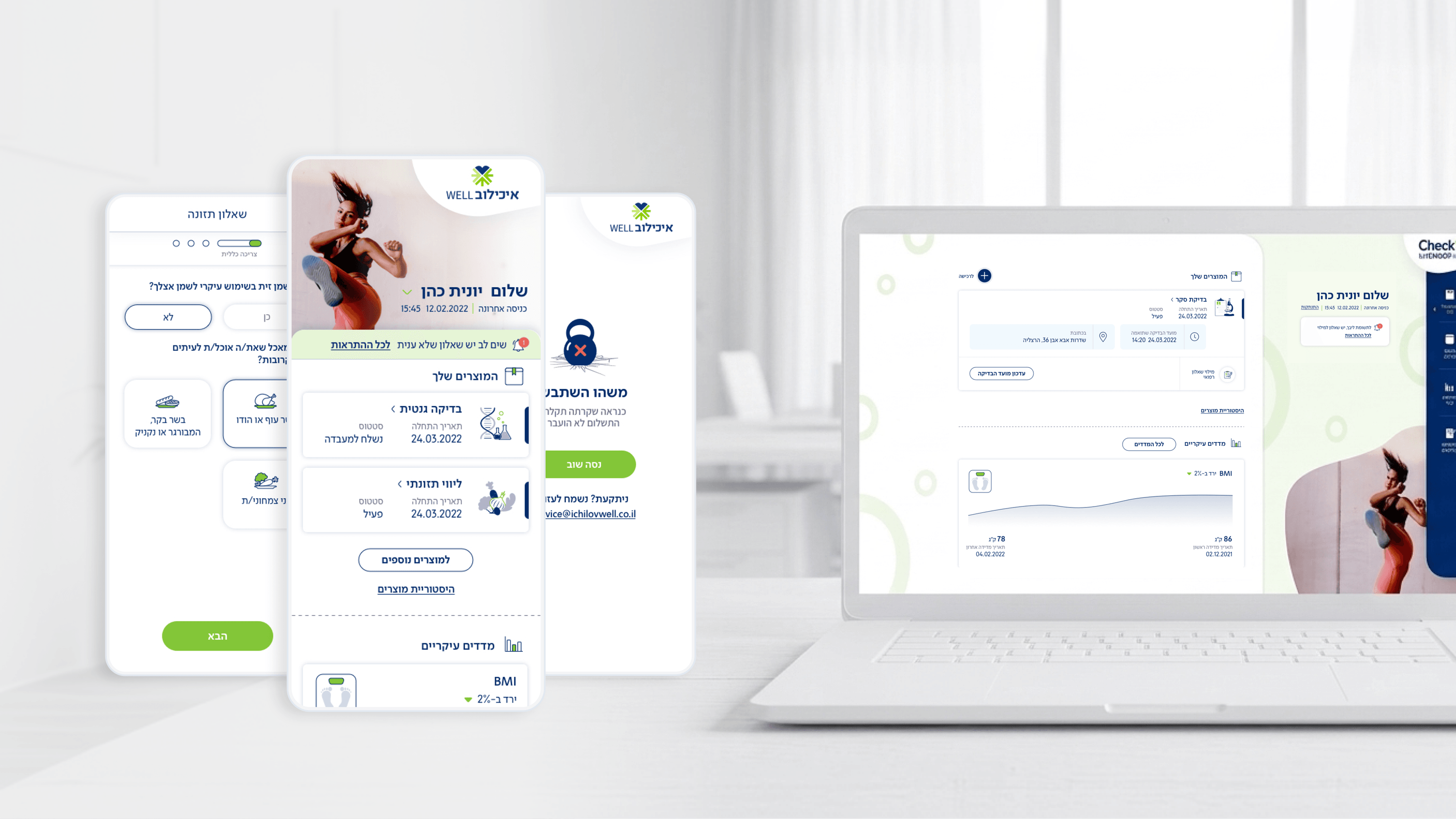
Movement — Corporate Health Checkup App for Ichilov Hospital
The trickiest assumption I had to unlearn on Movement was that I was designing for patients. I wasn't. Ichilov's corporate checkup service reaches people through their employer as a benefit — they aren't ill, they're showing up for a routine they didn't choose for themselves. Research had to start there. Talking to these users, I kept hearing the same tension: they wanted to know 'where am I in this' without feeling pulled into a clinical system. That insight reframed the whole product. For a PM, that's the part that protects the roadmap — it tells you the dashboard isn't a feature list, it's an answer to a single anxious question: what's done, what's next, what did my body just say. Research also exposed where the experiential questionnaires would either delight or get abandoned, since completion is the metric we actually live or die by. I treat research less as validation and more as scope defense: it's how I tell a stakeholder which 'nice to have' is actually load-bearing, and which polished idea quietly solves a problem nobody we interviewed actually has.

Get in touch

Have a project in mind?

Drop a line. Meytalyav@gmail.com

Related articles

Movement
Studio & Agency

Augmenting Your Outsourced Workforce for HealthTech Projects: Expert Support for Studios With No Medical Background

Studio leaders, a HealthTech project can look intimidating – medical regulation, terminology, doctors. But it's also a market with big budgets. My experience with Ichilov's Movement app lets me come in Plug & Play – to communicate with doctors, document medical edge cases, and deliver ready-made outputs to your studio. Don't pass up the project – bring in an expert.

Read
Movement
CEOsSpecific Feature ROI

What One Glance-able Dashboard Actually Returns

The dashboard in Movement (Ichilov's corporate checkup app) wasn't a 'nice to have' — it was the business case. In a B2B2C benefit, a product nobody reopens isn't a benefit, it's a cost that gets cut at renewal. So I designed the home screen to answer one question on open: where am I in my care right now? Purchased checkups, next appointment, latest measurements, recent results. The most expensive feature isn't the complex one — it's the one that drives downloads but no return visits, because you pay acquisition twice. Retention is the ROI. Design for the moment of reassurance, not screen time.

Read
Movement
Engineering LeadersProject-Specific Data Visualization

Visualizing Body Measurements and Results Without Pretending to Diagnose

Movement shows real body measurements and checkup results, to people who are checking in, not being treated. That boundary drove the engineering. The hard part of data viz isn't the chart, it's the data contract: reference ranges, units, result states, and graceful handling of pending or missing values across many orgs. Visualize for orientation, model for truth, and never let the chart claim more than the data honestly supports. Liability and clarity in one decision.

Read
Meytal Dahan

About

Making complicated into easy for users.

Senior product designer with a decade of work across complex systems - financial risk platforms, legal operations, healthcare apps, manufacturing tooling and insurance portals. The common thread is depth: products where the data is rich, the users are expert, and the interface has to disappear into the work.
