
Typography as Triage: Ordering a Legal Community Hub
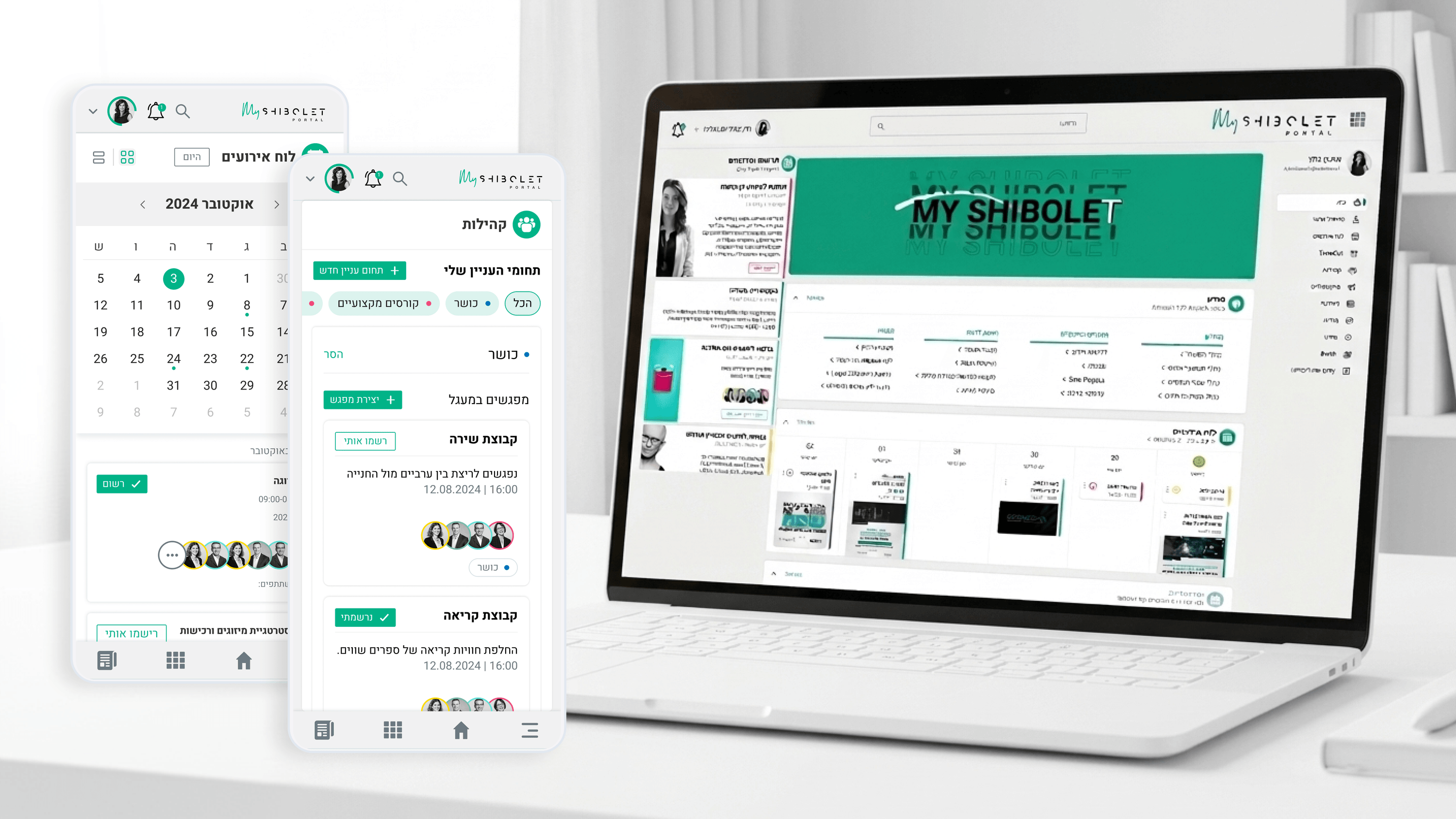
Every PM I work with eventually asks the same thing: how do users know what matters on a page that does five jobs at once? On Shibolet's internal hub, that wasn't abstract. A single home view had to surface a mandatory compliance notice, a new training course, an upcoming firm event, and an interest-group invitation, all at once. Typography was how I made that triage legible without a redesign per content type. I built a clear type ramp so official, time-sensitive items read with authority while social content stayed approachable rather than shouting. Weight, size, and spacing did the prioritization work that a PM usually tries to solve with more sections or more tabs. Visual hierarchy let one layout carry both a benefits announcement and a casual community post without flattening them into noise. For product, this is leverage. Instead of negotiating real estate per stakeholder, hierarchy gives you a repeatable rule for what leads and what follows. The content model and the type system reinforced each other, so when new content categories appeared, we already knew where they sat in the visual order rather than improvising.
Related articles

About
Making complicated into easy for users.
Senior product designer with a decade of work across complex systems - financial risk platforms, legal operations, healthcare apps, manufacturing tooling and insurance portals. The common thread is depth: products where the data is rich, the users are expert, and the interface has to disappear into the work.