
Onboarding Without a Tutorial: How a First-Time Furniture Shopper Finds Their Footing
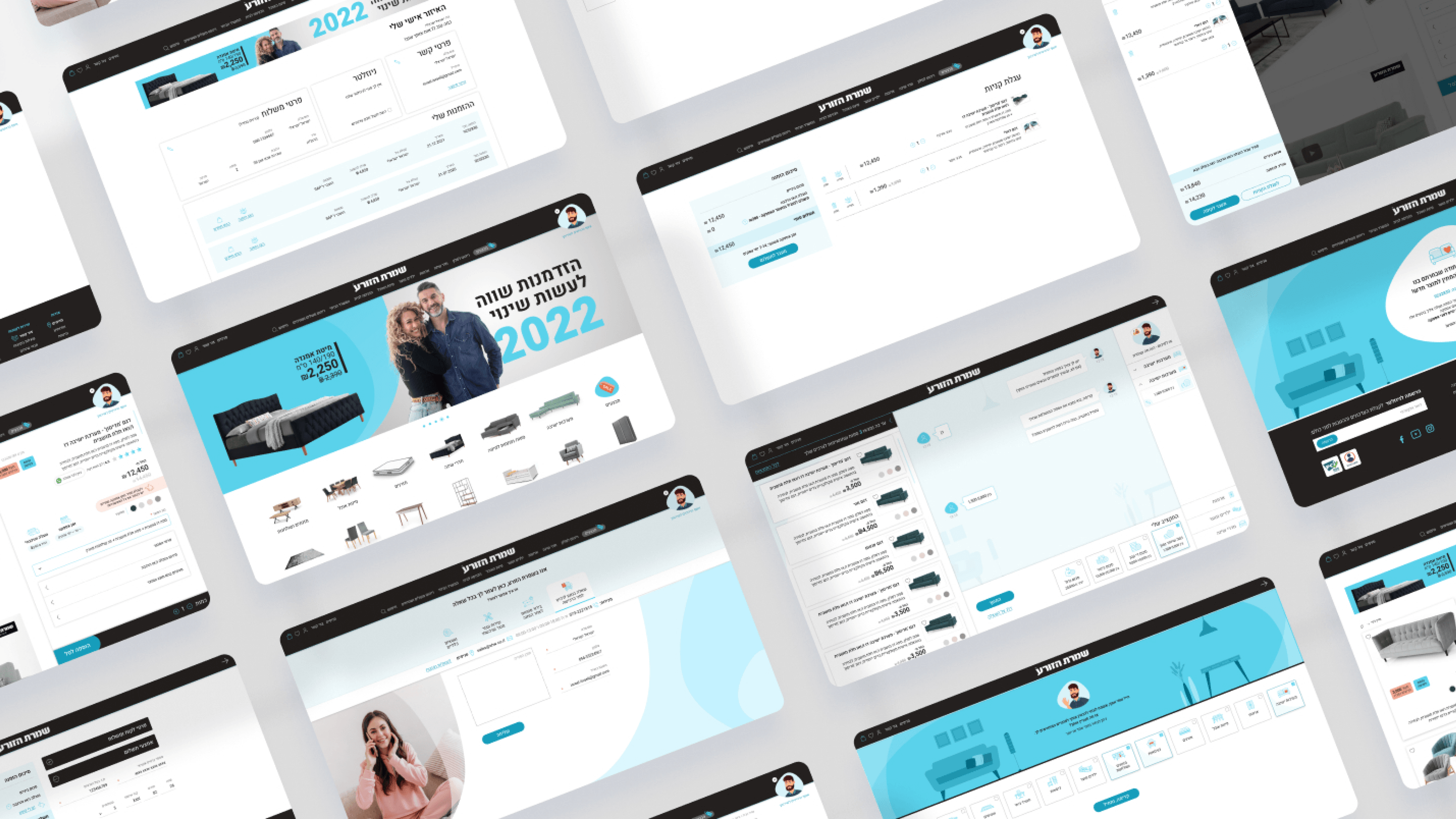
First-run onboarding for an e-commerce site is a trap if you treat it like a SaaS product tour. Nobody arriving to browse a sofa wants a five-step coachmark walkthrough. On Shomrat HaZorea, onboarding had to be invisible — the experience teaches itself in the first few seconds. As a PM, the metric I cared about was orientation, not completion of a tutorial: does a first-time visitor immediately understand where they are and what they can do? The inspiration-led homepage does that work, opening with imagery that reduces choice overload and signals 'this is a place to get ideas,' not a spec database to decode. Asaf is the onboarding mechanism itself: by replacing intimidating filters with a friendly virtual assistant and conversational visual cards, a newcomer is guided into the catalog without ever needing to learn a filter taxonomy. The first card is the first lesson. On the product page, progressive disclosure carries the same intent — emotional context up front, deep configuration available when wanted, logistics collapsed until needed — so a first-timer is never overwhelmed on arrival. Good onboarding here isn't a layer you bolt on. It's the experience being legible from the very first screen.
Related articles

About
Making complicated into easy for users.
Senior product designer with a decade of work across complex systems - financial risk platforms, legal operations, healthcare apps, manufacturing tooling and insurance portals. The common thread is depth: products where the data is rich, the users are expert, and the interface has to disappear into the work.