
Accessibility When the Product Is a Sofa You Can't Touch
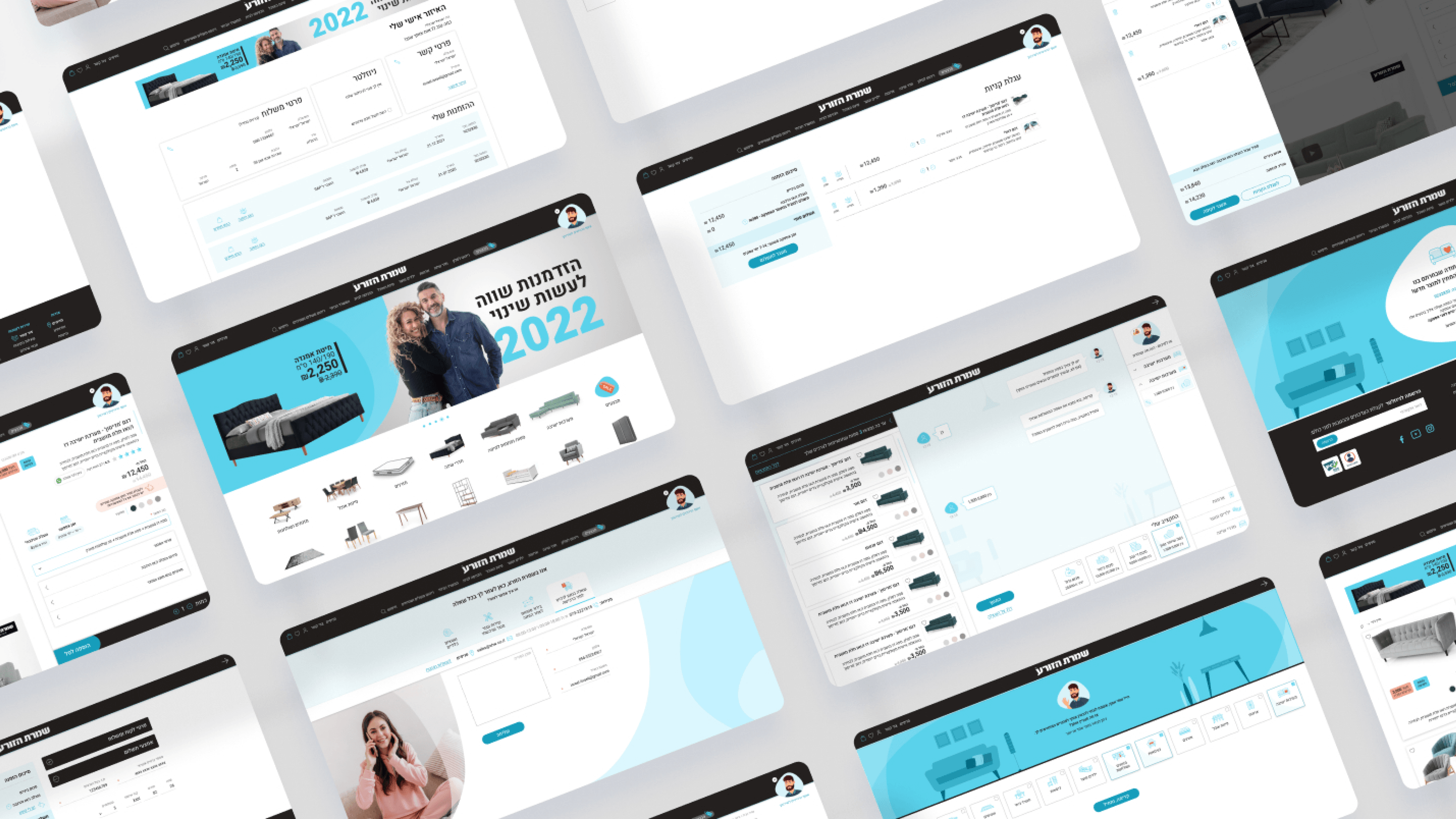
Accessibility on a furniture e-commerce platform has an industry-specific twist that I don't think gets enough engineering attention. Our entire redesign leans on sensory richness to sell — in-home video, color selection, fabric and finish shown visually, a configuration drill-down that goes all the way to the foam in a pillow. That's the experience for sighted, able users. The risk is that the more immersive we make it, the more we quietly exclude people who can't consume it that way. So the accessibility brief here wasn't generic WCAG box-ticking; it was: every decision a shopper makes visually must have a real non-visual equivalent. Color swatches need meaningful names and state, not just hue. The video can't be the only place key product information lives. Asaf's conversational cards and live results feed have to be operable and announce changes for keyboard and screen-reader users, because a results feed that silently updates is invisible to them. For an engineering leader, my framing was that accessibility is a parallel data and interaction contract, not a CSS pass at the end. In a category sold on look and feel, the discipline is making sure look and feel aren't the only path to a purchase decision.
Related articles

About
Making complicated into easy for users.
Senior product designer with a decade of work across complex systems - financial risk platforms, legal operations, healthcare apps, manufacturing tooling and insurance portals. The common thread is depth: products where the data is rich, the users are expert, and the interface has to disappear into the work.