
Typography Did the Heavy Lifting in Removing Choice Overload
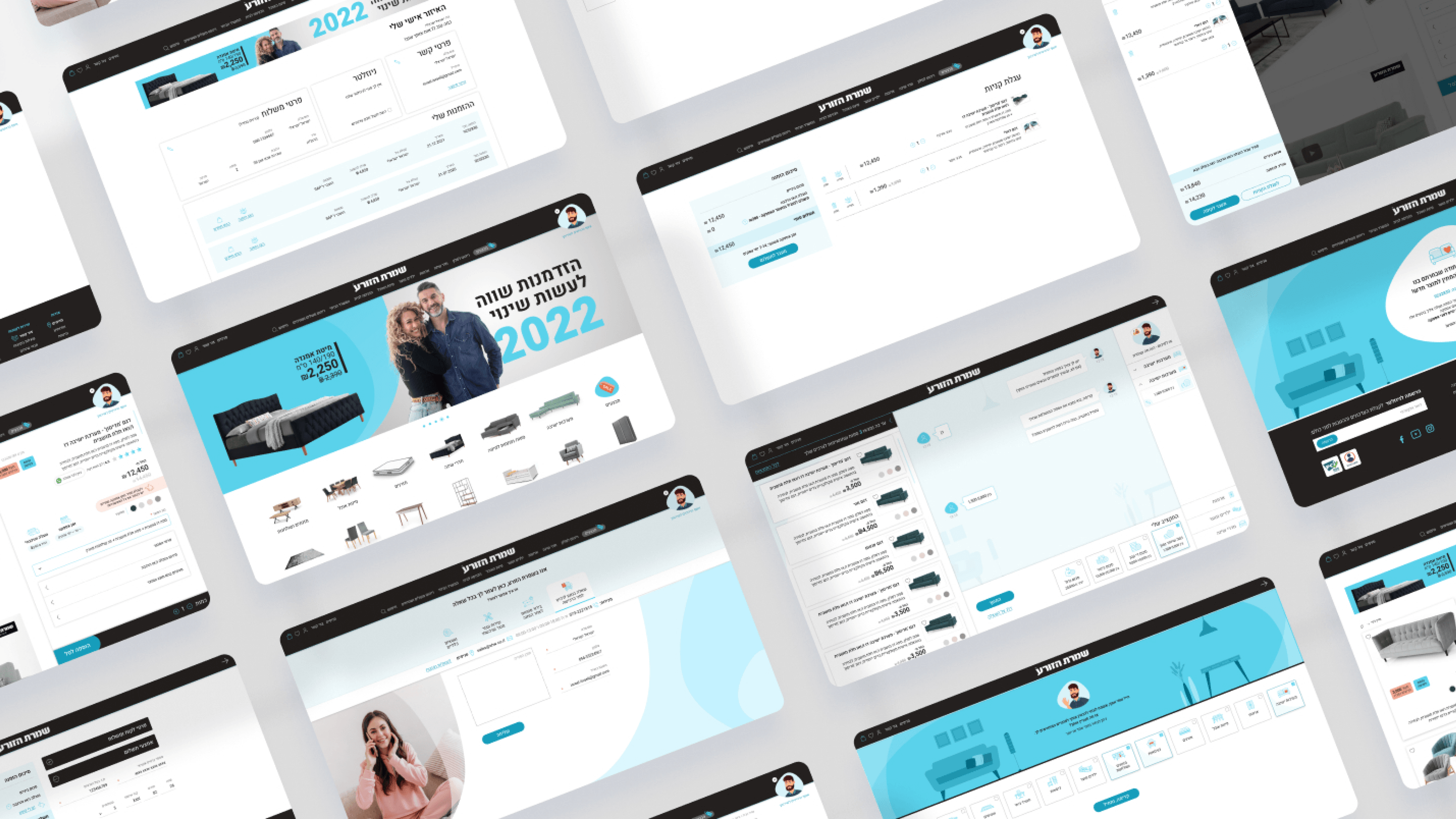
Furniture buyers don't fail because they lack information — they fail because everything shouts at once. The old Shomrat HaZorea site stacked specs and product rows with no sense of what mattered first, and the result was paralysis. On the new platform I treated typography and visual hierarchy as the primary tool for sequencing decisions, not as decoration. As a PM, you care that hierarchy maps to the buying journey, and that's exactly what we designed for. The inspiration-led homepage leads with imagery and a calm, confident headline voice, deliberately demoting dense detail so visitors feel invited rather than tested. On the product page — built as a friction remover — type scale tells the eye where to go: the emotional in-home context first, then configuration, with logistics intentionally set quieter and tucked into collapsible blocks. Asaf's conversational cards rely on short, legible prompts so a choice reads in a glance. The principle is simple but easy to lose under stakeholder pressure to surface everything: hierarchy decides what users notice, in what order. Get that sequence right and you reduce overload without removing a single feature.
Related articles

About
Making complicated into easy for users.
Senior product designer with a decade of work across complex systems - financial risk platforms, legal operations, healthcare apps, manufacturing tooling and insurance portals. The common thread is depth: products where the data is rich, the users are expert, and the interface has to disappear into the work.